HOME | DD
 r2ds — Windows 9 OS (Preview 1)
by
r2ds — Windows 9 OS (Preview 1)
by
Published: 2013-09-03 06:06:25 +0000 UTC; Views: 12070; Favourites: 61; Downloads: 71
Redirect to original
Description
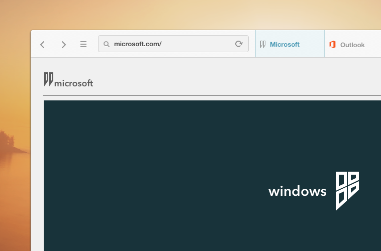
I am excited to show my "Windows 9 OS" mockup. Windows 9 OS is based on 7 while adding similarities of 8.
Updated design fav.me/d6rdyc6
Updateder design fav.me/d7z1bs9
Related content


Comments: 28

This looks awesome i wish Windows 9 was created and it looked like this
👍: 0 ⏩: 0


I do not know, this is only a mockup. Sorry.
👍: 0 ⏩: 0

")
 (Smile)")
Thank you. There is an updated design which is cleaner. fav.me/d6rdyc6
👍: 0 ⏩: 1

This one is stunning too, but I prefer the simplicity of the first preview. Anyway, I love your works
👍: 0 ⏩: 0

Looks pretty sweet! I'd definitely like to see this as a theme!
👍: 0 ⏩: 0


This looks excellent. Looking forward to the full concept.
👍: 0 ⏩: 1
Thank you! I am also looking forward on the full concept.
👍: 0 ⏩: 0
Very cool, thanks for showing me!
👍: 0 ⏩: 1

I seen it 'cause 2 of my concepts have been published on this website
👍: 0 ⏩: 0

Nice! I'll be waiting for more Windows 9 concepts from you
👍: 0 ⏩: 1

The logo seems to be a little to bold for my taste, but other people might like it
Can't wait to see this concept unfold
")
👍: 0 ⏩: 1
Even though that may be true, at least this logo doesn't look like Toys R Us made it.
👍: 0 ⏩: 0

Love this, looks way better than that transparency stuff, but the logo looks a bit awkward to me
👍: 0 ⏩: 1
I'll be removing the text, which does look less awkward.
👍: 0 ⏩: 0

Yeah, I used a few assets from my iOS7(ish) OSX redesign. I will be replacing them before I finish.
👍: 0 ⏩: 1