HOME | DD
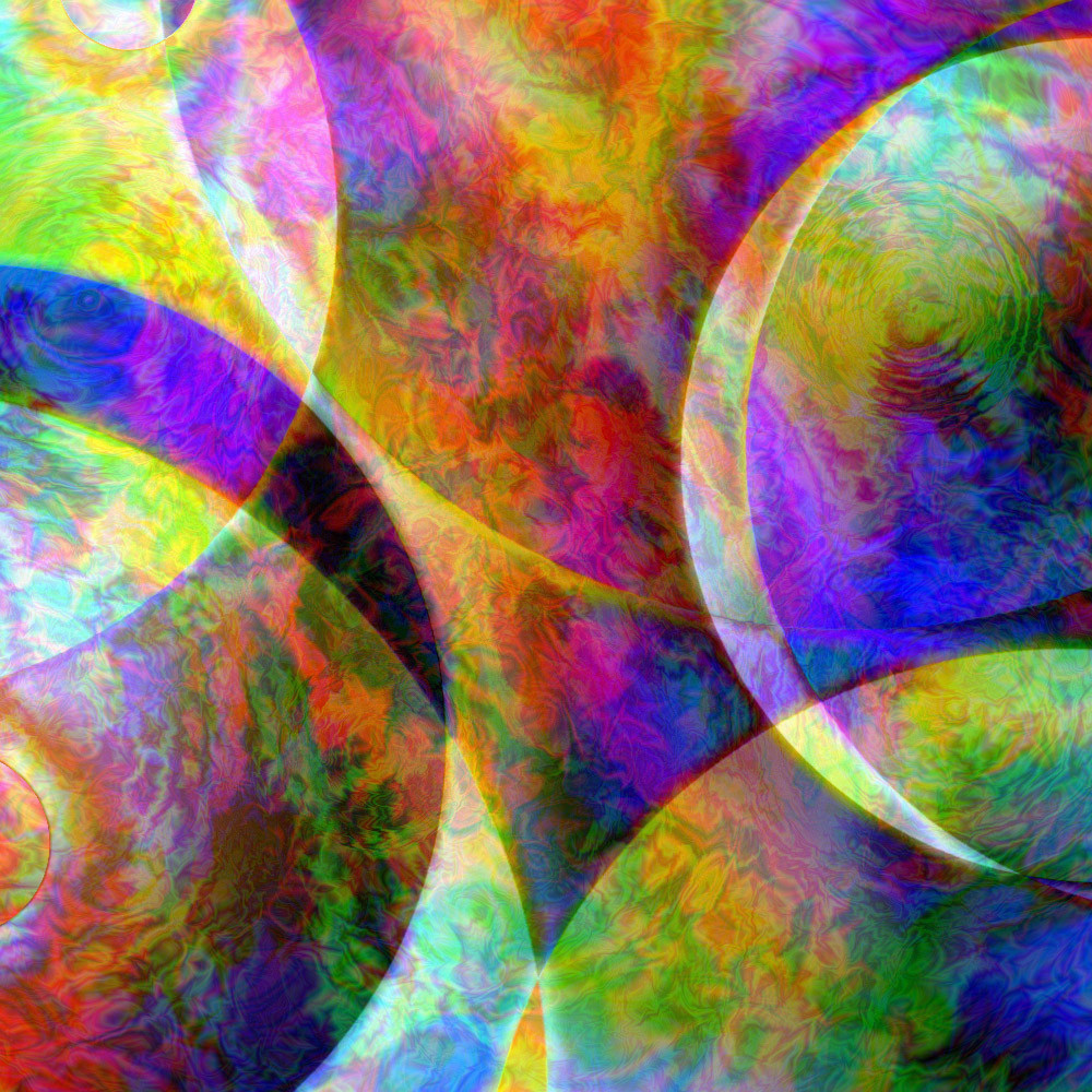
 r4v1 — Psychedelic Splendor
Published: 2007-01-16 17:16:30 +0000 UTC; Views: 17718; Favourites: 98; Downloads: 11972
Redirect to original
Description
Ive gone back to the psychedelic-abstract style I first started out with. You can see some examples here - [link] and here - [link]As usual - all done on photoshop, one layer no filters
 (Wink)")
advanced critique encouraged.
I hope to do more of these, if you want me to do more, please say so in your comment so I can dedicate time to this as well as fractals and video tutorials.
Related content


Comments: 34

Wonderful. I would like to walk around inside this picture!
👍: 0 ⏩: 0


I have seen these colours before, with no digital help
 (Smile)")
👍: 0 ⏩: 0

wow this is really nice !
can you teach me how to do this?
👍: 0 ⏩: 0
wow this 1 is really nice!
can you teach me how you did this?
👍: 0 ⏩: 0


i like this
interesting patterns
and there is a type of motion to it too
cheers
👍: 0 ⏩: 1
")


you are one of the most enormous reservoirs of potential I have ever known ...
👍: 0 ⏩: 1

not to worry, we all forget things sometimes. I'm flattered by your comment
👍: 0 ⏩: 0

Wow! I know this isn't a fractal, but it is so fractal-like in appearance. It reminds me of hypnagogic vision.
👍: 0 ⏩: 1


The colors, lighting and shapes are cool. And I like the paisley and ripple effects. It just seems to lack a focal point. And a full view makes it more confusing, rather than clarifying the picture or adding needed details.
Perhaps less would be more?
👍: 0 ⏩: 1
Its not really meant to have a focal point. However I do understand that the full view is a bit too full-on. Though, it may also be dependant on your screen resolution as when I saw this from I a friends computer I agree with you, but from my computer and the ones at school, it didnt have this effect.
👍: 0 ⏩: 0

Trippy! They look like planets given a paisley effect. The light that this piece has is brilliant!
👍: 0 ⏩: 1
I find it fascinating that you accomplish something similar to some of my stuff but with a completely different technique. One layer ... wow! Mine have hundreds sometimes.
Do you build the colors? Or choose them as is?
Plus, did you cut a small portion out of a big painting or did you paint it as is? I am so curious.
Lovely.
👍: 0 ⏩: 1
Mine would be so much better with hundreds as I would have more control - but I don't have the patience to or the CPU processing power too.
I start off with 2 / 3 colours and work with them and if I like how I'm doing, I continue; if I dont, I scrap it and start with a fresh set of colours. by continue, I mean add many many more colours - sometimes even upto 9 - 12 at a time.
I partly build them and partly choose as is - it all depends on the first 2 - 3 actions.
I decide how large I want the canvas to be before I start and work on that.
However, unlike my fractals where you can see all of it, I make my abstracts fill up the whole page to give the 'full on' effect as though there is more beyond the frame. I dont crop/adjust anything.
👍: 0 ⏩: 1
Most of my paintings are a small portion of a much, much larger canvas ... just to get that same effect.
It is always fascinating to hear how someone else works. Are the colors chosen thematically?
👍: 0 ⏩: 1
thematically? is that meaning as though I know what I want in mind? no - I actually just 'play' around with randomly selected colours to see if I like the effect. I always name the title after I make it as I think the art should define the title and not the other way round.
👍: 0 ⏩: 1
that is what I did when I started. now I have an idea of something that happened or was said or I saw in my day and that is the start for the basic shape. the colors are always the same.
as you know, I avoid titles altogether unless it is a very personal piece.
thanks fro explaining.
👍: 0 ⏩: 0

wooooooooow this is really kl. nice detail, colours fit it well !!!!!!!!!!!!!!!!!!

👍: 0 ⏩: 1


circular gradients (if you look carefully, you will see some ripples - these are the tiny ones and the huge circles are gradients too
👍: 0 ⏩: 1

