HOME | DD
 RadenWA — HO SHET ITS REALIZM
Published: 2010-07-17 14:02:40 +0000 UTC; Views: 2808; Favourites: 29; Downloads: 52
Redirect to original
Description
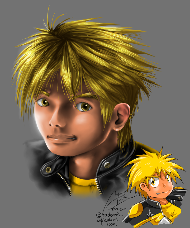
So....hnurr, since it's very likely that my college'll have assignments to draw face potrait anytime soon, I randomly decided to try practicing those...and got hooked.And there. My FIRST trial at realism potrait. Decided to do Arky, cos he's da man.
Added a chibi of him in my usual style just for comparison.
Mmmm...so does he look older than he should be? I planned him to be around age 17-18...
and one thing I sincerely regret: I forgot his MOTOCROSS GOGGLES!! But oh well, if I were to add any more detailed stuff on this, I might die anyways.
Hunh, can't win them all at the first try, I guess.
And you're free to say "Oh he looks like ... !!", but fyi, no references photos were used for this drawing. I peeked at the mirror a lot, tho >.>
PaintTool SAI.
Painting done in roughly 3-5 hours, cos I suck liek dat.
Art and Character: Arky Rayleigh, belongs to me.
Crit requested cos it still sucks in many ways. Parts I found disturbing are the neck, the left cheek, the eyes, the mouth and...uhh....everything else.
Related content


Comments: 76

I know the horizontal problem. Maybe it'll really help if I compress it down...will try.
👍: 0 ⏩: 1


Fantastic ^^ I think he looks on the age you suggested, 17-18, maybe a bit younger ^^
Very good job on the skin colorin´so smooth =3 Also the eyes and the hair, so detailed ^^ The idea of draw his anime vwersion is good too, to compare both
👍: 0 ⏩: 1


I got to admit, the portrait's too clean, or say, neat and shiny X3 And the right eye appears further/smaller from the nose compared with the yonder.
Other than that, I like your hair coloring style
👍: 0 ⏩: 1
Haha, because I'm more used to anime digital coloring, which are smooth and shiny. I dunno how to do skin textures and things like acnes
The right eye's too small...mmm I'll note that.
Thanks anw

👍: 0 ⏩: 1
Yeah, I can see that referencing. I don't recall seeing any acnes in manga art though o.o only freckles and single zits  (Smile)")
👍: 0 ⏩: 0

Huahahahahaha kalo dilihat lebih dekat.....
Tapi nice first try ! Kalo menurutku kayak udah pro ajax D

👍: 0 ⏩: 1
Kalo diliat dari deket jadi ANCUR
Karena itu jagalah jari anda dari godaan untok memencet "fullview".
👍: 0 ⏩: 0

False alarm! Saw a little guy with yellow hair and thought it was Viktor.
Realism, eh... no, I think you aught to stick with what you know.
👍: 0 ⏩: 1
Haha
He doesn't got spikes on his hear like the human Viktor do.

👍: 0 ⏩: 0

WOW that is a real good attempt for realism, you pulled it off!
👍: 0 ⏩: 1

woaw i liked the hair (omg that my favorite) the ears and the eyes
👍: 0 ⏩: 1


wow....
wajah-wajah anak badung tuh
kalo sepengelihatanku sih, untuk ukuran realis jarak matanya masih kejauhan...
keliatannya masih agak terpengaruh sama cara pasang proporsi kartun

👍: 0 ⏩: 1
itu pake referensi nya wajah saya sendiri...
Wah gawat ni ntar kalu gw mesti gambar wajah cewe cantik gimana gw tentuin proporsinya >.<
Ooh, terpengaruh, sangat. Itu lho masi pake skeleton nya wajah manga chibi saya >.>
👍: 0 ⏩: 0


Heheheheh...more like 15-16. Looks younger, actually. Nice job for a first try! Waaaay better than what would've happened if I attempted realism (at my current stage).
...That hair...Why is it that everyone can do hair in realism epically and not me! When I tried out a tablet, I couldn't even remotely get the shape right! (aka, the hair = You're doing it right).
👍: 0 ⏩: 1
Whee, younger! Yay!! That's better than older. Babyface is win.
Hehe, the hair, somehow turned into one of the easiest part >.< It's more about finding the hair source and set the layers, then for the rest you just simply make a flurry of random thin brush strokes across the lines you've set
👍: 0 ⏩: 1
lol you make it sound so easy~
👍: 0 ⏩: 0

He looks awesome! and he looks to be around 16-17 so, yay!
College aprty time! WOOT!
👍: 0 ⏩: 1
That's great! I succeeded in making him look young and energetic
College party? Haven't got such things yet :/
👍: 0 ⏩: 0


This is jaw dropping. I am really jealous of your skill and awesomeness!!!
👍: 0 ⏩: 1

FIRST AJA BEGINI ASJHFASJKASFHASJKFHAJKS
KEREN ;A;
👍: 0 ⏩: 1


Wow, the shading looks really great. Awesome job.
👍: 0 ⏩: 1

i think that generally it looks very good but there are some flaws... idk exactly how realistic you wanted it to be but like for a truly realistic pic his eyes stand apart too much. i think you should move his left eye more towards the nose (considering his nose is in quite a sharp angle it looks a bit unnatural for his eye to be there). his ear looks a bit funny too but i think thats mainly to do with how you colored it (especially the top of the ear and teh bottom, the inbetween part looks great). also the light on his yawline near his ear isnt right i think. his mouth is actually colored really well but i think its just the "pose" you put the mouth in that makes it look a bit strange and also a bit the harsh shadows next to the mouth while you let out the shadows of the lines between the sides of your mouth and your nose (if you know what i mean). and if anything i think he actually looks younger than 17- 18 ^^'
well that's alot of comment but i think everything i didnt point out looks just GREAT! i especially love the hair and the clothes ")
👍: 0 ⏩: 1
Yes, the further apart eyes is the main problem everyone noticed. Well, I guess I'd still gonna have some manga-esque mixed in my realism then =w=
Yeah, the top and the bottom part of the earlobe-I randomly decided to shiny them up by the end, but guess it doesn't quite worked up
Mmm...yeah. I used quite a hard kind of mouth pose or this one, a wide smile with slightly open grin >.<
I dunno about the jawline-I found that when I looked at myself on the mirror XD
Mmm thanks anw, I dunno if I gonna do this style again

👍: 0 ⏩: 1
well i think its a cool style ")
👍: 0 ⏩: 1
I'll try again once I got the urge to see my guys for real again ^^
👍: 0 ⏩: 0

Hmm.. The perspective of the ear is incorrect.. I think everybody else pointed out the eyes and whatnot lol. But your coloring is really good and that jacket is awesome
👍: 0 ⏩: 1
| Next =>