HOME | DD
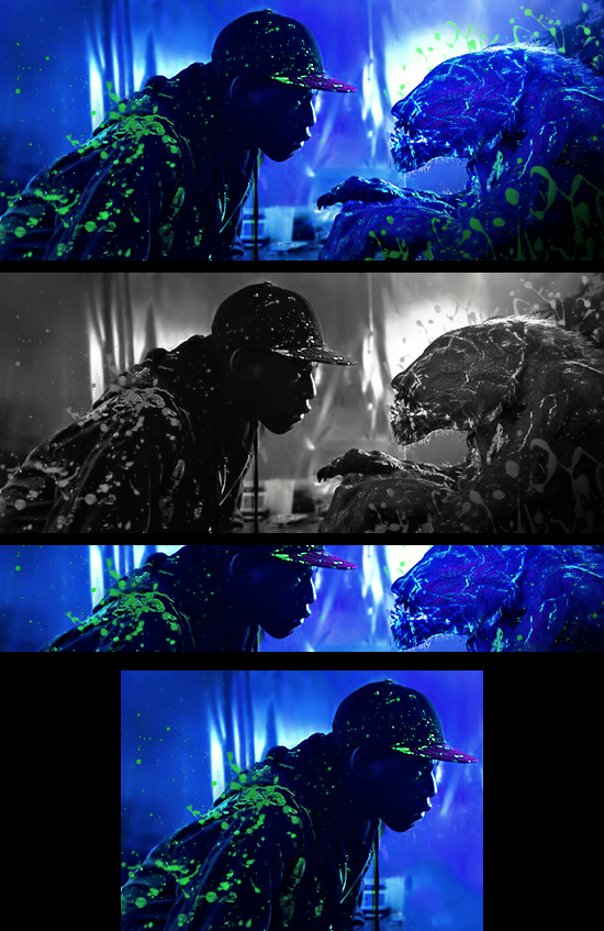
 RadillacVIII — Tech Dragon Signature Tutorial

Published: 2010-01-20 19:38:34 +0000 UTC; Views: 4270; Favourites: 22; Downloads: 554
Redirect to original
Description
I had a few requests for a tutorial on this signature, so here it is mates!Everything I use can be found in the resource package, click the download button to get it.
Be sure to post your outcomes!
Related content


Comments: 13


You did pretty well with the background and atmosphere. The gaussian blur added a nice touch of sparky glow.
I would however like to see more effects in front of the dragon, to blend it in better and make it more interesting. Add effects so it flows with the wings of the dragon, give it motion and make it come alive.
Bigger and more visible text would also be good
Well done so far, just a tiny bit more to make it superb!
👍: 0 ⏩: 0

wfcamb from GFX Void!  (Smile)")
 (Wink)")
👍: 0 ⏩: 2
Well hi there!
I'm glad to hear that
👍: 0 ⏩: 0
*and you know my outcome: [link] and all the other ones..
👍: 0 ⏩: 0

what an amazing tut you made and thanks for the resources ")
Isn't as good as yours plus I made huge changes ")
👍: 0 ⏩: 1
Glad you like it and you're so welcome
It's good that you implanted your owns touches, that's what I like to see.
About the sig: I'd recommend you to either removed the text or redo it with another font and move it closer to the dragon's neck. Since it drags to much attention away from the focal atm. You got good colors and a nice flow, only flaw I can see there is you've erased to much over the center focal of the dragon making it pop out to much and not blend that well with the rest of the sig. So keep some effect layers above th head of the dragon to give it some colors that match the rest of the sig.
Other than that great job and thanks for following my tut

👍: 0 ⏩: 1
Thanks for the helpful tips and I'm glad you like it
👍: 0 ⏩: 0

What a great tutorial and intreasting.
I was owndering if you can alow me post it at my forum. I will credite you and post you DA page.
👍: 0 ⏩: 1
Yes I give you the permission to do so. You can then send me the link to your forum so I can check it out.
Glad you liked it that much
👍: 0 ⏩: 1
Here is the link :
www.gfxresource.com
It can be found at the tutorial section.
👍: 0 ⏩: 0

Very Nice Tutorial, and the Outcomes are quite interesting.
👍: 0 ⏩: 1