HOME | DD
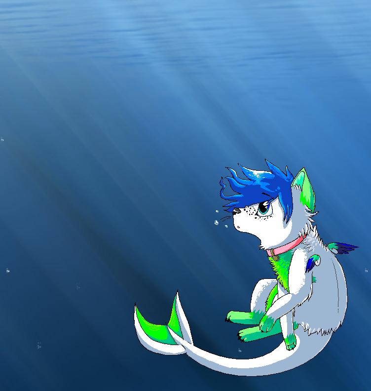
 Radioactive-Ink — Dancing Cheek To Cheek

#dolphin #fish #ocean #seaweed #swimming #sparkledog #sparkledogs
Published: 2014-10-20 00:12:32 +0000 UTC; Views: 878; Favourites: 31; Downloads: 1
Redirect to original
Description
Art trade with my amazing friend dolphin4dreamer :3 I had so much fun drawing this, but I feel like I'm constantly getting worse and worse at drawing. :/ I hope it looks okay though, and thank you so much for agreeing to do an art trade with me! <3Related content


Comments: 19

Overall
Vision
Originality
Technique
Impact
Really nice piece of art, indeed. I like the idea - very lovely and cheerful.
I suppose you wanted to make the sea dog (you don't mind if I call it like that?) the most outstanding part of the picture - and you achieved that goal on 100% but from the other side there's underwater stones either- I'll mention them down to the text. But Let's get to the point e.deviantart.net/emoticons/s/s… " width="15" height="15" alt="
 (Smile)")
Pluses
+SO - the strongest part of this picture is - very pleasurable composition, The location of objects looks smooth and harmonical to the eyes
+ Anatomy. Even if the dog looks like fantasy creature - it still has good proportions and I don't find any negative features there. As for a dolphin - it's also drawn very well..the only feature that disturbs me - this is it's tail - looks a bit unnatural, dolphins have horizonal-turned tails, the tail drawn here is more fits for usual fish. But this is really nothing compared to the rest of the well-drawn characters.
Minuses
- The Lightning. I really like how you reflected the sunbeams of water surface on the back of the dolphin. And it seams that the sun beams is really strong on the picture. But it's reflection on characters doesn't really depicts the reality - as a result the picture lacks its depth and the characters looks a bit flat under such strong sun. Remember - the water is completely different enviroment than the air - the deeper you go from the surface the darker colour becomes - I see this on the background but characters seem to live separate from this statement. Don't be afraid to add some contrast and make deeper shadows next time - and it makes your work looks much realistic. (but, of course, don't overdo with it either e.deviantart.net/emoticons/w/w… " width="15" height="15" alt="
 (Wink)")
nynightclubbing.com/wp-content…
It also has fur but there are sunbeams on it anyway.
- Detailing. Don't get me wrong - I have nothing to say about detailing of the dog - other than that is great) But - again - the other components looks separate and flat compared to this great dog e.deviantart.net/emoticons/b/b… " width="15" height="15" alt="
")
e.deviantart.net/emoticons/s/s… " width="15" height="15" alt="
e.deviantart.net/emoticons/w/w… " width="15" height="15" alt="
...and this is it) As I said - the picture looks nice in common. Work with minuses and you'll be even much closer to becoming a great artist)
I've tryed to be less subjective and more objective in my critique, relying on artistic point of view rather than my own.
I'm still learning but I hope this critique was somehow helpfull to you e.deviantart.net/emoticons/h/h… " width="15" height="13" alt="

👍: 0 ⏩: 0


Technique
Impact
This is a beautiful piece. As far us the underwater scenes I have seen it is up at the top, Simply stunning and I love the concept.
I love love the texture in the fur and the lighting. Particularly the streams of light from the surface . The additional specs such as the seaweed, shadows of the fish and the detail of the sky help contribute the feeling of emotion and atmosphere displayed.
On a constructive note I would say work on your anatomy of a dolphin, the is perhaps a little strange to the eye ... but other than the superb work! Keep it up
👍: 0 ⏩: 1

Thank you so much! 
👍: 0 ⏩: 1

Overall
Vision
Originality
Technique
Impact
Hi there! This is a wonderful piece of art you have here! I think I'll break it down into the separate categories. Forgive me if it's a bit unorganized: this is my first critique.e.deviantart.net/emoticons/b/b… " width="10" height="10" alt="

+: I think that this is a very beautiful piece! It captures a large environment. There are obvious foregrounds and backgrounds, plus lovely details all the way up to the sky. The fur has a very professional texture, and the patterns do not seem forced. Colours are not blinding. The kelp foreground is not all one shade of green, which is how it would occur in nature. Jay's anatomy is quite accurate.
-: Since this is very nice, my cons will be very nitpicky, which means you did a good job. Both animals appear to be moving to the right, since they are looking in that direction and their body movements suggest that. However, Jay's black hair suggests that she is moving backwards. The ocean's cast of light does not touch Jay, but it touches the dolphin. It also looks a little harsh; I would recommend more blending. The dolphin's tail anatomy looks kind of like the anatomy of a shark tail; dolphin tails are horizontal. I'm actually not quite sure which way the tail is in this picture.
Overall: It looks very beautiful! I surely could never have made something as nice as this.e.deviantart.net/emoticons/b/b… " width="10" height="10" alt="
+/-: Well, considering that this is and art trade and I don't know the details, I'm not quite sure what to say. The character is very original, but it's not your character. It is said in her character reference that she likes water and dolphins, so you made this. The scene itself is very original (swimming with the dolphin under the beautiful sky), but there isn't any real super-creative concept, which is okay, since this is an art trade. Because of that, I'm rating this category 3/5 rather than 2.5/5.
The way that the title is "Dancing Cheek to Cheek" doesn't really have anything to do with the artwork, since it's just a title, but I do like it! It explains swimming as dancing, which is not particularly original but does change the meaning slightly to mean something greater.
Overall: I think that it's okay! There's nothing to fret about.e.deviantart.net/emoticons/b/b… " width="10" height="10" alt="
+: This is very painting-like, which I admire. Everything is very smooth and surreal in nature. Like earlier said, the fur patterns look natural as possible. I enjoy how sharp the foreground is in comparison to the softly brushed fish in the back. The stream of light from above are also very soft, which is nice. The rainbow in the sky does not look like it's made out of plastic, unlike many other rainbows.
-: I don't think there's much to say here: it's phenomenal. The streams of light cast on the dolphin are just a tad too prominent, but it's really spectacular in this category!e.deviantart.net/emoticons/b/b… " width="10" height="10" alt="
+/-: Similar to originality, this is hard to evaluate because the purpose of this piece was not to deeply touch us or teach us anything about life. It's not moving, because it's not supposed to be.
However, the way everything flows and just looks so gentle is a little relaxing, and makes us imagine their dancing is if it were moving.
Overall: Not bad! I think it's very well done.e.deviantart.net/emoticons/b/b… " width="10" height="10" alt="
👍: 0 ⏩: 1
Oh my gosh, this critique was perfect, thank you so much!
👍: 0 ⏩: 1
You're welcome! I'm glad to have helped. Anytime!
👍: 0 ⏩: 0

The anatomy on both the dolphin and the canine character seem very off. Although the dolphin seems less so, dolphin fins aren't pointy like that. The paws on the canine are a bit too large and neither tails have the illusion of being flat or paddle-like like the way a dolphin's tail is. There isn't an equal distribution of attention or work in the piece, and that's distracting to the emotion you're trying to show.
The illusion that we're underwater is lost, as you did a water reflection only on the dolphin and nothing else. The ripples in the water could have been done better, too. The fur on the canine is not done well at all. It's far too stiff and is too uniform to look like natural fur. The colors seem slapped over solidly drawn markings, and there is a lack of darks that takes away the depth in the image.
A good way to fix these is to study photos with great attention to detail, watching how lights and darks change the way an object looks and how things are textured.
👍: 0 ⏩: 0

Wow this is an amazing pice. I really love details in the fur of the animal and the shading of the clouds and seaweed. I think parts to improve would include the shading and details of the dolphin as it looks a little flat. And also the details of the sea/waves as that would bring more realism into the drawing, but other than that there is not much to comment on. I love how you drew the rainbow and the light shining into the water.
👍: 0 ⏩: 0

I haven't read the other critiques, so I hope I'm not repeating anything that's already been said. But the first thing I noticed is the super sharp clarity and detail of the fur, in contrast to the super blurry, simplified painting of everything else (seaweeds, fish, dolphin, ..everything). This happens *a lot* to people who heavily focus on only painting a specific thing, they turn out to suck at painting other things that they never/rarely do. The dog-mermaid (?) looks like it took 4 hours. The seaweed looks like it took 3 minutes. You have to balance everything out and give equal attention and detail to everything. I know, cause this is actually something I'm struggling with too lol
👍: 0 ⏩: 0

OBSOBWOBW SO SORRY BAE I HAVENT BEEN ON DA A LOT
LOOK I RHYMED
IM FINISHING MY PART ASAP XD
👍: 0 ⏩: 1
HEY C: AND IT'S FINE, DON'T STRESS ABOUT IT, TAKE YOUR TIME :3
👍: 0 ⏩: 0


TOO PERFECT. Great job on them seaweeds!
You're not getting worse at all!!
👍: 0 ⏩: 1
aww, thank you so much! 
👍: 0 ⏩: 0

Holy cow this looks amazing, you did a great job! <3
I am loving the detail of the fur. c:
👍: 0 ⏩: 1
thank you so much! i'm glad you like it :3
👍: 0 ⏩: 0