HOME | DD

Raekre — untitled.for.a.reason

Published: 2006-07-27 05:28:33 +0000 UTC; Views: 1322; Favourites: 16; Downloads: 171
Redirect to original
Description 
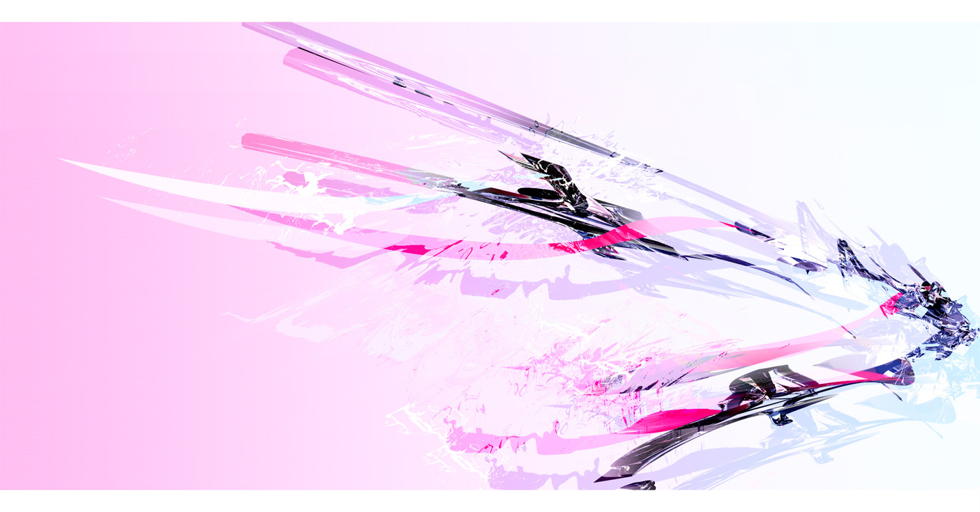
Maybe you know, maybe ya dont. simple as that.

This is an attempt to try and get my flow back. Im going to be puttin this one up for prints likely. i liked it.
Related content
Comments: 29

blackwind [2006-08-23 08:57:39 +0000 UTC]

loved the composition, congrats

👍: 0 ⏩: 0

PhoenixFx [2006-07-28 08:54:47 +0000 UTC]

Nice colors (:

👍: 0 ⏩: 0

VahagByurat [2006-07-27 22:51:05 +0000 UTC]

I think it looks better than when you showed me, but ya, you're capable of better.

👍: 0 ⏩: 1

Raekre In reply to VahagByurat [2006-07-28 00:17:59 +0000 UTC]

yeah i worked with it a bit. took some advice you gave me

👍: 0 ⏩: 0

J-Sado [2006-07-27 17:42:08 +0000 UTC]

nice

👍: 0 ⏩: 1

Raekre In reply to J-Sado [2006-07-27 22:48:47 +0000 UTC]

thanks

👍: 0 ⏩: 0

1ALPHA1 [2006-07-27 17:24:45 +0000 UTC]

colors are nice..

👍: 0 ⏩: 1

Raekre In reply to 1ALPHA1 [2006-07-27 22:48:43 +0000 UTC]

👍: 0 ⏩: 0

fee1 [2006-07-27 17:20:40 +0000 UTC]

nah :/ dont feel it.

👍: 0 ⏩: 1

Raekre In reply to fee1 [2006-07-27 22:48:33 +0000 UTC]

whys that you gotta be able to feel it cause your *fee1 =O

👍: 0 ⏩: 1

fee1 In reply to Raekre [2006-07-28 13:07:27 +0000 UTC]

xD ok, 1:0 for raekre

👍: 0 ⏩: 1

Raekre In reply to fee1 [2006-07-28 18:54:04 +0000 UTC]

woo

👍: 0 ⏩: 0

trigness [2006-07-27 17:09:24 +0000 UTC]

hmm.. what I do know is that this is intriguing to me for some reason. It's very simple, yet not; elegant, yet shifty. This was beautifully exectued, with much style and visual appeal. And as typical as this is, I love your color scheme. The only thing I would do is add something to your background. There needs to be something that pops out at you, though I supposed that could be your render. Either way, nice work.

👍: 0 ⏩: 1

Raekre In reply to trigness [2006-07-27 22:48:03 +0000 UTC]

thanks for your time

👍: 0 ⏩: 0

YemeniteCamel [2006-07-27 11:18:38 +0000 UTC]

I liked this! The render is sweet and the design is cool.

Good Memories' Shards (?) as a name?

👍: 0 ⏩: 1

Raekre In reply to YemeniteCamel [2006-07-27 22:47:50 +0000 UTC]

cool thankies and im leaving it at untitled for a reason..

👍: 0 ⏩: 1

YemeniteCamel In reply to Raekre [2006-07-29 23:13:24 +0000 UTC]

oh my god, I just had this cool idea in my head -

Celebration of the Free Mind

And I know you want to keep it untitled for a reason ..

👍: 0 ⏩: 0

UVArthos [2006-07-27 10:55:54 +0000 UTC]

That looks good bro! =]

👍: 0 ⏩: 1

Raekre In reply to UVArthos [2006-07-27 22:47:35 +0000 UTC]

thankies

👍: 0 ⏩: 0

Putkin [2006-07-27 09:48:23 +0000 UTC]

thats hot, will see more of this style

👍: 0 ⏩: 1

Raekre In reply to Putkin [2006-07-27 22:47:28 +0000 UTC]

maybe

👍: 0 ⏩: 0

Rchitkara [2006-07-27 05:49:17 +0000 UTC]

i like the colours

👍: 0 ⏩: 1

Raekre In reply to Rchitkara [2006-07-27 22:47:20 +0000 UTC]

yay

👍: 0 ⏩: 0

SeanyHolla [2006-07-27 05:44:02 +0000 UTC]

scraps?

👍: 0 ⏩: 1

Raekre In reply to SeanyHolla [2006-07-27 05:50:32 +0000 UTC]

yeah likely. this is an attempt. i'll prolly take the same concept and make a new one

👍: 0 ⏩: 0

Hellknight10 [2006-07-27 05:40:59 +0000 UTC]

very good
it looks better resized
before it looked too sharp and huge
good work

👍: 0 ⏩: 1

Raekre In reply to Hellknight10 [2006-07-27 05:43:17 +0000 UTC]

thanks for the C&c man it helped alot

👍: 0 ⏩: 0

resurge [2006-07-27 05:33:04 +0000 UTC]

it's very cool !! congrats. !!

👍: 0 ⏩: 1

Raekre In reply to resurge [2006-07-27 05:43:28 +0000 UTC]

thanks

👍: 0 ⏩: 0