HOME | DD
 rafater — OOPS!

Published: 2011-03-07 10:51:59 +0000 UTC; Views: 23954; Favourites: 436; Downloads: 239
Redirect to original
Description
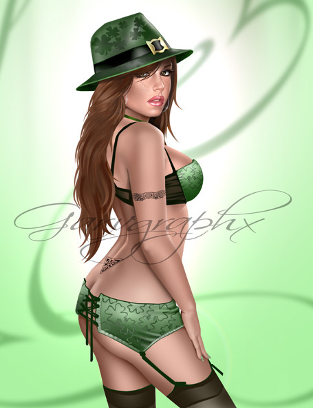
Oops!Why are you looking at me?
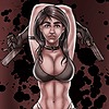
more pin-up drawings:
Related content


Comments: 29


 (Smile)")


She didn't oops enough IMO...that hat's in the way! LOL Fantastic!
👍: 0 ⏩: 0


^^ Very nice! ")
👍: 0 ⏩: 1

thanks!!! The traditional look is because the original drawing was mede on paper. Then scanned and painted in photoshop. I like to preserve the traditional look and avoid the cold sense of digital art.
👍: 0 ⏩: 1
You're really good at it... I can never sketch that neatly ^^
👍: 0 ⏩: 0

Dibujo genial! chica potentisima.
Oye hablando del fondo como s t suele ocurrir, es por q sabes d composición?
m vendria bien algun consejillo.
--
Mi blog: [link]
👍: 0 ⏩: 1
gracias!!!
Respecto a los fondos no sabría muy bien que decirte. La verdad es que creo que se nota algo mi etapa de diseñador gráfico en ellos. si te das cuenta suelen ser sencillos pero a la vez efectistas, no quiero que atraigan más la atención que la propia figura, aunque a su vez intento que quede toda la imagen bien integrada. Sé que son consejos muy genéricos, pero abordo el fondo de una forma muy intuitiva y voy haciendo pruebas hasta que doy con algo que me gusta
👍: 0 ⏩: 0


Pues si no quiere que miremos se ponga otro modelito o se reduzca la talla de semejantes senos....
que los demás ya tenemos suficiente con ser simples hombres!!!! jajajajja
como siempre magnífico trabajo Teru!!!!!
👍: 0 ⏩: 1
XD Gracias  (Wink)")
Por cierto Mr. Tristanbeiker.. ahora que hace bueno, a ver si quedamos un día
👍: 0 ⏩: 0