HOME | DD
 RagnarokEOTW — In the Shadows - Coloured
Published: 2009-10-07 20:08:32 +0000 UTC; Views: 1362; Favourites: 6; Downloads: 397
Redirect to original
Description
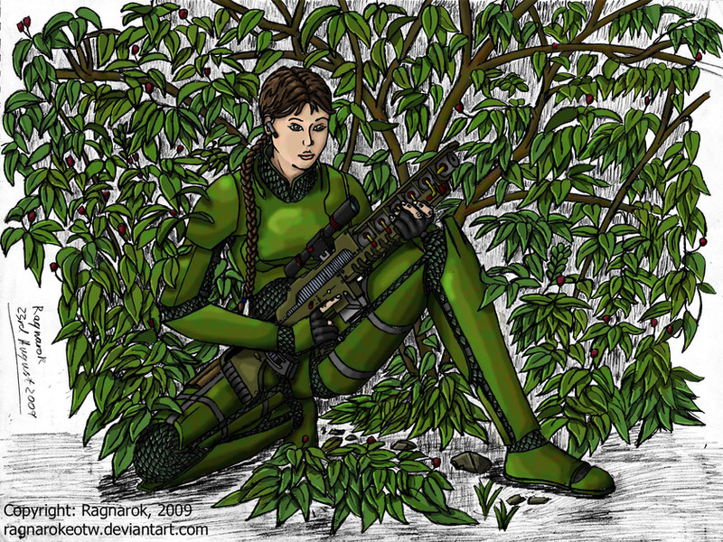
NOTE - Revised version here: [link]Finally! Finished, for now.
This has been ages coming, and I've only finished now due to 5 solid hours of colouring (the entire background) today.
Some big numbers go with this.
- 16 weeks since I began.
- 17,017,896 pixels at the full resolution.
- 20 layers in Photoshop.
- 975 Megabyte Photoshop file.
- 25 megabyte PNG export (at the full 4872x3493 resolution).
- 5 WIP uploads: [link] [link] [link] [link] [link]
Anyway, this is a submission for Ordo Illuminatus' Sketch Group (#4), and is almost certainly the most overdue piece they'll receive for some time (as it was set in January...), as well as the one that took longest in terms of hours of work (Don't ask exactly how many, I don't know...)
Line work is all traditional, done in 0.5mm B mechanical pencil on A3 sketch paper. Colouring is all digital, done in Photoshop Elements 6.
It's sort of lost the original "In the Shadows" name, because the shading and colouring isn't all that dark, but whatever.
EDIT: Forgot the basic details.
The character is Frost, armed with her coil rifle.
Definitely one of the best pieces I've ever done. Comments and Criticisms welcome.
Related content


Comments: 17

This is REALLY good! I love her gun, brilliantly drawn! Very well done,Sir!
👍: 0 ⏩: 1

Thanks. I keep meaning to get a version of this printed out (although likely the adjusted version). That's the downside to when I colour digitally - it's not on the wall to look at!
👍: 0 ⏩: 1

great work!! great to see this one finished up at long last!!
👍: 0 ⏩: 1
Thanks (for the fav as well).
Although this is a good piece, I really need to get back the pace I had a few months back.
When I started, I had five pieces up in a week - and they were good pieces (particularly Excessive force and Not to her Liking ).
Okay, one of those five was a (slightly) older piece, but I'd really like to get that pace back, because it's practise that makes perfect, not hesitating for fear of messing up a piece.
But my mindset makes that hard. Oh well, here's hoping I can do it again.
👍: 0 ⏩: 1
I know what you mean.I cranked out 8 pictures in 12 weeks and 2 since!!! lol
👍: 0 ⏩: 1
The problem mostly seems to be concern about "messing up" a piece combined with a certain lack of ideas.
I had a few ideas I was "saving" for another occasion, but I suppose I'll be breaking them out sooner rather than later.
👍: 0 ⏩: 1
I know the feeling!! I look forward to seeing your next project!!
👍: 0 ⏩: 1
I guess that next project is going to be either a "group shot" of my OCs, or perhaps the redux I'd like to do of this one: [link]
Dunno which yet.
👍: 0 ⏩: 1
tough choice.The group shot would be pretty cool though
👍: 0 ⏩: 1
Having thought it over, I'll leave the group shot for my next piece. It's going to be somewhat more work, and I really need to get back into my stride first.
I'm also looking to experiment with a different technique, and it'll be better to try it on a piece with one character, rather than one with several.
Already started on the "Redux" - hopefully, it'll only be a day or two.
👍: 0 ⏩: 1
cool,I look forward to seeing what you come up with!!
👍: 0 ⏩: 0

You know what simple thing would make this piece a lot better? Change the white background layer to black. Even if it eats your linework, I think you'll find the whole thing more dramatic as well as easier to read if you let her face pop more.
There's also a lot to criticize about your proportions and shading but I don't want to go into that. You spent a long time on this and I don't want to rain on your parade by detailing the way various shapes are wrong. (I will if you want me to though.)
👍: 0 ⏩: 1
I've had the "darker background" suggested elsewhere, and I'm not entirely sure why it didn't occur in the first place.
I'll try it out when I get the time to go through it and track down the background - as there is no background layer currently, and it's not been changed from the original pencil shading other than a minor contrast change (it seemed a lot darker earlier on).
As for the proportions... I'm aware there are some issues that need to be dealt with. The overlay of the linework over my reference shows the left leg is a bit out , but I don't think it spoils the piece horrifically.
But feel free to criticise errors in my work. I'm trying to improve, and it's harder to do that if I don't know what mistakes I'm making.
👍: 0 ⏩: 1
Well I see one of the reasons it looks wronger than it should be: You based your exact proportions for a female character off of a male model, failing to compensate for the differences between the sexes such as shoulder and hip width. ALSO: The kind of hair she has wouldn't stick so close to the person's skull like your model's hair does. That kind of hair is supposed to puff out more, making the model's head look somewhat bigger.
👍: 0 ⏩: 1
The "Male model" would be me - it's easier to get the shot I want, costs nothing, and there are no copyright issues.
And while I didn't compensate for everything, I wasn't so foolish as to copy directly - it was a reference for the pose, not the anatomy as a whole.
As you can see, her shoulders are less heavy than mine (bear in mind the thickness of the armour), and her waist is somewhat thinner.
Compensating for the hips - I tried, but it turned out to be more of a mess than not bothering.
Hair-wise, hers is tied back, so is going to be somewhat neater than the horrible mess that sticks out everywhere that I have on top of my head.
Either way, thanks for the feedback.
👍: 0 ⏩: 0

COOL ART WORK
HOPE YOU COMMENT ON SOME OF MY STUFF
👍: 0 ⏩: 0