HOME | DD
 RAHeight2002-2012 — Shoot It Cover
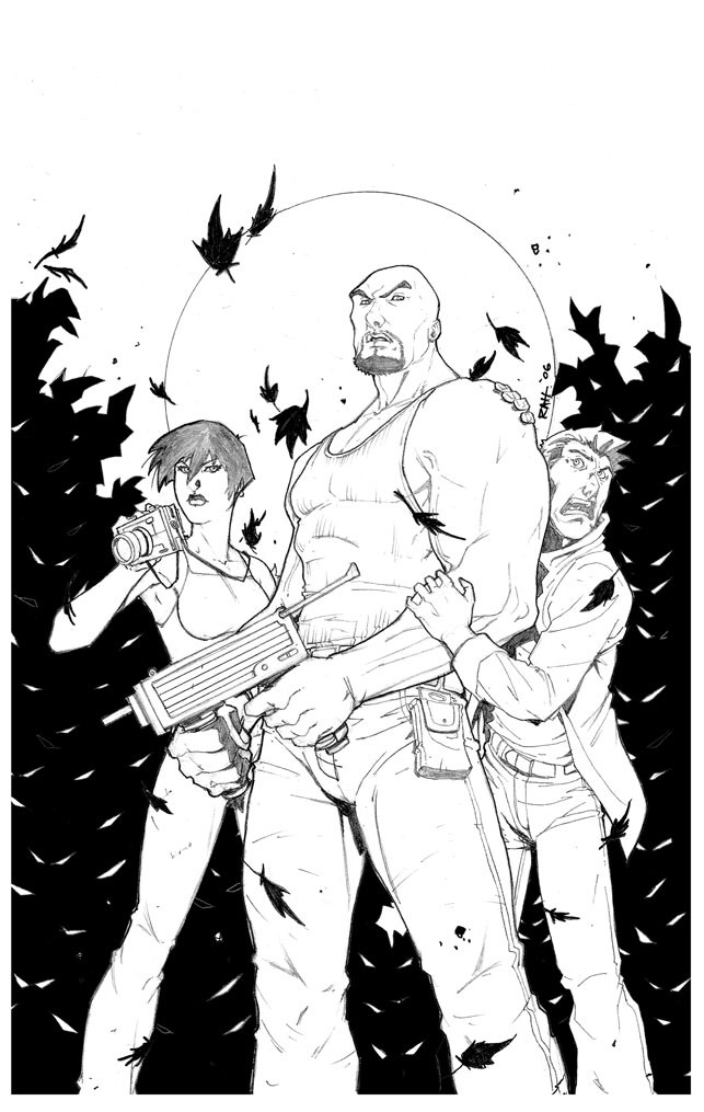
Published: 2006-12-11 01:48:06 +0000 UTC; Views: 2320; Favourites: 44; Downloads: 50
Redirect to original
Description
This is the cover pencils to a great book called Shoot It! Created by Julian Brantley. It came out last year..well at the San Diego Comi-Con 2006.I really like how I rendered this cover and have been debating on having this be my regular rendering style with less shadows and minimal solid blacks. Just nice clean lines.
Related content


Comments: 24

 (Smile)")

I prefer to leave the shadows to the colorist cause they can be sometimes a pain in the ass if you want to color it with a special lightsource
I like this but I regret that they dont have feet
greets Soulrailer
👍: 0 ⏩: 0


Great linework. Yeah, if clean is in, then go for it. I like being King of the "Dirty Inks" anyway.
")
👍: 0 ⏩: 0


i think you should continue with this style, it looks like it would work well
👍: 0 ⏩: 0

Right!! LP did the pages for this book last year some time.
-Ray
👍: 0 ⏩: 0

This would work great, If it could speed up your production on your pages I say try it out witch ever you stick to your art still rocks.
👍: 0 ⏩: 0


I really like this piece. Very nice rendering on the figures. I say, keep it up.
👍: 0 ⏩: 0


damn nice
please make this your new style
you know every colorist on this planet would love you for it
Nic
 (Wink)")
👍: 0 ⏩: 1

ahaha agree "every colorist on this planet would love you for it"
👍: 0 ⏩: 0


i like this clean look quite a bit. of course, if you have less solid black shadowing, the coloring would have to be more detailed i think...
👍: 0 ⏩: 0

Great stuff man. I like your art either way, but I personally enjoy the minimalistic approach. Thats why I like Salvador Larroca and Ed Benes. Of course their art isnt always like that but when they do and they throw some nice colors on it, it looks awesome. This one looks good man.
👍: 0 ⏩: 0

It's very modern. I vote for going with it. Been liking the method for a while now.
The gun's a bit blocky, though, and the barrel's much too thin.
A lot of Joe Mad in the faces and hands, too.
👍: 0 ⏩: 1
Thanks, Sqarr! Are you on my watch-list?
👍: 0 ⏩: 1
Nope. Not much to watch right now, though.
👍: 0 ⏩: 1
I just went by there...great stuff, anyway! I will watch!!
-Ray
👍: 0 ⏩: 1
Thank you so much! I'm honoured!
👍: 0 ⏩: 0

Well if you enjoy the style, and it doesn't hurt you production. I say go for it.
Great job on this cover
👍: 0 ⏩: 1
Thanks. Actually, it helps my productivity because it takes less time to do.
👍: 0 ⏩: 0