HOME | DD
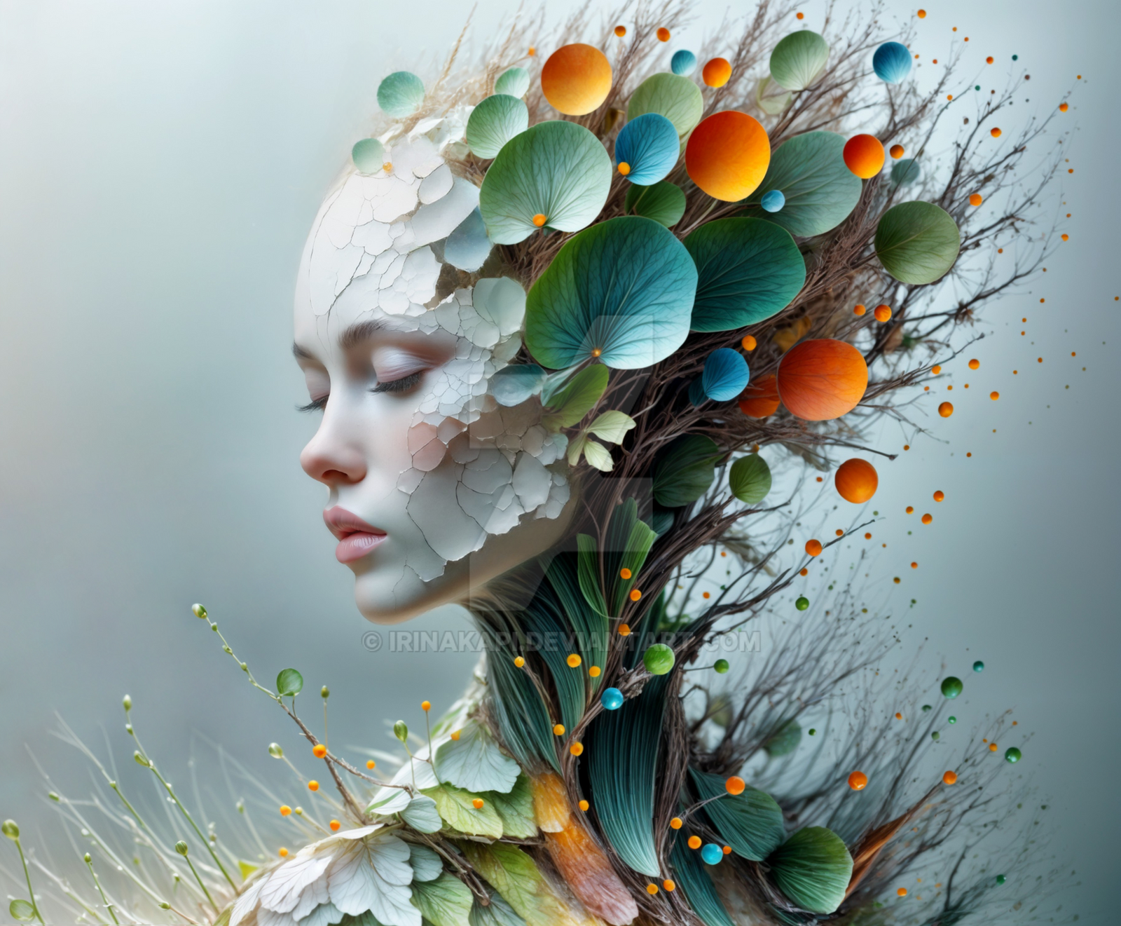
 Rahimz — The tree of immortality

Published: 2004-09-25 16:47:11 +0000 UTC; Views: 3296; Favourites: 52; Downloads: 479
Redirect to original
Description
full view_________________________________________________________________ ______________________
stocks
~littlestock thank you very much
 and comments are needed
Related content


Comments: 20

 (Smile)")


great composition, I love the colors you used; beautiful dream you have

👍: 0 ⏩: 0

")

Very nice. Love the colors and concept behind it.
👍: 0 ⏩: 0

nice.. i had an idea of sth comparable on my mind for some time, maybe i can do it at last...
👍: 0 ⏩: 0

Nice scenery again and great concept. I like these.
👍: 0 ⏩: 0

your last tow deviations are wonderful!
Wow, i love your style!
Of course the other are great, but those two are great!
you got a fan man!
👍: 0 ⏩: 0

I like this composition and mood. Perhaps a littl emore contrast between the tree and the background will help bring more foucs to the hand and tree
👍: 0 ⏩: 0

I think it's great work but the limb in front of the pinky finger doesn't work for me it makes it seem 3d when the rest of the peice feels 2d. It conflicts for me. Lovely job blending the tree into the palm. All over it's a wonderful job.
👍: 0 ⏩: 0

I really like this idea, its absaloutly stunning as well!! Although maybe it could be a bit brighter? But I really think it's lovely. Good job
👍: 0 ⏩: 0


very nice concept and display 
---------------------------------------- ------------------------
D. R.O.U.T.- recesses of unattended thought
stock account-

👍: 0 ⏩: 0


Fantastic. Love it. Think it would make some great album art.
👍: 0 ⏩: 0