HOME | DD
 RainbowAurora — Amber

Published: 2012-08-11 01:38:23 +0000 UTC; Views: 452; Favourites: 5; Downloads: 1
Redirect to original
Description
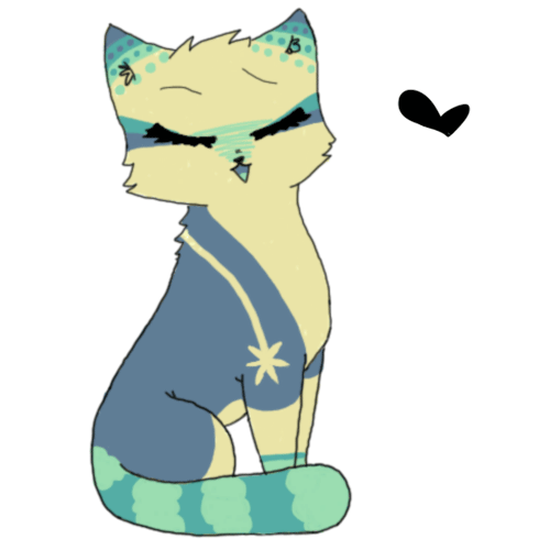
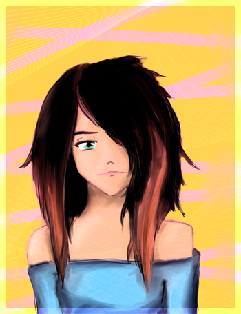
i decided to draw my OC amber, i don't like the anatomy of this one but oh, wellhope you like her
please critique!
Related content


Comments: 10

Overall


Vision
Originality
Technique
Impact
Hello. This is a critique.
Lines.
Your lines look smoother now. Very pleasing to the eyes.
You did not use plain black for them (besides the clothes, but that is fine) so that is good.
Though there are still some fuzzy lines present, but you are improving.
I notice one thing though. The lines for the hair are a bit thicker than the rest and that is distracting.
Thick lines are usually used to give emphasis to a significant.. thing, but here, the reason is unclear.
Anatomy.
Mm. The face structure is decent! But the clavicle looks a bit too low.
Her arms are a bit confusing (lacking a better term).
Because it seems like her palm is facing the front, judging from what the lines at the arm suggest. But then it also looks like her hands are clutched.
So I think the lines at where the forearm joins should start from the inner part (closest to her body), instead of being in the middle.
Oh. Body. Yes. Her torso is a bit odd.
The part below her chest is small. If you try doing her posture, you'd notice that the curved part is not visible. The only curved part visible would be the pelvis. Unless you extend your arm further from your body or hold it higher.
Colours/Colouring.
The colours you used are of beautiful shades of blue. It makes me happy.
Nothing too gaudy.
But avoid colouring outside the lines. Take your time and with each stroke.
You did minimal shadings, at her face, eyes, and her forearm, but the shading seems to have disappeared. There aren't any on her clothes or hair.
You should have done so, try it out, experiment with it.
And reference from pictures of clothes to get a rough idea on the colour tones.
Additional thing: If you don't like doing backgrounds (I know I don't at times e.deviantart.net/emoticons/let… " width="15" height="15" alt="
")
Okay. Thanks for reading)
👍: 0 ⏩: 2

WOW! You're becoming a FANTASTIC critique! XD
👍: 0 ⏩: 1

i can see all the things i did here that you were pointing out, thank you!!! this will certainly help me improve!!!!!!
👍: 0 ⏩: 1


thank you!!!
i plan to keep improving!!! <3
👍: 0 ⏩: 0