HOME | DD
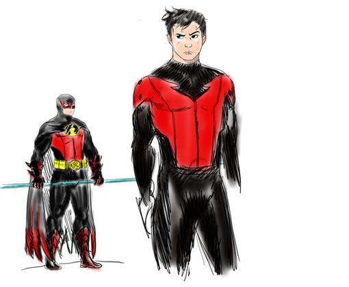
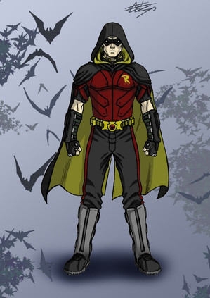
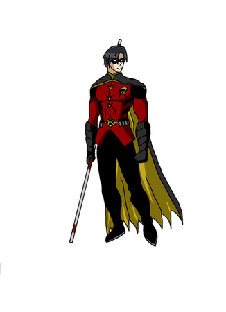
 Raius1 — Red Robin Redesign Update

Published: 2010-05-24 06:18:20 +0000 UTC; Views: 6683; Favourites: 70; Downloads: 152
Redirect to original
Description
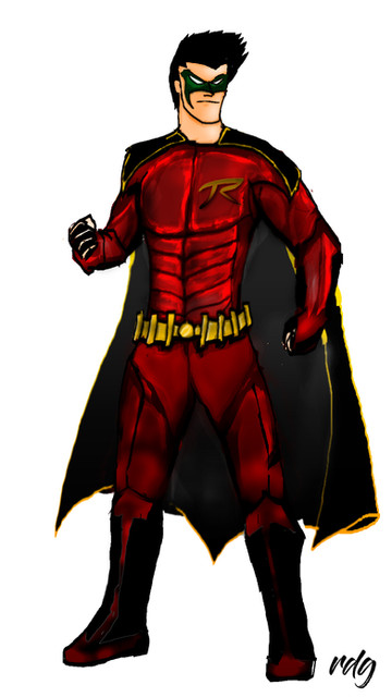
A fairly quick, much cleaner version of my Red Robin costume update idea. I like this because it preserves traditional elements of Tim's old costumes while still being very recognizably Red Robin.Related content
Comments: 19

While I never had a problem with the cowl (I loved it, in fact), your alteration really does make him look much better. Very well done.
👍: 0 ⏩: 0

sooooo much better than the DCnU costume! personally i would prefer if the cape was either yellow on the inside or solid black, but the rest is bad ass!
👍: 0 ⏩: 1

Thanks. Now that it's been a while since I did this, it's probably one of the 2 or 3 elements that I would keep. It really does make the cowl way less boring, and it's still practical, unlike the (imho) ridiculous "hair free" masks like Kid Flash wears.
👍: 0 ⏩: 0

The red part over the eyes makes the cowl so much better.
👍: 0 ⏩: 1

I agree. The current look isn't bad, it's just bland. I "worked" when Alex Ross drew it because it fit in with his whole overall "realistic" Silver Age approach to things, but whenever someone else does it I just kind of look at it and go "meh."
👍: 0 ⏩: 0

Really good I was working on a design for him too I hate the Red robin name though. He should have changed to Redwing or something after he beat Ra's in the books this month.
👍: 0 ⏩: 1

It's tough isn't it? Redwing was his car. I'm allowing the name to grow on me. It has kind of a highwayman/old school outlaw appeal in it's way. "Tis Red Robin stalks the roads this night!"
👍: 0 ⏩: 1

I like the name Red Robin. Somehow it shows Tim's independence and individuality. Makes him be more like the great Dark Detective. Level headed and more cunning than he was as (Red) Robin (i was referring to his Red I mean, well the One Year Later Robin costume).
I like Tim's new transformation...
👍: 0 ⏩: 0

this is actually good. nice work (though i guess the red 'mask' over the cowl is a bit too much, why not make it smaller and simpler?).
i like the shoulder pad, though...
good work...
👍: 0 ⏩: 1

The red mask is actually one of the important parts to me, because it keeps his bird theme and makes the cowl less boring than his current costume. I was also sort of picturing the protective graphite faceplate from Batman Begins. I tried to keep it streamlined to the cowl, but I can see how you might thing it was obtrusive.
👍: 0 ⏩: 1

hmm... I'm kinda a simplistic kind of person. I like things look simple but functional. I guess it'd look good if you make it a bit like a frame to his eyes like Deadpool or Slade's.
well, it's your choice of style... hehe...
(^^)
👍: 0 ⏩: 0

Now my most favorited pic ever. I guess people like Tim a lot more than Cyclops.
👍: 0 ⏩: 0
