HOME | DD
 RalphHorsley — Betrayal
Published: 2009-08-21 12:32:04 +0000 UTC; Views: 32813; Favourites: 609; Downloads: 889
Redirect to original
Description
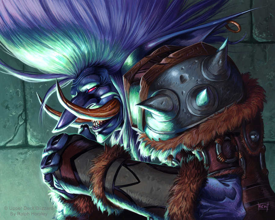
BetrayalAcrylic, approx 7" x 10"
World of Warcraft trading card game illustration
©Blizzard Entertainment & Upper Deck.
Original artwork for sale; UK£200
"Friends are mere stepping stones when plans are hatched..."
I wanted to try and capture the sense of devious malevolence that is clearly redolent in this Troll. To do that I opted for strong directional lighting. This would mean dark shadows to aid the mood, and by choosing the green light I am visualling signalling that something less than good is at hand.
The closer crop on the figure, and static, almost profile, form further helps give the sense of a quiet, composed, moment as the cogs begin to whirr!
Related content


Comments: 118

Thanks. It is all interesting what viewers pick up on
 (Smile)")
👍: 0 ⏩: 0

")

There is no uniform composite centre from for divisibilities. Work is not collected in a single whole. Identical light in different parts of work breaks it into fragments.
👍: 0 ⏩: 1
Thanks for the further explanation. I don't entirely agree; I think the strong underlighting does provide focus and direction. Thanks.
👍: 0 ⏩: 1

Colors are so very WoW and eye popping! You can definitely tell he's up to something with that wicked grin and steepled fingers
 (Wink)")
👍: 0 ⏩: 1
Thanks. Seems like I managed to press all the right buttons
👍: 0 ⏩: 0

that is the paragon of mohawks, I really like the textures going on in this too. it kinda reminds me of a norse/oni crossover
👍: 0 ⏩: 1
Yes, there was quite a lot to play with here, stone, wood, fur , flesh and that hairy mohawk
Glad you like it
👍: 0 ⏩: 0

A stunning and richly detailed piece of work. I really like how you've applied the highlights. The colour scheme is also beautiful; vibrate, but very tasteful! Excellent piece of work.
👍: 0 ⏩: 1
Thanks very much for your comment. I am very pleased it works so well for you - thanks
👍: 0 ⏩: 0
<= Prev |