HOME | DD
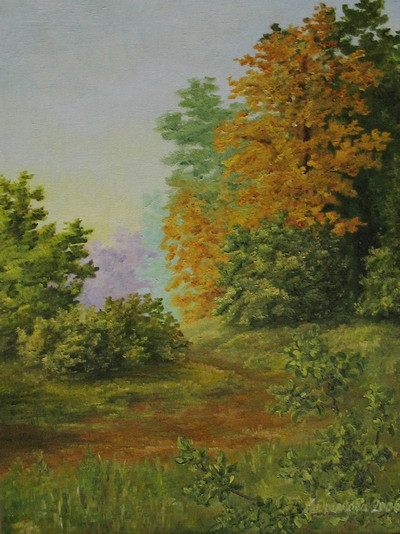
 RandomSearcher — Autumn Colors

Published: 2010-05-13 19:29:15 +0000 UTC; Views: 1907; Favourites: 22; Downloads: 0
Redirect to original
Description
Well... (Smile)")
First of all, I don't like this pic. No, seriously, I was sort of bored and wanted to paint, I painted, but I don't quite like how it turned out. I just enjoyed the process
 (Cool)")
And I upload this only because I want to submit it to Crit Night #3 at
Now, get prepared to face a wall of my severe self-crit (you may skip it if you want).
What I don't like in this painting is (random order)...
1. ...that it is messy. I haven't been doing watercolors for eons, and now I failed to get the paints light and bright as it should be.
2. ...excessive use of colors. I shouldn't apply so much cadmium to birch foliage, warmer yellow could do fine; I shouldn't make the trees on the right so multi-colored, the bush on the left looks much better.
3. ...that the reflections look muddy. Adding to (1), I must say that the water is terrible, especially to the right. It's not a reflection, it's just something brown-ish.
4. ...the background wood on the right. It got messy, too. Actually, it did, because I was inventing the composition on the go, and the foreground trees were originally supposed to continue farther to the right. Then I thought better of it and had to remove the yellows, reds and browns quickly. However, the blues I put over that disaster were not so clear as on the left. The same reason for poor water and grasses there, on the very right.
5. ...the composition, which results from (4). I should have thought it out in more detail before I started painting, but I wanted to paint, not to draw. Actually, this painting resulted from the same sketch as my Autumn Day . I think that the decision to cut the trees on the right was correct; what I don't like is (a) that these trees got too close to the birches, (b) they are a bit too high, touching the ceiling, and (c) the bottom part is rather dull. If I ever try this composition again (and I have a strong feeling that I will), I think I'll put a boat there, slightly off to the right. This will help, I hope.
6. ...the unfinished look. Well, it's not a look. All that you see here was done "at once", and then I lost interest. The details could be added, some more color touches on the brown trunks and on the water, maybe some touches of white gouache, especially where the grass stands in the water on the right (I know, you didn't notice it at all - it badly needs more contrast).
7. ...the photo itself. The bottom left looks washed out, but as far as I remember, the grass in the lower part was of the same tone on the right as on the left. And you can see the crookedness of paper in the top left: I should have corrected this, but I don't care much.
That's what comes to my mind right now. I'm sure, there are more bugs here, so please comment!

Watercolors on A2 size Whatman paper.
Related content


Comments: 23


Submission to #Traditional-Artists 's Critique Night successful, feedback given - here you go: 
"I really like the atmosphere in this picture. The reflections on the water are great, and I love the contrast between the warm colours in the front and cold colours in the background. Also, the kind of sketchy look is great (if it is supposed to be sketchy, that is)."
"This is a lovely watercolor done in a quite impressionist style, sensitively colored. The backmost hedges are a little too blue for me but they should be bluer than the rest of the piece, definitely - they recede into the background this way and set off the oranges of the foliage! The water and reflections are done with care, I love how the reflected forms dissolve into mostly colored shapes in the water. Again this is just how it should be.
The sizes of the foliage shapes are a little too equal. What I mean is, the Papa, Momma, Baby principle - lemme explain this - When you have some big main forms like the trees in this, it's good to step back and make one shape the biggest, one form medium sized, and then some other shapes that are quite a bit smaller. So in this example the green tree on the left is "fighting" for visual importance with the orange tree on the right. Think of your next painting in terms of abstract forms and step way back from it....and pick your Pappa.
Otherwise this is a high-quality watercolor that could be matted and sold anywhere. Again the water really does it for me!!!!! Great work."
"Well, this is really good done. I mostly like the details of the water at the bottom of the picture. So it bothers me a bit that the trees don't have the same level of details. The BG is little bit too much blue for my taste. It also would be great to see more shadows on the picture, as well I love the brightness of watercolors. And, like LeahJay I mostly (I've said this earlier 
"Really, I like this! One thing: Don't state you don't like it. Just don't. It makes people look at the things they don't like, and not at those they likle. And there are a lot of things that are likeable here! The colour scheme of the left bush is just so gorgeous, and I love the blue in the background. That could have gotten a little more green, if you ask me, though. Then there's the reflection. It's just amazing! I love the muddy look, it's really autumn-y. Maybe you got a bit too many colours on the right-hand tree - but autumn is colourful, so I like that. And as a shadow, it's a nice contrast to the orange. A lot of great things, so don't be so ciritcal to your work (that's what we are for ")
"> I like the contrast of detail and softness in this piece - it really helps the three dimensionality. The color combinations are really interesting, too. What could be simply a warm autumnal painting is elevated by the blues and purples. I like the darks you achieved in the birch trees, and I think I’d like to see some more darks in other places, too. For instance, where the reeds meet the water under the birches, and as the orange trees transition into the blue brush, especially on our right. Also, you don’t have to render each blade of grass - reserve that treatment for certain blades in the foreground, and certain places near the trees to add contrast and drama. The rest of the grass can be more texture than detail, just scrubby, loose and wispy. Also, do the same treatment to the water - accentuate just a few ripples, and let the rest be peaceful and glassy. Let the foliage of the far tree get really soft as it hits the sky. This is a really nice painting - a few tweaks and it will really sing!"
I hope it is helpful and you can use it for your future work!
 (Wink)")

👍: 0 ⏩: 0

I really love this pic!
You've captured the autumn-atmosphere perfectly.
")
👍: 0 ⏩: 1

Thank you
thanks alot for the fav and for your comment during the Crit Night!
👍: 0 ⏩: 1
You're welcome!
I think I've fallen in love with the pic...
👍: 0 ⏩: 0

This is a very beautiful piece . Sometimes things turn out best when we least expect it. I like how you combined the colors and the reflection looks pretty good
👍: 0 ⏩: 1
Thank you and thanks for the fav, too!
👍: 0 ⏩: 0

Firstly, I like this pic VERY MUCH though I don ´t like autumn.
You shouldn ´t think over your works too much ... And if you are really conviced about the 7 poins you wrote, take the pic and throw it away ...
That´s all
👍: 0 ⏩: 1
Thank you
I just think of things that could be done better. I needed the process, not the result at that time, so I got what I wanted and I don't care what will happen with the pic now. I'll store it somewhere in the far corner, I think

👍: 0 ⏩: 0

пасиб. хотя я могу спорить 8)
👍: 0 ⏩: 0

Its ok to be perfectionnist, but I suspect that you are being a hard audience on yourself.
Of course, its a web image from a digicam, our judgement must be limited..
👍: 0 ⏩: 1
oh no, I'm a hard audience on all, not only myself
I just listed the things I think I could do better... Anyway, thanks!

👍: 0 ⏩: 1
As I said. Its ok to be a perfectionist.
It does not prevent you from showing that you believe in what you do
👍: 0 ⏩: 0

I think the reflection near the bottom picture are very good.
Hmm, may be you are right about the right side


👍: 0 ⏩: 1

