HOME | DD

randyblinkaddicter — Positivity by-nc-nd

Published: 2010-12-28 09:53:41 +0000 UTC; Views: 7557; Favourites: 100; Downloads: 322
Redirect to original
Description 
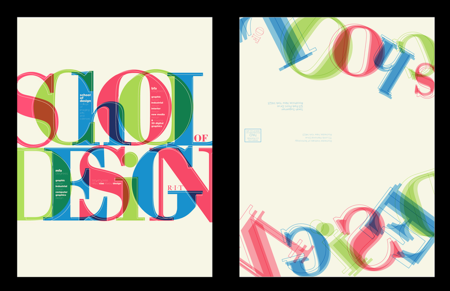
typographic study, a base for me to create my new self logo ident, i expect it to be more dynamic, more flexible and more fluid.
Related content
Comments: 15

TinyWild [2017-11-24 17:09:38 +0000 UTC]

Featured in my journal!


fav.me/dbuicug

👍: 0 ⏩: 0

chickenkimWYJ [2015-12-25 15:37:03 +0000 UTC]

Love it 😍

👍: 0 ⏩: 0

athena-cris [2013-01-27 09:28:27 +0000 UTC]

I like the font

👍: 0 ⏩: 0

Miyazu [2011-07-14 03:50:12 +0000 UTC]

incredible

👍: 0 ⏩: 0

Lilyas [2011-05-29 21:28:58 +0000 UTC]

Featured in Project Educate Feature: Miscellaneous Designs .

👍: 0 ⏩: 0

briena [2011-01-21 05:44:02 +0000 UTC]

love the treatment you gave to the "W" and "Y"'s

👍: 0 ⏩: 0

UEY-S [2011-01-20 05:32:36 +0000 UTC]

an an exceptional piece here!! very well done, shows style and skill in an instant.

👍: 0 ⏩: 0

junkieenet [2011-01-13 20:45:35 +0000 UTC]

This awesome artwork was featured in our blog
60 Inspiring Typography Designs: [link]

👍: 0 ⏩: 1

junkieenet In reply to junkieenet [2011-01-15 21:33:56 +0000 UTC]

We changed the link [link]
Sorry!

👍: 0 ⏩: 0

choeyy [2011-01-03 18:05:43 +0000 UTC]

look very good. dynamic, flexible and more fluid it is

👍: 0 ⏩: 0

libbbbb [2011-01-03 06:58:34 +0000 UTC]

wonderful, great flow

👍: 0 ⏩: 0

sumasiapa [2011-01-02 13:29:32 +0000 UTC]

osem!

👍: 0 ⏩: 0

viyatgandhi [2010-12-31 09:15:26 +0000 UTC]

incredible work.....i just love it.

👍: 0 ⏩: 0

powerbuffy [2010-12-29 01:28:30 +0000 UTC]

this is way beautiful and creative! i love the swirls and fat fonts i see balance

👍: 0 ⏩: 0

diekave [2010-12-28 16:12:27 +0000 UTC]

nice

👍: 0 ⏩: 0