HOME | DD
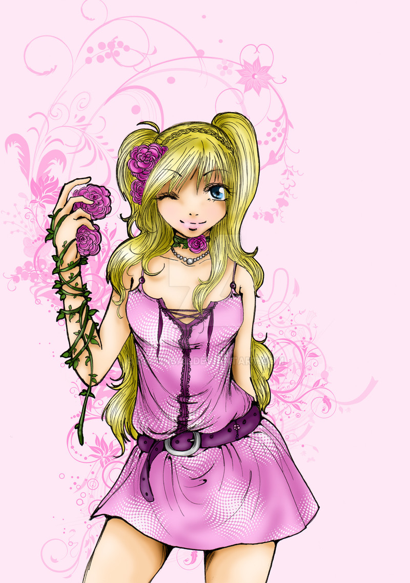
 RapunSal — Spring is Coming 2
Published: 2010-03-21 11:07:14 +0000 UTC; Views: 865; Favourites: 23; Downloads: 0
Redirect to original
Description
I finally coloured it.As always I had no idea for the background xD The brushes used in the bachground aren´t mine. Later I´ll add the names of the persons who designed these brushes because now I can´t remember.
Related content


Comments: 26

I love her outfit and the anatomy.  (Smile)")
Anyway, great job on the textures and overall picture!
👍: 0 ⏩: 1


ooh! a second picture by you! your stuff is really awesome, and it seems to be an entirely different style
Here I have a similar complaint as in the last submission, there are a few odd lines and random points of boldness (in her right hand for example). Another complaint, has already been taken into great detail by henry-james.
Also: Maybe this is just me, but it looks like the left eye is slightly higher or smaller than it should be. I have poor sense of distance so I could very likely be wrong.
Overall though, the piece is tremendous. Great colors to compliment the character, she keeps all the attention and has very strong themes. Everything in this piece is very elegant, vibrant, and refreshing (like spring!). Even the bacgkround compliments her perfectly. Great piece!
👍: 0 ⏩: 1

thanks very much
I´m very happy that you think my stuff is awesome and yes I just tried a completly different style. I was inspired by a korean manwha-artist whose style is really great. ^^
yeah...the few odd lines...I just forgot to correct them so thanks for the advice
I´ll try to follow all the hints you and henry-james gave me and I hope you´ll like it
Thanks for all the compliments and the critique. This is very helpful
 (Wink) - ;)")
👍: 0 ⏩: 1
^_^ no problem. thanks for producing such an awesome piece >:3
👍: 0 ⏩: 1
I´m glad that you like my stuff
👍: 0 ⏩: 1
I'm glad you make stuff I like ^_^
👍: 0 ⏩: 1
xD
yeah...but I´m not satisfied yet...it´s not good enough now
👍: 0 ⏩: 1
>:3 i have that problem all the time. then you'll just have to keep making awesome pieces until they start poppin' out perfect. >:3 and I'd better get an invite to see all your masterpieces when they do!
👍: 0 ⏩: 0


It looks very good.
Only problem I see is the eyebrows are a little high. if you look at most people, their eyebrows are a little closer to their eyes. the shading is nice, really soft looking skin~
👍: 0 ⏩: 0

You did a really nice job on this! The colours are very eye catching and carry across the spring feeling very well, and the proportions are quite well done.
As for critique, I'm not sure I can say much about the stylistic decisions simply because I don't know much about cartoon art, so I'll leave that to someone who does.
In terms of colouring, however, the hair stands out quite a bit to me. You have quite a bit of suggestions as to strands and direction, but the colouring doesn't follow the lineart suggestions. Maybe try painting following the shapes of your lineart without smudging/blurring it? You also don't seem to have a consistent light source, which seems to affect your colouring. Maybe try doing some more colour variations without using any blurring, but instead blending with your brush opacity down?
👍: 0 ⏩: 1
thanks for your comment! I really appreciate it
well, I´m not very good in colouring and I always fail when I try to colour hair -.- But I keep practising ^^
About the light source...well, there is one and it affects my colouring and I see the finished picture in my head but I´m apparently not skilled enough yet to do it right -.-
I´m better in traditional art, where I can use pencils ^^
Thanks very much for the hints! ^^ I´ll try to implement it in my next picture
👍: 0 ⏩: 1
No problem! I really look forward to seeing your work!
If you don't mind my suggestion, one of the best ways to figure out hair is to just grab pictures and then paint/draw them in chunks of colours based on where the light is coming. One of the ways I started to figure out light on strands or grouped similar objects was to work entirely in greyscale -- it forces your brain to focus on the way light hits objects instead of on the colour you want to portray. When you combine that study and colour study, you get a much better grasp of it.
After looking at your image I took a quick wander through the stock images to maybe give you a couple of references and ideas. I hope this helps!
[link] [link] [link]
👍: 0 ⏩: 1
thanks for the hints again
the way of practising you mentioned is really effectiv and actually I´m able to draw hair rightly because originally I´m a pencil artist and I really can handle pencils (except of portraits -.-). But it´s a good idea to start practising again the way you suggested.the only problem is: I´m lazy ~.~ but I promise I´ll try harder and I really hope you´ll be satisfied next time
Wow, thanks for stock images! They´ll help me a lot, I suppose. I always have problems with blong hair
👍: 0 ⏩: 1
I'm glad to hear it's helping.
Just keep it up and I'm sure you'll do well!
👍: 0 ⏩: 0

Woha! I really like this picture and the first thing I thought (before reading the title) was "Hm.. Looks spring-like 
 - :D")
👍: 0 ⏩: 1
thank you very much!
Actually I dislike pink too but as you noticed it fits the theme best
I´m very happy that you like it

👍: 0 ⏩: 1
