HOME | DD
 rasice — Restyle : IT.issues journal

Published: 2004-09-07 20:00:28 +0000 UTC; Views: 13080; Favourites: 53; Downloads: 6504
Redirect to original
Description
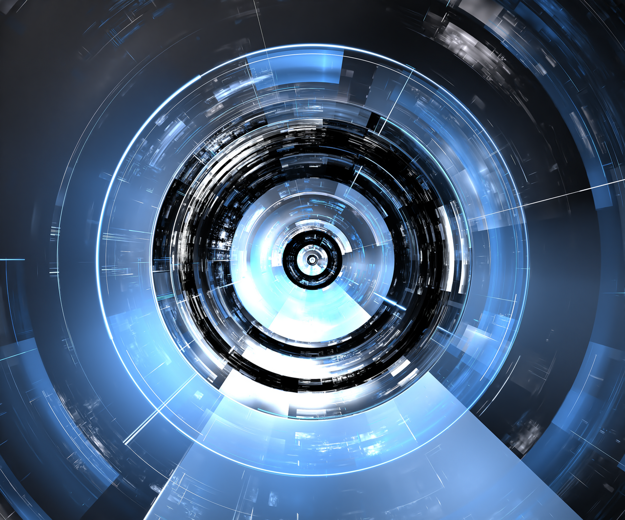
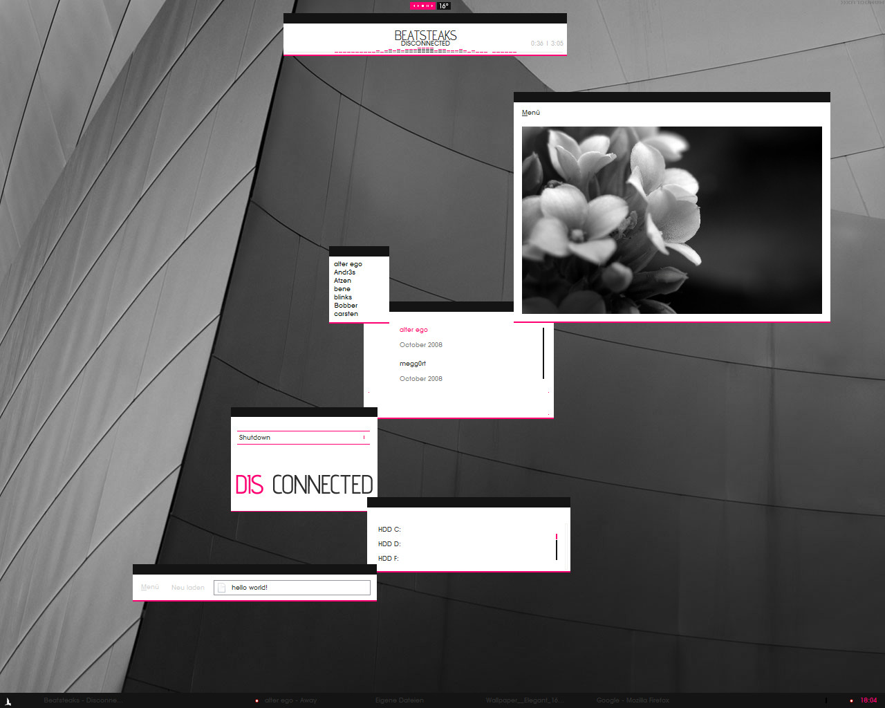
this is one of my very first designs i probably did 2 years back. Im going to be uploading a few of my old designs in the next few days mostly for back up but also for feedback.Please let me know what you think
Related content


Comments: 37


Looks like this guy ripped you, [link] , I reported it.
👍: 0 ⏩: 0


I like it, very compact, sleek, and simple. Well done.
👍: 0 ⏩: 0


 (Wink)")

wow! man, that one is really cool!
+fav
upload more your 'very first designs', they seem to to be very interesting...

👍: 0 ⏩: 1

haha thanks. i will add one on saturday
")
👍: 0 ⏩: 0

The little crosses ( + ) at the upper left quarter are reminding me the HP advertisings... a lot !
apart from that, it's neat.
👍: 0 ⏩: 1
i think i made that before the hp ads came out. lol. probably in 2002 or even 2001. bastards.
👍: 0 ⏩: 1

nice site..I started out a design a long time ago with that very same eye..and I had in that very same spot
👍: 0 ⏩: 1
really? where did u get the eye from?? i got it from Gilad do you know him?
👍: 0 ⏩: 2
I think I got it from deviantart..can't recall from whom. Nah, never heard of him.
👍: 0 ⏩: 0

I actually really like this - the lines are sleek and clean and grey is always pretty - I also like the tiny bit of hot pink. V. pretty.
👍: 0 ⏩: 0

i like the work i've seen from you on here.... i don't post any of my web design work on DA but i may start, who knows. not under this account though, heh... this is my "fun" account.
👍: 0 ⏩: 0


nice work! I like the pic! I was trying to take a pic like that but it was too hard!
👍: 0 ⏩: 0

the layout is simple, the design is clear, its a great piece. where did you get the photo from?
if you find the source, i would love to have a look at it.
cheers
if this is what you made 2 years ago, what are you making now?!
keep up the good work
")
👍: 0 ⏩: 1
its been awhile ~ dunno where i got the picture. probably from some stock site.
thanks for the comments
👍: 0 ⏩: 1
the picture was actually given by a friend
👍: 0 ⏩: 0

I think u did a great job with the layout of it, few things tho: i reckon the eye n the effect of it blending it in with white bg is awesome, but its a bit plain on the left side with just + signs.. maybe u could add something to it like ur more recent designs... also i'm still not sure about the pink u used, a lighter colour was good as it evens out the design, but pink? im abit half hearted on that... but yeh overall looks aight, keep posting these ay; be famous soon..
👍: 0 ⏩: 0

Cool! Love the colour scheme and the cleanliness/clarity of it all

👍: 0 ⏩: 0

I would love the source and design for this, if you're giving it away...  (Smile)")
-Tye
👍: 0 ⏩: 0

Nice design, soft and clean. I have nothing to complain.
👍: 0 ⏩: 0


wow, that's nice! I love how the eye floats into the white of the page... great job!
👍: 0 ⏩: 0

Ah lovely.
Good colors.
Nice and clean.
Good work!

👍: 0 ⏩: 0
