HOME | DD
 rasice — kashmir project : ldesign
Published: 2004-10-02 15:09:15 +0000 UTC; Views: 16830; Favourites: 39; Downloads: 4737
Redirect to original
Description
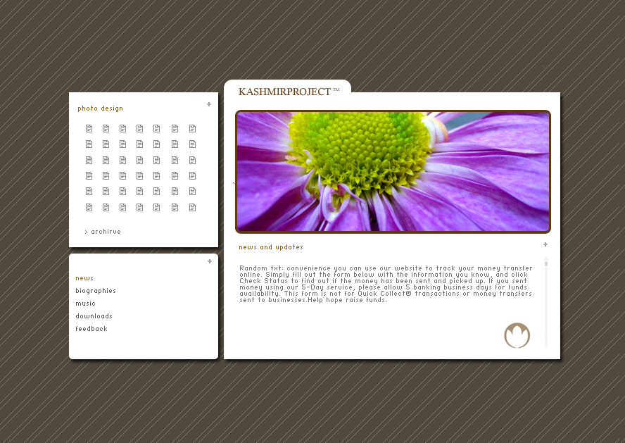
this is a sample layout design for kashmir project. what do you think?thanks to stephanie for the awesome photograph : [link]
Related content


Comments: 60


It is great. The color disposition of the iterface makes photos seem better. Is it up? I wanna test the navigation.
grettings, from Colombia
Adrian Felipe Pera
👍: 0 ⏩: 1

never did it man, ended up selling the design. thanks for commenting though.
Panduka
👍: 0 ⏩: 0

So simple and clean.Great use of white spaces.
👍: 0 ⏩: 0


looks awesome; love the clean and smooth look it has. Also the white is just so bright and contrasting against that background it looks even more white than normal white
")
👍: 0 ⏩: 0

i love the simplicity and cleanliness of it...it's very clean-cut and still has that splash of color! If i had a personal website, I'd love something like this!!
👍: 0 ⏩: 1

stunning, really really beautiful..
why do the photo design and photo design pages have square edges, when the news page has round edges? just a thought
👍: 0 ⏩: 1
did the edges on purpose. but your right doesnt make much sense. lol
👍: 0 ⏩: 0

very nice... neat and clean... but kashmir proj means ??
👍: 0 ⏩: 0

pretty good except the 2nd square on the bottom/left is round and the other are squares not bad tought ^^
take a look at that! [link]
👍: 0 ⏩: 1
thanks. i actually did that on purpose, probably not very logical. that link you gave me didnt work btw :S
👍: 0 ⏩: 0

i really like this layout, very simple but great looking! great job
👍: 0 ⏩: 1

oh and maybe you could try breaking the text in the main
frame into two columns, that way it would be more
pleasant to read and give you more possibilites regarding
typography.
👍: 0 ⏩: 1
sweet. ill try splitting the frame sounds promising ~ thanks man, wouldnt have thought of it myself.
👍: 0 ⏩: 1
wow...very slick, nice and clean design 
I'd try another background texture but stick to the brown -
fits it very well
👍: 0 ⏩: 0

thanks! havnt heard from you for awhile
👍: 0 ⏩: 1

Heh, I've been busy with school
👍: 0 ⏩: 0


realy, really nice kashmir!  (Wink)")
👍: 0 ⏩: 1
👍: 0 ⏩: 1
hey, havent. im bit ill these days, resting a lot
enjoy urself kashmir
👍: 0 ⏩: 0

Wow again! All your stuff looks so good, dammit! lol, great work
👍: 0 ⏩: 1
haha. that a generous comment. thanks alot. haha and yeh the build up sucks, so uncomfortable, im not looking forward to the next 2 months lol.
👍: 0 ⏩: 0

what programing are you planning to use in it? some php?
very good looking
👍: 0 ⏩: 1
thanx. havnt decided yet mate sorting out the content
👍: 0 ⏩: 0


I think very stylish! really cool!
but and once again i agree with ~Kvlsners! (don't think that we'd arranged  (Smile)")

👍: 0 ⏩: 1
you and Kvlsners causing trouble again ey? lol na man im totally clueless on the background. Any suggestions would be great.
👍: 0 ⏩: 0


Very nice, I can't find anything to complain about.
👍: 0 ⏩: 1


I really do like it except that I think all the edges on the pic should be rounded. And that the white lines don't contrast too much with the brown behind it.
I really do love the retro-ish sort of feel to it, but I do notice the lines don't fully extend on the right. But other than those MINOR problems, I really do like it!

👍: 0 ⏩: 1
thanks very much. about the rounded edges suggestion ~ its not really wnat i wanted for this layout. thanks again.
👍: 0 ⏩: 0

wow, thats really nice..i love simplistic layouts..you did a great job ^^
👍: 0 ⏩: 1

the only thing i really like on here is that lil pic on the bottom right corner, i reckon the pic doesnt really match the whole thing and vice versa, i dunno why u would have so much background for, just seems bit boring with the background like that...the layout n stuff looks fine excpet it mite looks abit bland... heh ur gonna hate me for this comment.
👍: 0 ⏩: 1

")
👍: 0 ⏩: 1
| Next =>