HOME | DD
 rasice — multitalent submission

Published: 2004-11-03 01:44:09 +0000 UTC; Views: 12834; Favourites: 57; Downloads: 5689
Redirect to original
Description
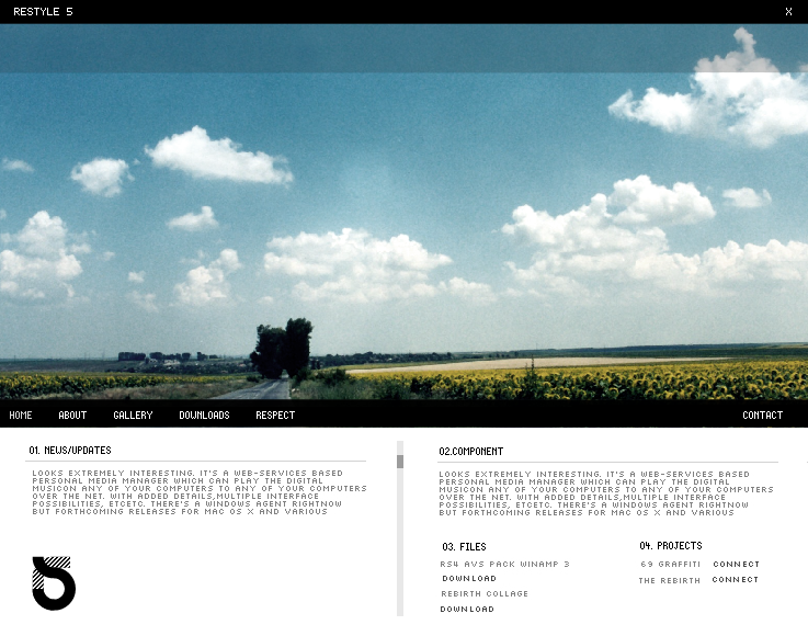
my design for multitalent (Smile)")
*the color pallette will be functional: to change the color scheme and site background. (the number of available colours would be minimized though)
Related content


Comments: 83

can u tell me where u find the patter for background, i really like it, and i want to use it too
the webpage is awsome, u`r good
👍: 0 ⏩: 0

The wallpaper is very nice. The rest is nothing special in my opinion.
👍: 0 ⏩: 1

ah a nice simple layout, very refreshing ^_^. nice font choice for the titles btw, and i just love the pattern pg
👍: 0 ⏩: 0

lovely design u got going there
👍: 0 ⏩: 1

hey thanks. try k10k.net or search pixel patterns on google. P
👍: 0 ⏩: 0

another great design Rasice! The header seems to have alot of free space, makes it look empty but apart from that the rest looks fine (the pattern bg is fab!).
one of these days you have to teach me how to do those bg's with shadows over the pattern.
👍: 0 ⏩: 0


Hi mate, i was just wondering if this is sold? if not i would like to talk to you about something.
👍: 0 ⏩: 0

i was just wondering what font you used for the content text. Nice design, very clean and effective.
👍: 0 ⏩: 0


Wonderful design, I love the idea of the color pallette

👍: 0 ⏩: 2
thanks so much mate. ")
 (Wink)")
👍: 0 ⏩: 1
Oh do I?? well that means your friend is goodlookin ")
👍: 0 ⏩: 1

Very clear and sexy.
The flower is simply awsome!
👍: 0 ⏩: 1
cheers man, and thanks for the fav!
👍: 0 ⏩: 0

thanks very much! yes, it will be nice to see it up and running, its a competition so i goto win first.
👍: 0 ⏩: 0

this is stunning bro, the simplicity in your designs is awesome
👍: 0 ⏩: 1
thanks man. india really kicked ass yesterday. hehe
👍: 0 ⏩: 1
haha.. whata joke ")
👍: 0 ⏩: 0


Great work. Loved the color scheme idea. Besides the header being a bit empty, it's perfect!
👍: 0 ⏩: 1
thanks alot. have any suggestions for the header by any chance
👍: 0 ⏩: 1
I'd suggest fitting a company logo or a low-opacity background image in there, although the logo would look better
👍: 0 ⏩: 1
sounds very good. no logo so ill go with the bg
👍: 0 ⏩: 0

nice design. not a fan of the background though, but at least it can be changed as you stated.
👍: 0 ⏩: 1
thanks mate. yeh guess the bg goto go, simple change though.i remeber your daily deviation it was excellent man nice work there. love typography.
👍: 0 ⏩: 0


Wonderful design and font as always. I am afraid I will have to add this to my favorites!
")

👍: 0 ⏩: 1

i like this alot, looks so simple and clean, +fav!
👍: 0 ⏩: 1

i like it a lot..clean, and very professional..^__^
👍: 0 ⏩: 1

Your designs are top of the line man.
Keep em coming. =]
👍: 0 ⏩: 1

stop doing so many good web designs...it makes me feel bad.
joking, but excellent work.
👍: 0 ⏩: 1

yet another great submission rolled off of the production line.. congrats
where do you get the time?!
👍: 0 ⏩: 1
👍: 0 ⏩: 0

Amazing layout, wonderful how everything is ordered. I like the alternating colors of light and dark gray.
👍: 0 ⏩: 0

I like it. I'd love to see the final product.
If you get it uploaded, edit this deviation and put it in the description!
👍: 0 ⏩: 1
| Next =>