HOME | DD
 RaspberryTickle — Led Astray
Published: 2014-05-30 21:01:16 +0000 UTC; Views: 574; Favourites: 15; Downloads: 4
Redirect to original
Description
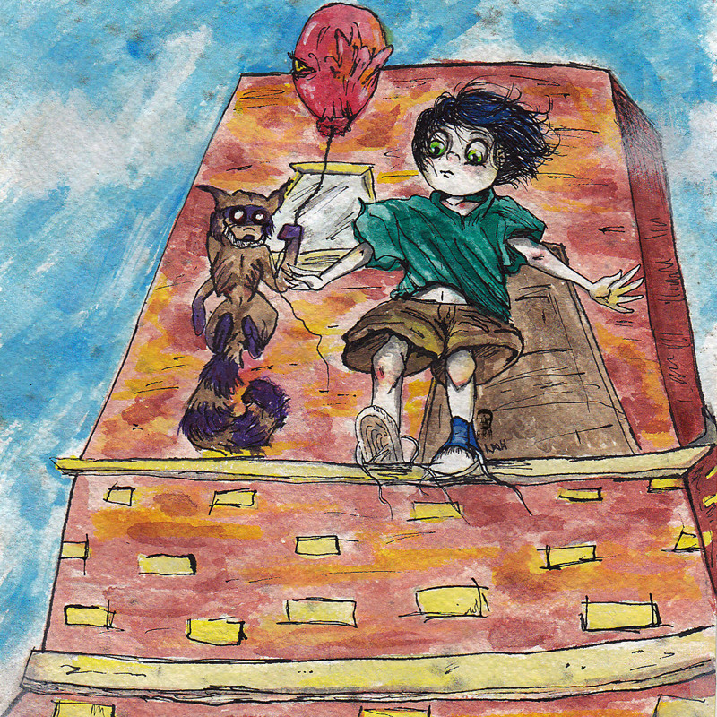
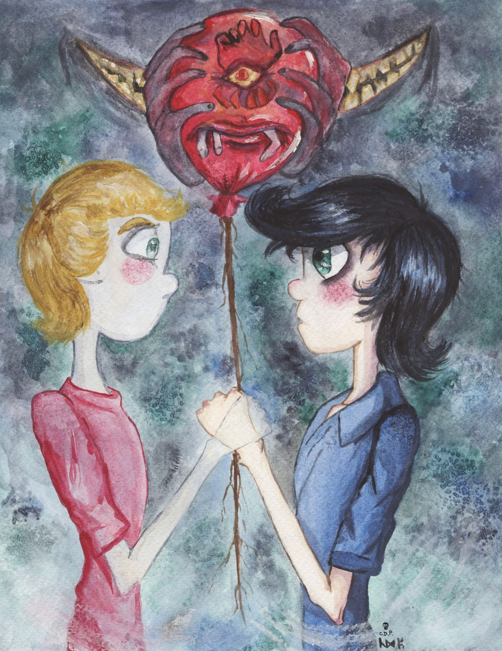
I figured Bebe needed a "bad friend". The raccoon holding the 'babaloon' is Matches. Matches is a shapeshifter, he usually comes in the form of a raccoon, gerbil, or magpie. Matches tries to convince Bebe to be violent or to do dangerous tasks.Here he is daring Bebe to jump from a 60 foot building so that he would land in the same spot, just 60 feet below. He says that it's only a game and that he won't die or even feel pain when he lands. Matches told Bebe that if he himself could do it, then so could Bebe. Bebe first had this event happen in a dream, where he did actually jump but when he woke up, he found himself on the sidewalk below the building, therefore he believed Matches. Matches told him to do again because this time his mom was watching. Of course, his mom was screaming at him to come down. And so Bebe was going to do it a second time but he was saved before he made the jump.
I did this on moldy watercolour paper with acrylic ink. (The mold is the little black spots all over the paper, I thought it gave a nice effect)
PLEASE DO NOT USE WITHOUT MY PERMISSION
~Ced
"Bebe" & "Matches" belong to me
Related content


Comments: 21

Matches reminds me of a tanuki from Japanese legend!
👍: 0 ⏩: 1

Haha, well he is a raccoon!
~Ced
👍: 0 ⏩: 0

The lineart is really interesting. It's sketchy, and the watercolor is a little messy, but it sort of works, almost like it was done on purpose. The kid's oversized clothes and his scabby knees really tells you something about what sort of character he is. I also like the added detail of his untied shoe laces.
While the hand that shows us his palm look well done, his other hand looks more messy and undefined.
I like how the lineart at the top of the building gets thicker, and how it's shaded, but the perspective looks a little wonky at the base of the building.
Matches has an interesting design, and it's sort of cool how you defined his rib cage. I like the sort of BeetleJuice smile he has. The arm at his side was a little hard to decipher. I thought he had that arm behind his back, and it looks a bit like he's shrugging. I can't tell if the balloon looks tattered on purpose.
I read the bit about this being drawn on moldy watercolor paper, and I agree it does give it a nice effect. I though those were paint dribbles you had put on the painting on purpose.
👍: 0 ⏩: 1
Thanks for your feedback!
The perspective is something I struggle with. Yes, I messed up quite a bit on that hand.
I like drawing ribcages so having emaciated characters is fun for me XD His pose is a bit odd if you try to imitate it, it doesn't really work with a realistic anatomy. His hand is supposed to be sorta hanging off the side, but the style is defined shrug-like shoulders.
Nope it's mold! XD
Thanks again! I appreciate your feedback!
~Ced
👍: 0 ⏩: 1
Oh I hate doing perspective, I really have trouble with it. I've been getting better, but that's only after doing it for a while, and I still have a ways to go.
I usually don't draw skinny, characters, so it's fun to do some different body types.
So the arm is supposed to be like out of socket?
It looks cool, gives it this distressed effect which matches the art style. Hope it doesn't do anything funky with you respitory system.
")
👍: 0 ⏩: 1
Same here.
I guess the best way for me to describe the pose is to jab your elbow into your ribs and put your shoulder up a bit. It's an awkward pose, but like I said, since his anatomy is exaggerated it doesn't work for us. But I probably did put the arm too far back. Perhaps I couldn't decide where I wanted it to be
Ja, I think I'm okay now since I did this maybe a year ago lol
I'm really glad I joined this group. I love having these conversations with people.
~Ced

👍: 0 ⏩: 1
Exaggerating poses is fun, but you still need to keep the irl anatomy in mind. But, yeah, a year makes a hell of a difference.
Me too, it's nice to have people say more than "good work" on art you've worked really hard on
👍: 0 ⏩: 1
True true.
Ja I know!
~Ced
👍: 0 ⏩: 1

I guess that's one way to make use of mold! ")
Anyway, the most obvious tip here I can give you is to break out a ruler or some other straight surface, like a piece of paper. If you know what the one-point perspective method is, mimic it by deciding on a spot somewhere maybe a couple of feet above this page's border (something like that) and repeatedly adjust the ruler to point toward that spot so that you can make a series of straight lines for the edge of the chimney, the door, etc. and it will all fade upward naturally. The door should also be larger relative to Bebe... by a lot, I think, unless it's a door intended for raccoons.
However, you do have a good command of anatomy and facial expressions, although I'm not quite sure how Matches is standing upright on his tail or why he looks so delighted to see his human friend about to jump. Those durned raccoons, I guess... Your color choices are also fine, except that I'd have made the sky a lighter shade of blue and/or included clouds. Shadowing would also not be a terrible idea, if you wanted to go over the watercolors with a light black watercolor or a black colored pencil (or even cross-hatching with the pen) - again lightly, of course, to create darker versions of the colors already there. But that's a style thing and you're welcome to ignore it if you don't feel it's appropriate for this kind of drawing.
(Sent here from #projectcomment )
👍: 0 ⏩: 1
Thanks for your comment!  (Smile)")
Yes, rulers, they are things that are never around when I need them... I should have found a reference photo or something since I struggle with perspective and angles on buildings! I see what you mean about the door! Yes, it is very small, dangit >:<
Since Matches is an imaginary friends, he is floating just by the tip of his tail, much like the Chesire Cat.
Thanks again for your thoughtful comment!
~Ced
 (Wink)")
👍: 0 ⏩: 0

It's like a bizarre nightmare drawn in a sweet and almost childish style. I love how you painted it, the colors and the strokes.
👍: 0 ⏩: 1
Thank you! That's exactly what I was hoping for.
~Ced
👍: 0 ⏩: 1
Great then! You're welcome!
👍: 0 ⏩: 0

Almost all my characters are skinny, so is the boy. XD
~Ced
👍: 0 ⏩: 0


Thank you
~Ced
👍: 0 ⏩: 1