HOME | DD
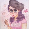
 Ravietta — Tarot style - comparison
by-nc-nd
Ravietta — Tarot style - comparison
by-nc-nd

#card #empress #eriu #evora #painted #ravi #tarot #theempress #mclaggen #ravietta #art #queenofcups
Published: 2017-01-09 03:11:56 +0000 UTC; Views: 18561; Favourites: 1689; Downloads: 0
Redirect to original
Description
Happy New Year to all!I've been silent for a while. Working on stuff. Doing things.
And as I was doing things, I've come to realise that I'd gladly accept a challenge of making my cards in a different style than I've originally planned to. Have a little comparision of the styles I've been contemplating lately.
On the left the original Empress design, on the right the new design and the Queen of Cups card, much more into symbols as such, simpler shapes, somewhat DA:I stylised.
Related content


Comments: 65

Oooo, do you plan on making a guide or reference on how to make these particular designs?
👍: 0 ⏩: 1

I pretty yolo my way through, you know? I thumbnail some stuff in the beginning to have a general feel of the composition and just... dab until I'm done.
👍: 0 ⏩: 0

your cards are beautiful, I esp. love the one on the right! <3 I would buy a deck like that!
👍: 1 ⏩: 1


omg i could tell immediately the influence from Dragon Age for the Tarot on the right
they both look amazing!!
👍: 0 ⏩: 0

While I really like the one on the left as an image, for a tarot card I definitely favor the one on the right (late comment but oh well).
It's not the same style-wise, but I love my Tarot Mucha deck and I feel like the one on the right brings back some of that similar nostalgia. :'D
👍: 0 ⏩: 0

Then I envy you, my friend.
👍: 0 ⏩: 0

I love the composition of the second one (and tbh both pictures are wonderful) but I prefer colours on your normal style, so it's really hard to pick... but I'm sure that it will be amazing no matter what style (or combination of) you go with, because you're an amazing artist c:
👍: 0 ⏩: 0


I'm a big fan of you're normal style, and the left one really captures Eriu's character. But, the left one has much more of a "Tarot" feel instead of a picture you've loaded symbolism into.
I guess it depends on what you're going for: An exercise in art and composition, or a fun project to get to show off your characters and aspects of them we haven't seen yet.
👍: 0 ⏩: 0

Maybe I just like your original style too much, but I like the left one....
👍: 0 ⏩: 0

Both are great, of course, but I like the desgin on the right a little bit more
👍: 0 ⏩: 0


I like both but I'm more in love with the newer design.
👍: 0 ⏩: 0

I love the updated design! I can really see the DA:I influence with your spin ^_^
👍: 0 ⏩: 0

i like the new design, it feels more mythical!
very nice work!
👍: 0 ⏩: 0

Uwielbiam DA:I'owe karty tarota, więc mnie się bardziej podobają te z masą symboli
👍: 0 ⏩: 0

I like both! But I think I like the one on the right better
👍: 0 ⏩: 0


I really like the new style for cards. Both are amazing art though!
👍: 0 ⏩: 0

I ADORE the one on the right. The left option is very vivacious and cool, but the right has the quiet dignity I usually like seeing in Tarot art.
👍: 0 ⏩: 0

the new one on the right is more true to the traditional style of tarot cards, so it has more of that feel to it, if that's what you're going for. The bright colors of original stylized one are a lot more eye catching though.
👍: 0 ⏩: 0

Wersja po prawej niby ładniejsza, ale... ten styl widzę dosłownie wszędzie. Taki "wysyp" tych obrazków zaczął się właśnie po Dragon Age Inkwizycji. I spoko, ładne to, ale osobiście już mam przesyt tego, bo jest gdzie się człowiek nie obejrzy. Karta po lewej po prostu bardziej kojarzy mi się z Tobą, Twoim stylem, a nie z czymś "zapożyczonym". Nawet jeśli ta po prawej jest lepsza technicznie (aczkolwiek według mnie to kwestia tego, że karta po lewej jest starsza...) to jednak wybrałabym lewą stronę. Ale będąc bardziej obiektywną pod kątem "co się sprzeda lepiej" to raczej stawiałabym na prawą.
👍: 0 ⏩: 0

Both are beautiful, but I think I like the feel and abstract shapes of the new design better  (Smile)")
👍: 0 ⏩: 0


Both are beautiful as tarot cards. If you want to go for something more "traditional" in style, then I'd pick the right one, but the left one is different and more dynamic, which is great in it's own right. as a fan of patterns and textures, I'd personally pick the one on the right as a tarot card.
👍: 0 ⏩: 0

Ta po prawej jest bardziej elegancka i jakby 'karciana'. No i jeżeli chciałabyś dorobić więcej kart, to przez takie geometryczne kształty chyba łatwiej będzie utrzymać je w jednym stylu, żeby rzeczywiście wyglądały jak talia (;
👍: 0 ⏩: 0


The one on the left is more original, there are many decks already out there with the style on the right ( though yours is nicer than most).
Honestly they're both great; if I was getting a print instead of a deck it would definitely be the left.
👍: 0 ⏩: 0

I love both personally, but I prefer the style on the right, as it's a little easier to read the symbols and interpret, and since I'm still somewhat new to tarot cards it would be easier for me to decipher. I rather like simplicity either way, personally.
👍: 0 ⏩: 0

The left one is just a good art, and the right one fits perfectly for the Tarot.
👍: 0 ⏩: 0

It depends on what impression you'd like to give. The left has more contemporary and dynamic feeling to it, but is also very straightforward, it is bugging me that she has a knife in her back, is burning and still - smiling ")
👍: 0 ⏩: 0

I personally prefer the left one because I love the style, but as a Tarot cards design I would go with the right
👍: 0 ⏩: 0

I prefer the first one (left), because of the movement and the stronger symbols...
👍: 0 ⏩: 0

do both, imo. not at the same time, of course. the right side first then rock out with the one on the left.
👍: 0 ⏩: 0

Stunning work! ^^
Though I have no idea which I like better, they are both really pretty.
👍: 0 ⏩: 0

The left one is really impressive, but in my opinion, the style of the right one suits tarot cards better. It looks very mystical! I'd love to have such tarot deck myself
👍: 0 ⏩: 0

Always thought tarots cards were a bit "dark", so when i think of tarots i think of the right one more.... BUT... the left one is more original and woudl be a ncie lil change to it so... therefore i woudl go with right one ;3!
👍: 0 ⏩: 0

I personally would go with the right one, it suits really well the Tarot cards and the symbols are a really important part of them. (And I always liked the DA:I's card designs.)
While the left one is also really beautiful, it's too eventful for a card design.
Anyway, I hope you find the perfect style for this project (my dream is to design my own tarot cards also, but still looking for the right style that fits me and the cards as well), and I'm looking forward to see further designs from you!
👍: 0 ⏩: 0

I really like both design and style, and I think both could work for Tarots' cards.
The thing is that the one on the left looks more personalized (Idon'tknowifthiswordexistI'msorry) than the one on the right. In fact, people won't really understand the left one since it looks like one of your characters. Which is pretty cool ! But not for the public. In contrary, the right one looks more generic, because it's a neutral character (only if I didn't missed one).
👍: 0 ⏩: 0


I think that while the one on the right read more like a traditional card and has a quiet ferocity to it the one on the left is well, FIRE. The brutality of it and the color play on the one on the left are amazing. Overall though, if your going for a stylist challenge for yourself, go a design that looks like it's going to go with a set, and stick with your theme then I would go with the one on the right. They are both so so breath taking though.
👍: 0 ⏩: 0

Just seeing these made me almost scream in joy. They look amazing.
The Queen of Cups card is a lot closer to what I would consider the typical style of the DA:I tarot cards, but the Empress design kind of makes me think more of the cards representing the characters in multiplayer of the game.
👍: 0 ⏩: 0
| Next =>