HOME | DD
 ravivasavan — Erroneous
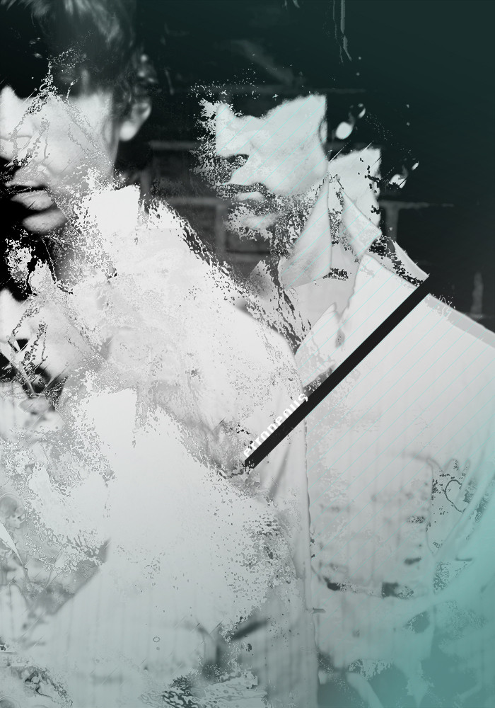
Published: 2004-08-23 11:03:30 +0000 UTC; Views: 841; Favourites: 17; Downloads: 223
Redirect to original
Description
///-/-
---------------
-/-- eccasror
Related content


Comments: 33


i 
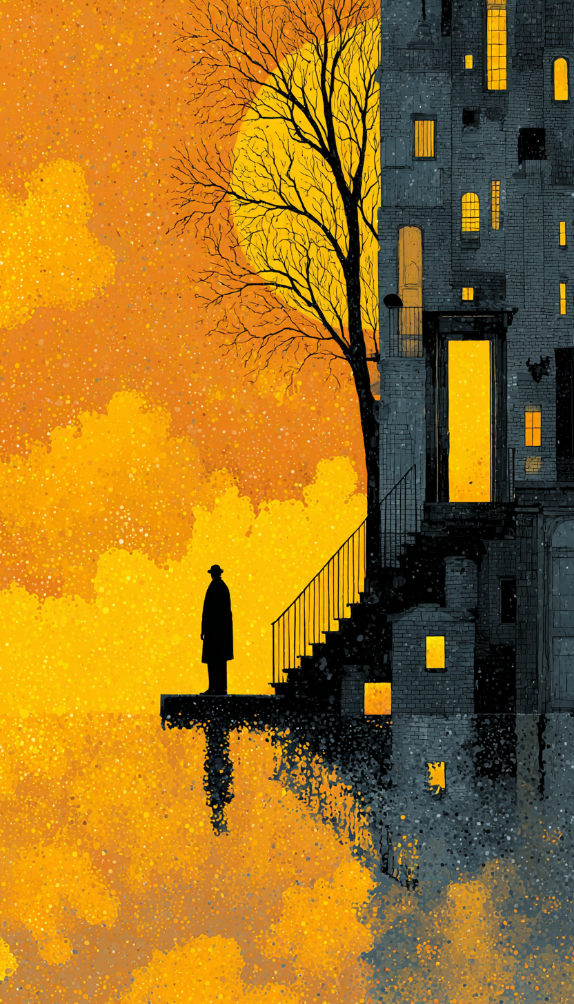
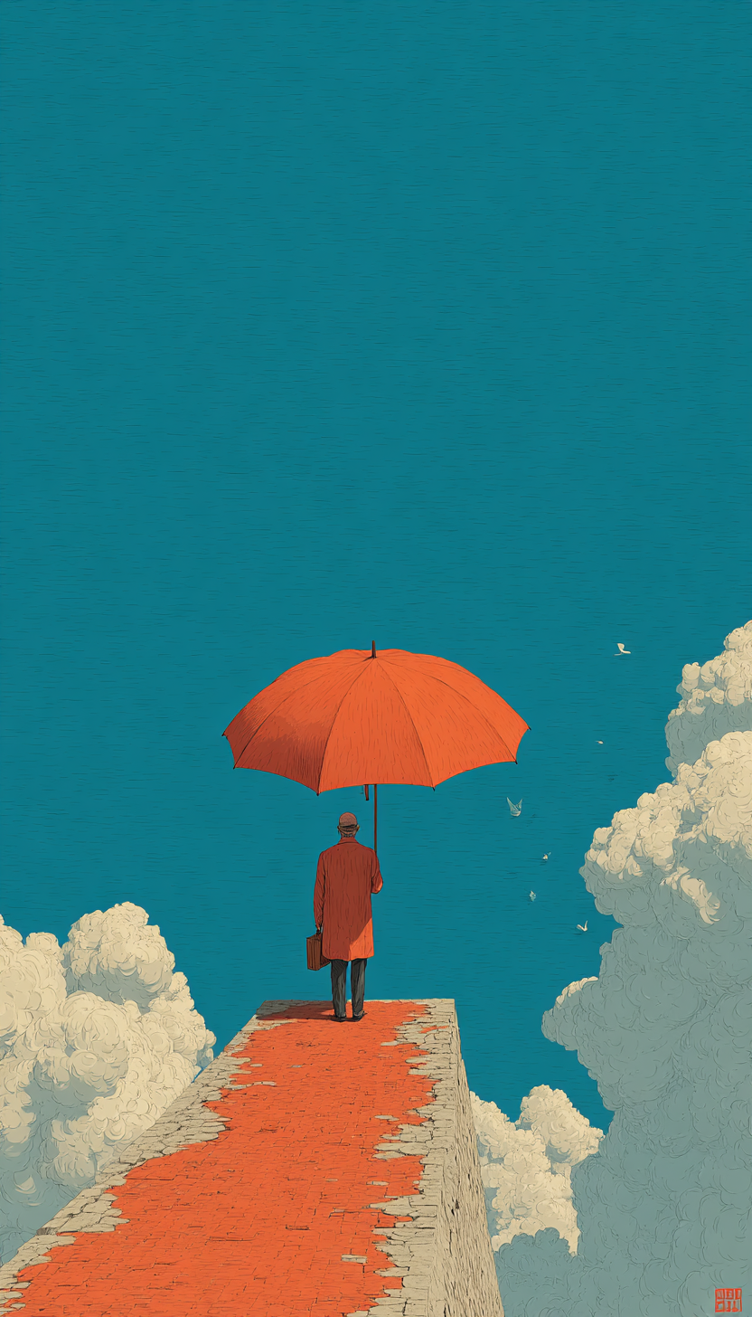
from the thumbnail it looks like a person in the clouds.
love ur work.

👍: 0 ⏩: 1


wow, you're work is way good sad i don't want to bore you and comment on everything but this one in particular is fantastic !
👍: 0 ⏩: 0

Okay. Lets start with the title Erroneous - this word means mistaken, incorrect, so what are you actually trying to say with this piece?
The use of a few filters in photoshop could accomplish a similar look, or if you prefer a simple print process using a scalpel and a printing loom, which can be found in almost every college and even some schools.
To be honest, this does looks like a mistake, something picked up off the floor after a class has evacuated a lesson.
Try again...
👍: 0 ⏩: 1

trying to pick up some of the mistakes out of this one. well, you've accomplished so many of mistakes, there were no filters, or simple print process.
👍: 0 ⏩: 0

")


great colourchoice, i really like ur last submissions!!!
👍: 0 ⏩: 0


Why don't you ever credit the guy you keep taking all the photos from? All you've been doing is putting a copy + grungy contour over the top of rofile& l=seer">eosis / seer's 's photos.
👍: 0 ⏩: 1
[link] src="https://e.deviantart.net/emoticons/r /razz.gif" width="15" height="15" alt="=p" title="=p (Razz)" />rofile& l=seer
[link]
👍: 0 ⏩: 0

looks like the beatles. if i can remember, i'm gonna do something with the beatles when i get home
well i like this
👍: 0 ⏩: 0


i like it... but
i desagree with *funkcrush, I don't like the brick bg i don't like the diagonal with the title of the work, it does not add anything to the piece
anyway i like your this style of breaking photos, i didn't see it before
👍: 0 ⏩: 0


dammit dude, this shit is tight.
when i get my digital camera next week we should do some collabs.
👍: 0 ⏩: 1

The composition works very well, the gradient and the lines in diagonal balance the composition correctly, very well executed in composition and also in palette scheme. General look transmit good vibes.
👍: 0 ⏩: 1
👍: 0 ⏩: 0

Nice work man, you know i'm loving this recent work of yours.
👍: 0 ⏩: 0

who's that guy now 
👍: 0 ⏩: 1
don't you just love lucien's family.. lol who's next, his sister
👍: 0 ⏩: 1
i love his skills of photography.
👍: 0 ⏩: 0


I can't seem to like the font or it's placement, but other than that you did a 
 (Smile)")
👍: 0 ⏩: 0

thanks baby, it was there already
👍: 0 ⏩: 0


