HOME | DD
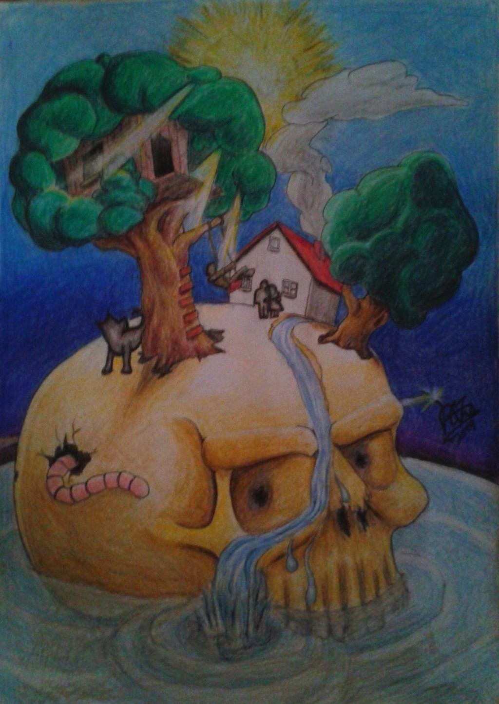
 razevortex — 4 SD gimped
by-nc-sa
razevortex — 4 SD gimped
by-nc-sa

Published: 2014-01-19 22:37:49 +0000 UTC; Views: 185; Favourites: 16; Downloads: 1
Redirect to original
Description
PencilA4
Related content


Comments: 6

Hello! Found your art through ProjectComment .
It feels like this was drawn from a photograph reference because aspects of the shading seem to be trying to capture photo type shadowing. If you include a link to the uploaded reference with your art description, it can help people give critiques that are helpful, since it might help someone better identify what is going on. Without seeing the reference, the anatomy and proportions feel right. There is a a sense of depth and that these people have weight to them. The man's nose and the girl's shirt stitching and bead decor are my favorite rendered areas. His nose is so well defined and formed, and her clothing has the right type of texture difference. The girl's hair is quite lovely, I can tell you spent a considerable amount of time trying to get her hair close to value as possible. The man's hair is rendered even better. Where your pencil work became rather jagged and too much like outlines on parts of the girl's ponytail, those issues are not present in the man's hair, and it is both realistic without the feeling of being overworked.
If you are trying to figure out where you can improve, value studies would be a--forgive the pun--valuable course for you. It feels almost as though you were scared to shade the girl's face because perhaps she is pale; but values have more to do with how the light forms around a structure rather than skin tone. Compare how well sketched the man's nose is, and in comparison, the shadowing of her nostrils is nearly the same shade as the under curve of her cheek. Keep in mind the values in relation to how other contours are shaded on the face (where are the darkest points of the face? How dark are they in comparison to the shadows of the face? etc).
Last suggestion is to watch how much you rely on an outline to define form. Outlines are a shorthand way of conveying where the forms wrap and are wonderful for sketches, but need to be selective in the final rendering. On plush surfaces like the lips, or complicated areas such as eyelash line, it can create an undesired effect of making what they outline appear stiff and lifeless. Further value study and becoming comfortable / loose in the way you render and define a face is the only remedy at this point for you.
I hope you've shown whoever these two people are your sketch of them. I bet they would absolutely love it, and feel flattered over how much attention you've taken to bringing them to life.
 (Smile)")
👍: 0 ⏩: 1

thx for your detailed comment basicly i have to agree to everything you sayed this work is already a couple years old it was a picture of a coworker she asked me to draw the picture of her marriage it had great resolution but had to much lighting for a good refrence but she realy loved it and i was quite happy how it turned out back then too... when i watched it again lately i noticed all the outlines i used today i would more likely just darken the background instead i even remember outlineing the shadow areas doing the shadeing and stuggle after to make the line less visible well it was my first attempt on something photorealistic and i had to lern by try and error. her hair omg it was fun putting so much effort into it and improved my feeling for how to draw hair... but since them im happy about people with more simple hair ;D.
again thanks for your comment
👍: 0 ⏩: 0

👍: 0 ⏩: 1
thx for your comment yeah its a picture of a coworkers marriage the drawing is a couple years old already... i have proplems with takeing pictures of my drawings forever... to much light the pencil start to reflect but less light kills the contrast of the drawing its just frustrating... good you mentioned add info to artist comments section reminds me to update basicly my entire deviant art stuff -.-
its not realy a track where i am its more like a field where i visit different spots just as i feel like ")
👍: 0 ⏩: 0