HOME | DD
 rbstorm — SDL: A Shoosh in Time

Published: 2007-11-10 05:19:07 +0000 UTC; Views: 12867; Favourites: 21; Downloads: 121
Redirect to original
Description
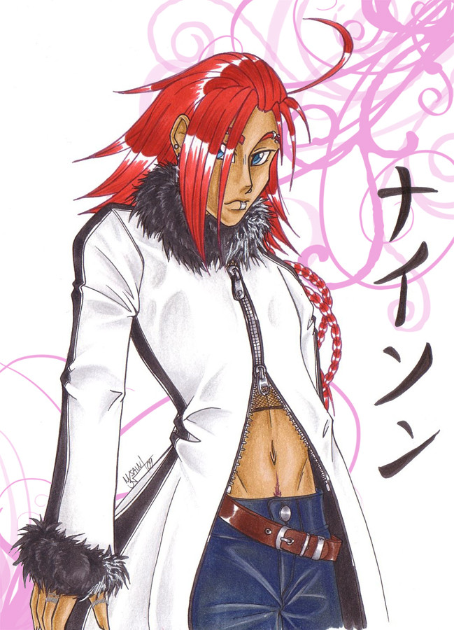
Shoosh got sent back in time to the feudal era of japan via random occurrence! How will Shoosh get home to Shoosh's own time? More importantly... how will Shoosh not get killed when there are hundreds of samurai roaming the lands!? Looks like Shoosh is going to have to become a samurai too. Good thing Shoosh already has ninjutsu training... samurai can't be that much harder... can it?Stay tuned to 's Samurai Dueler League to find out. o.o
(Note... not dueling anyone right away, just registering for now. There will also be characters joining Shoosh along the way so, when they do more will be added.)
Shoosh is copyright me.
Samurai Dueler League is
Related content


Comments: 40

Interesting how Shoosh pops out much more than other characters I've seen. The Values on the coat/robe-ish gives an interesting visual of flow.
👍: 0 ⏩: 1
 (Smile)")
Hopefully I made some sense, I'm not use to using the Artistic terms. And your welcome
👍: 0 ⏩: 0

So I'm gonna give you criticism, hopefully you won't be offended.
Your pose is dynamic, and your character is fairly colourful. I like the small touches like the ear piercings, the swirl and the bandages.
The biggest thing that pops out at me criticism wise in this drawing is the lack of textures you've used, particularly in the pants and the blade handle. Textures are a useful way to make something more believable whether you use tones or subtle hatching to elude to them, without them there your colouring will lack depth. Also the hair could have used more defined highlighting and shadow.
Okay last thing is your use of colours. When I looked at this at first I found it hard to take in due to the extreme amount of red. If you're going to use bold warm colours like reds, magentas and yellows you need to offset them with colours like blues, grays and greens. You definitely needed more neutral colours in this.
Typesetting and layout was good, with the exception to the Character's name Soosh. The typeface you used combined with the out glow effect made this hard to read.
That's about all I have to say on it, keep up the good work ^^
👍: 0 ⏩: 1

I'm going to criticize your criticism, hopefully you won't be offended.
Textures may be useful but I wasn't going to use them for the sake of using them. The blade handle and pants are exactly how I wanted them to look and not defining hair is just something I do, it doesn't have anything to do with not knowing how... especially for this character.
You actually don't NEED to offset colors, If you're going for a somewhat analogous color scheme. Not to say this was TOTALLY analogous, but the extreme use of red was very much on purpose.
The typesetting being hard to read is honestly just you, the glow is so subtle and the typeface is very clear. While it may be illustrative I made sure to pick a type face people could read... so much so that I had at least 5 or 6 people look at it on their own screens before settling with a type face.
How'd you come across this by the way? Curious as to how you randomly came across this one XD.
By the way, you give someone a critique, not criticism. I don't mind a critique but try to be a little more helpful about it, actually look at current work and my gallery as a whole rather than stopping on one thing and claiming it's all wrong for reasons that are very much a personal opinion. MIND YOU, having your own opinion is fine and all, but imposing them as "Right" or "Wrong" comes off as somewhat offensive... even with the disclaimer of "Don't be offended" at the beginning.
Again, I do take critiquing into consideration with my work but I don't really like criticism. That being said I wouldn't mind if you watched me and did harsh criticism towards everything I did... maybe it'll help, maybe it wont. One thing is for sure though, I'm going to be watching you... even when you think I'm not... I'll be watching you... on deviantART. o_o

👍: 0 ⏩: 1
Lol! Watch me? W00t I have a unhappy stalker? I do shit all art wise...I'm not a super motivated artist like yourself XD
I looked at your other artworks but this one was the one that I wanted to comment on the most, I saw similar things in other pieces of your gallery, particularly your use of color. I'm not trying to preach to you what's right or wrong, I'm offering my opinion as a designer because I considered you a talented artist.
I do think you have room to improve as all artists do and was offering my perspective. You don't need to agree but it's there for you to consider.
Actually I don't know where I saw your art, I just found it randomly...I think I saw you comment on someone's blog, from memory? Not sure..
To me a critique and criticism is the same thing, I said positive things about your art too! But my post was primarily to help you to consider things that may improve your picture, so I focused on that. I don't go around offering excessive praise to people because praise never helps someone improve as an artist (though it does stroke one's ego).
Anyways, your reply shows you considered what I suggested, hope it helps in some way ^^
👍: 0 ⏩: 1
Room to improve is a given for absolutely everyone. ^_^;;
I'm a designer myself... some of the things you said struck me as a bit inexperienced. To be blunt, much of it was very amateur. I know I'm an amateur myself, but I wouldn't give a critique for the sake of giving one. Know what I mean? I wasn't exactly "unhappy" with what I said, was trying to bring a little humor to it, glad you lol'd though.
Believe me or not, I have a BA in Digital Art and Graphic Design. I've taken several color theory classes, and while I know that's not enough to just "be good", I do know what I'm doing when I choose my colors. I've done color theory while applied to 2D Design, applied to art/painting, applied to Illustration, I tend to mix them. I've taken many critiques on color usage, and I adapt when they make sense and sound knowledgeable. Telling me "too many reds" isn't very knowledgeable... as you would know that's an analogous color scheme... not to mention this is to be used as a reference for the character, who happens to be those colors. I know it isn't 100% analogous but for the most part it is.
Oh and don't think I'm watching you so I can rip you apart if you upload something, I'm not that kind of person. I had a few people telling me I should, but again, I'm not that kind of person.
Personally, I think you should read my reply to your criticism and use some of it in your own art. For instance, the comment you made about patterns/textures... don't abuse them. That's one of the most amateur things you can do. ESPECIALLY on that one that's supposed to be L, the picture would've been ok... you do need work but it would have been an alright picture. But then, you put that honeycomb pattern over the whole thing, it makes it look awful. Also, you talked about fonts (my choice of font) which is very readable to others, but also helps illustrate the piece. The letter L you put on there is so far from the actual look, so different from your piece... it doesn't help, it just hurts it being there.
I think you should continue to work on art yourself though. You'll never be motivated if you don't just do it.
👍: 0 ⏩: 1
Yeah, I know what you mean. However, I will always be the type of person who gives a critique without needing to, if I see something worth suggesting. And I do believe you when you say you've been through art training, because you certainly have strengths in your art and are very productive.
And I would agree, that L picture is an awful picture full of cheesy overdone effects. My art either comes out with a result I'm really proud of or not at all. In fact, there are only a few things I'm proud of even though I've made many things, which is why I haven't bothered with deviant art recently. An artist needs motivation and creativity to make something, when I force myself to draw out of that I get crap like the L pic, the toboe picture and the majority of my gallery. Because I'm of the mindset that if it's not perfect don't put it up at all, I draw nothing and look at my current gallery in disgust. Really it's counter productive, at least you have the balls to proudly display your art.
P.S. I'm shit at grammar, spelling and the English language. My bad! I wish I could have written you a better written critique but due to my writing style it came out the wrong way. I actually didn't mean to be offensive, but I'm not good at wording things so they aren't read that way. Please know I didn't intend you offense, I just wanted to help you improve as an artist, like you put as one of your goals in your profile

👍: 0 ⏩: 1
I understand. But honestly, draw more, do more. You have to push yourself.
👍: 0 ⏩: 0
It's not really time travel... it's random occurance. I had to be very particular with RoninsUltramix and explain everything to show it wouldn't have a negative effect on the setting.
👍: 0 ⏩: 1

ooohs i see :3
and here i thought the only time traveling was the glacier trick XD
👍: 0 ⏩: 1
It's like... reverse glacier X3
👍: 0 ⏩: 1
cant wait to find out how :3
👍: 0 ⏩: 0

At some point sure, not sure exactly when though. A little busy right now and I wanna get an intro going first before I duel anyone. I put you on watch though, if you watch me you can keep track of when im available.
👍: 0 ⏩: 0


Awesome character 
Love his katana design

👍: 0 ⏩: 1
Thanks, pretty cool character yourself. ^_^
👍: 0 ⏩: 1
Thanks too
Just curious.. I'm kinda unsure how the scoring system works.. could you enlighten me? ^_^ Thanks
")
👍: 0 ⏩: 1
Oh I just read up on it... my 5 wins are from other OC Tournaments (if ya read the join thing it says to put previous win/loss record in)... but, they don't do anything to my rank.... basically, every time you win a duel, if you're already a higher rank than your opponent you gain 1 rank up, if you weren't higher than them, you go up to the rank just above them. Pretty sure that's how it works o.o
👍: 0 ⏩: 1
Ohhh, thats why i couldn't find your SDL battle
Thanks for the info
👍: 0 ⏩: 0


Yep, I'd been working on it for awhile... finally got to coloring it last night.
👍: 0 ⏩: 0


Welcome to the league! Background story fits him, especially with that name.
")
👍: 0 ⏩: 1
Thanks for the welcome. I don't know how to respond to your second statement.
👍: 0 ⏩: 1
As a positive, surely. I haven't read time-travelling as anybody else's background story, and his name, Swoosh, which is a name that reminds me of basketball, which didn't really start taking popularity until later, kind of lends that he is from a future time.
👍: 0 ⏩: 1
Ah ^_^ yeah, so thanks! And it's Shoosh, but still, same kinda sound.
👍: 0 ⏩: 0

