HOME | DD
 rcardoso530 — Hulk version:2 by diegobernard
Published: 2009-06-11 17:53:50 +0000 UTC; Views: 1177; Favourites: 18; Downloads: 26
Redirect to original
Description
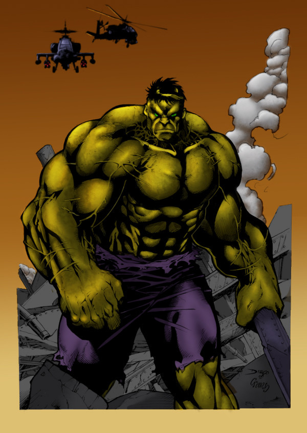
hey all....EDIT: just added some textures to hulk and some slight highlights... still working on him thanks for the votes makes the decision alot easier. i am also trying to make some ahhh wind down force ring under the forward facing copter...
well here he is. i am to a point where i could either leave him the way that he is or continue so i thought why don't i leave it up to you all.
so if you want me to continue working on him maybe adding some more highlights and textures to him or the background you can either vote here or on my poll on the main page. if there is something that you would like me to do specifically let me know and i will go with the most popular suggestions.
as for the piece its self... here are the specs:
---> pencils by
---> inks by
---> colors by
cs4
wacom bamboo fun
aprox. a few hours (roughly ahhh 3 i think was off and on)
other pieces that i have colored by =gz12wk
----> Batman: [link]
be sure to vote at: [link]
Related content


Comments: 16

Overall

Vision
Originality

Technique
Impact
You want a crit, you've got one! Well, not a bad start, expect to learn from us as well as others who do crit that have experience in coloring.
For the most part the image is flat and not as interesting, color wise, not artwise. Remember, this is a crit on the coloring aspect. The tones are dull and dark. Yeah, you're going for that dark look but there's ways of doing that with a lighter base tone. Just don't highlight as much.
Keep working at learning how to render shapes more. For example, his hand, small highlights on his knuckles and back of hand. Comes off as lazy and uninspired. Whoa! I know, harsh but you wanna learn or you wanna be pampered?
So how do you fix that? Well, lighting, first find the light source, then begin selecting how the lighting will affect certain bump structures from his bones. Continue from there and do the work! A simple gradient shot doesn't make anyone a colorist overnight.
The olive color is fine, heck, you can color him purple for all that matters. The point you wanna keep in mind is, tones and rendering. Grab those comic books you like with awesome color works in them and learn from that or nature as well. That's just some advice.
This piece is far from being completed and you do have a good starting point so we say build on that, keep at it and keep learning more rendering of shapes. Lighting is something you'll need to master as well. It's pretty much the season in the soup if you will, so get at it and keep posting more.
Don't let this crit or any others hurt any ego you might have, just roll with the punches and keep learning. You're on the right path so far! That's how we all learn e.deviantart.net/emoticons/w/w… " width="15" height="15" alt="
 (Wink)")
-Onixan
👍: 0 ⏩: 1

woooooo hooo..... that's what i like to hear/read straight up no bull shit critique!!! thanks brothers really, the reason i ask certain people for their critique is because i see something in their art that i personally believe is either better than mine or they do something that i like and am trying to learn from. i also realize that everyone has an opinion and no not everyone is going to agree but if you want to learn you HAVE TO LISTEN AND LEARN.
it's kinda like this i told someone the other day...when you post something it's kinda like throwing up a quarter someone people are going to scramble and try to get it as fast as possible like those people that say "awesome man or great work" just for the fact of saying it... then you going to have those people that already have a quarter in their pocket the ones that are better than you are and when they post something its like they are throwing up a dollar... so when i post something i know not everyone has a quarter in their pocket and i am one of them (not yet at least) but would like to earn a dollar!!!
so i ask people that do have a lot of quarters in their pocket what they thought of my stuff.... i am never offended and i don't worry about the whole ego thang i think it just gets in the way exspecially when you as for critiques...
as for the actual piece i hear you in ALOT of what you where saying ie. the gradient in the background and some of the tones. in this piece yes i was going for the "dark" feel to it but i was also trying to use colors that i am not used to and don't normally work with. example the gradient i normally don't use anything other than a solid color for the background and i was getting tried of doing that so i ventured out, i think if i where to go back i might try to make an actual horizon line with the colors dissappearing into the horizon.
as the light source man i still am working on that issue it seems to be a never ending battle with it but just like the issues with the "muddy" look i was having troubles with i will get through it.
you know the past couple of pieces that i have done i have really been trying to set a feel or a mood and i think i am getting the idea in my head it just hasn't transferred to my hand yet...does that make since?
anyways thank you for your time sorry for the long response but i really do value yourins opinion that is why i ask and one of these days when it all pays off in the end the first round or first couple rounds are on me!!!
late
rich
👍: 0 ⏩: 1
👍: 0 ⏩: 1
thanks guys, i appriecate you guys input and i know you guys are busy so i really don't exspect a big ol critique every time so when i do get some feed back i really try to read, understand, and apply cause even those little tid bits are worth a lot to me....
👍: 0 ⏩: 0

it good i like how you did the tones on the Hulk...His body mass is good too...Very good job on this...Not a fan of the Hulk, but was happy with the colors you chose
👍: 0 ⏩: 1
no love i see how you are...**sniff sniff**
👍: 0 ⏩: 1

Haha, this is pimp. Nice job on the colors, background should accept the setting sun outline or something but overall, this piece is pretty sick, I would add a few more highlights to the larger areas though, just to give it that added flava!
👍: 0 ⏩: 1
you know i was thinking the same thing but sometimes i go a little too far and mess the piece up but i think now that i getting more control with cs i will keep working on him.... you as for the background i was thinking about adding a little more white or lighter coloring at the horizon line
👍: 0 ⏩: 0
so i take it you like this one hmmm.... i actually took the time on this one. on the batman piece i was only trying to achieve a mood. so do you think i should keep going or leave it be
👍: 0 ⏩: 1

with the hulk, I would say you were done.
batman... ether rework or use for lessons learned.
👍: 0 ⏩: 0

interesting
you gave him a khaki green insted of the usaual gamma green tone
the color make him look like bruce baner is still changing to the hulk
great work
👍: 0 ⏩: 1
thanks i glad you liked the color choice, you know to tell you the truth i did originally went with the typical gamma green but it really didn't feel like it went with this scene and background colors that i choose.
you know i still perplexed on whether or not to keep going on him or not that is why i put up the poll on him. i was thinking of adding more brighter tones and maybe some texture to his skin but wasnt sure if that would be too much...know what i mean
👍: 0 ⏩: 0

nice body, and great work, and i like the colors!, always jeje
keep the good work
")
 (Smile)")
👍: 0 ⏩: 1
thank you i glad you liked it
👍: 0 ⏩: 0