HOME | DD
 rcardoso530 — Phantom of the Opera wip
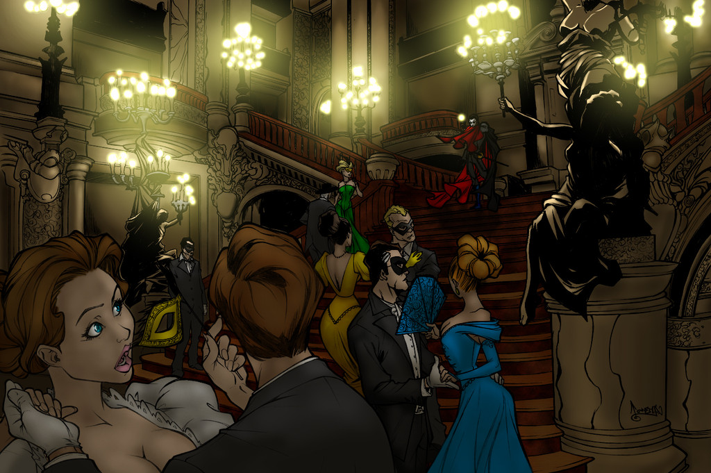

Published: 2010-07-21 02:55:22 +0000 UTC; Views: 9162; Favourites: 343; Downloads: 102
Redirect to original
Description
hey all....alright sooo this is the one that i working now for fun, i feel like i missing something or just not hitting on all cyclinders and i really would like to get this one right.
so here is alittle ummm story i would like to share about this one, i have been watching carlos for like ever it seems like and have been wanting to do one of his but i also wanted to do something different than the norm.... so i came across this one which was a commission for someone else sooo i thought hmmm that would be cool to do, not that i know anything about phantom of the opera or anything but it looked like fun.
so after laying down the flats for it i thought hmmm i should do some research on it and look for some inspiration, here comes the cool part. so it turns out that ~thebdc (ross) commissioned this one from carlos for his wife's birthday... ahhh how nice huh? well i thought soo cause if you all don't know i myself have almost been married for like 20 years to my best friend and sometimes it is the little things like this that means the most!!! KUDOS ROSS...
so with that all being said please give me some feed-back i not done with this one just lookin for some input.... hope you all like it soo far.
original by
colored by (me)
commissioned by
Related content


Comments: 58

Eerie how much it fits. I'm listening to Phantom of the Opera (Angel of music atm) And then this comes up. My player was on shuffle and I just had Masquerade...I had goosebumps.
👍: 0 ⏩: 1

There are some interesting things going on here that I thought I would point out. First of all, for a WIP this is still pretty polished. The visual contrast from the foreground to the background is extremely appealing. The foreground characters are not competing with the Phantom for focal point status. This is largely due to the Phantom's red cape having the same hue intensity as the foreground characters. From what I can gather from other areas in the image, they have less saturated colors, which if asymmetrical balance is what you're going for, kudos to you. I would say just introduce that concept into other parts of the piece so that there isn't a dividing area on the image plane. Other than that, I think it's looking good
 (Smile)")
👍: 0 ⏩: 1

hmmm thanks for the comment i appreciate it, i still messing around with some ideas i just not sure yet. and most of my ideas are with other aspects into the piece too
👍: 0 ⏩: 0

this is such a beautiful piece. and the phantom of the opera is really good my brother in law got me into its very good
👍: 0 ⏩: 1
thanks bro, you know i watched it like a looooong time ago i just don't remember much bout it
👍: 0 ⏩: 1
your welcome, and yea its been awhile since iv seen it myself but i remember it was pretty good
👍: 0 ⏩: 0
<= Prev |