HOME | DD
 rcardoso530 — Phantom of the Opera wip

Published: 2010-07-21 02:55:22 +0000 UTC; Views: 9162; Favourites: 343; Downloads: 102
Redirect to original
Description
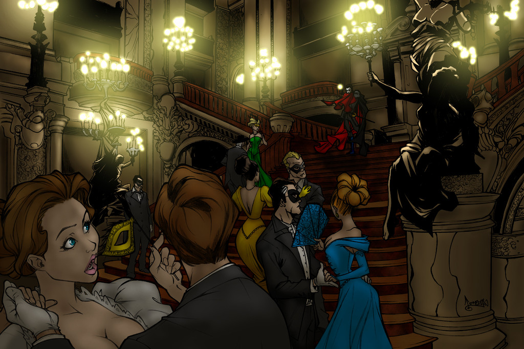
hey all....alright sooo this is the one that i working now for fun, i feel like i missing something or just not hitting on all cyclinders and i really would like to get this one right.
so here is alittle ummm story i would like to share about this one, i have been watching carlos for like ever it seems like and have been wanting to do one of his but i also wanted to do something different than the norm.... so i came across this one which was a commission for someone else sooo i thought hmmm that would be cool to do, not that i know anything about phantom of the opera or anything but it looked like fun.
so after laying down the flats for it i thought hmmm i should do some research on it and look for some inspiration, here comes the cool part. so it turns out that ~thebdc (ross) commissioned this one from carlos for his wife's birthday... ahhh how nice huh? well i thought soo cause if you all don't know i myself have almost been married for like 20 years to my best friend and sometimes it is the little things like this that means the most!!! KUDOS ROSS...
so with that all being said please give me some feed-back i not done with this one just lookin for some input.... hope you all like it soo far.
original by
colored by (me)
commissioned by
Related content


Comments: 58

Thanks...seems sooon long since i colored this in time and skill level...the artist that drew it was very good at telling his story huh
👍: 0 ⏩: 1

yea... spooky how this scene looks so real.
👍: 0 ⏩: 0


1- The art and the coloring are stupenda! 2- I love the way the Phantom looks. He just exudes mystery.
👍: 0 ⏩: 1
thanks... it seems like sooo long ago that i colored that piece
👍: 0 ⏩: 0

how could u have any doubt about this peice? it's stupendous! intoxicating! wonderful! amazing!
👍: 0 ⏩: 1
thank you very much i appreciate your comment
👍: 0 ⏩: 0

Stunning! Wow you really captured that moment well!
👍: 0 ⏩: 1

You did an amazing job here.Whole seen is brilliantly executed.Great work
👍: 0 ⏩: 1
Thanks I want to go back someday and finish it
👍: 0 ⏩: 0


One of my favorite musicals of all time, and amazing picture as
well. Your colors fit it perfectly
👍: 0 ⏩: 1
thanks i might be up-dating today of where i am now if i get a chance stay tuned
👍: 0 ⏩: 0

FINISH IIIIT! Its looking bang so far... just needs a few highlights and tweaking of the levels a little (prob just my screen though!)
BG is looking ace
👍: 0 ⏩: 1
haha well i trying to push through the project i am on which i only have 4 pages left and sometimes when i get bored i start others for fun, the problem is i get consumed with the ones for fun more than the others hehe....
i will be up-dating soon but it may stay alittle ummmm so i can finish others. as for the highs well i have added some but i going for the darker room atmosphere sooo i wont be going to high.
thanks of the bg toooook forever and there alot more marble on the up-date
👍: 0 ⏩: 1
I know that feeling well, the ones for fun are just so much more appealing... I struggle so badly with sequential work, its so slow. I can manage 1 a day at the mo with endless breaks (and maybe flatting some fun ones for later!)... I need to foucs more like that
Cant wait to see it finished and more of your new stuff
👍: 0 ⏩: 1
i hear you i am currently working on a dc piece that has umm like 40+ characters in it and i think by the time all is said and dont it will be the longest i have ever worked on one single piece
👍: 0 ⏩: 1
You, as an amateur colourist like myself (I know we make some money, but not as much as a pro!)... are insane!!!
You love these crazy multiple character pieces... I am scared shitless of them haha! I love a single character pin up (hopefully with boobs!), I need to try one of these big character pieces one day. Props to you for working on em
👍: 0 ⏩: 1
haha well, you know to tell you the truth seems like every project that i do the money is on the back end which is fine i understand that and all but the only time i actually see money is on my commissions and alot of my commissions aren't able to post
haha well i didn't really like them i actually do them cause i believe that it helps me more with the lighting and how it works and don't work, you know along time ago a "pro" told me that when i am choosing a piece to color for fun there needs to be a reason (besides the cool factor) there has to be something that i can learn or push my skill level on each and everytime and the as for trying new styles too...
so you wana see the piece i doing?
[link]
how is that for insane brother....
")
👍: 0 ⏩: 1
Yep...insane, see you next century when you finish it haha!
Never done a back end deal since my fist one (which was a watse of my time), now I operate on an upfront or a sample, payment, hi-res deal. Mostly upfront though which is nice, and my morals keep me well incheck as to get those done asap ")
👍: 0 ⏩: 1
haha i hear you i kinda wish i would have started a timer on it when i started, cause i had to research every character soo that i could have their correct customs especially since there are soo many different genes know what i mean shit there are like 4 or 5 different green lanterns.
you know as for the back end thing this is the last time i do that cause though i think it was a good learning experience there no money in it... they saying that there will be but i don't think so...
yeah i finding the same thing out too actually the more i do different styles when i go back and do a "normal" piece i bring something new a ummm new favor that i think improves everytime
👍: 0 ⏩: 0


Very good work, Rich, is coming out great. I read the comment of thebdc and I like the way you're working with the BG but I have to say that I know nothing about the Paris Opera House.
👍: 0 ⏩: 1
thanks nando...
i have been working on it alittle adding some ummm ambient lighting from the candles and some more shading on the marble as well as a couple of extras (hehe no hints on those though) as for the opera well ummm i not the one to clue you in i know nothing about opera...
👍: 0 ⏩: 1
You're welcome Rich. I'm waiting to see the final result.
👍: 0 ⏩: 0

haha thanks for the comment be sure to message carlos too he likes hearing stuff too hehe
👍: 0 ⏩: 0


Before I get started...how dumb is it that you have to be a Premium Member to "write a critique"? Watch me do it for free.
I think you've got a really good start to this pic. This is an extremely challenging pic to pull off because of the combination of the extremely beautiful setting of the Paris Opera House and the need to keep the Phantom as the focal point of the pic even though he's pretty small in it.
The first thing that really jumps out at me is the lack of color in the opera house itself. It may be a case of you just haven't gotten to it yet, but I think the environment gives you such a great opportunity to play with color that you just can't pass it up.
Here is the link to the pics that I found when I was doing my colors for this. Carlos obviously used these for reference too.  (Smile)")
One of the things that I've noticed from others that have colored this is the tendency to treat the room as if it's very dark. I'm guessing that's because their thinking that the candles as a lightsource wouldn't be giving off very much light. There are a couple of other pics of the Paris Opera House out there besides these that show how extremely well lit it is. (There are more lights higher up and closer to the ceiling) Don't be afraid to brighten things up.
It looks as if you're using black to shade your characters. I'd recommend staying away from this. Rather than making your colors darker, it's making them ashy or dirty. It's also making the lineart difficult to see in many places. Using a darker shade of the same color will be much more effective for you and keep your colors crisp and the line-work easy to see.
Keep in mind that all roads lead to the Phantom. Even though he's small in the picture, he's still supposed to be the focal point. You've done a good job and keeping the reds of his cape the most saturated color on the page and it is helping him to stand out from the background. The woman in the foreground (most likely Christine, so still an important figure) is really competing with the Phantom for the eye's attention. She's much brighter than any of the other figures, and because of her size in the shot, she's naturally drawing the eye away from the Phantom. I'd suggest toning her down slightly.
I'm loving the textures you're working into the marble. Keep pushing things.
I can't wait to see the finished product!
Ross
👍: 0 ⏩: 1
hey ross..
what up brother... thanks for the feed-back and since you haven't seen my stuff before (i assume) i generally like to respond to everything cause i feel that if someone takes the time to write something you owe them the respect of answering... alright with that being said here goes.
yeah you know to tell you the truth it is a very challenaging piece because of all of the aspects involved from the lighting to the focal point being so small like you said but that is originally what drew me to it, you know trying to push my skill level. alright i am going to be the first to admit i don't know anything or haha want to know anything about opera or opera houses for me personally it just not my thing but there are alot of aspects of opera that appeal to me.... ie moods and atmospheres and all that.
so now that i said that the lack of color is because of a couple of reasons first i kinda thought that it would be set in a dark place and on the middle area from the forground character on no it not and overlay i just unsaterated tooo much i think to create seperation from the foreground to the phantom dude. and with also being said i never use black or white in any aspect of my work they don't happen normally sooo.
maybe i bring the colors back up and turn down the sat level it just a merge layered with a mask over know what i mean.... actually now that i have some better references i can go another direction thx for thoughs
you know let me through this out there for you too originally i thought i might include a ummm spot light on the phantom and maybe some fog on the steps but i not sure i want to go there...
you know i was thinkin of really over doing it on the atmosphere with ambiant lighting and what not but sure i kinda torn between a dark and i lighter mood now i mess around with it more. i will keep you up to date brother
-rich
👍: 0 ⏩: 0

I think it looks good just the way it is...the variations in color tones and hues (not that I am much of a colorist) from the foreground to the background are done very well and to me give the preception of depth.
👍: 0 ⏩: 1
thanks brother... that was my intention i just think i need more color into it now
👍: 0 ⏩: 1
I would leave it like it is...just my opinion
 (Wink)")
👍: 0 ⏩: 1
I told you I'm not much of a colorist, I think it looks good as is
")
👍: 0 ⏩: 1
it all good brother... i am don't think that i will be doing much to it right now i am adding some curtains in the balcanies (spelling?) and maybe add some ambient lighting here and there i don't want to over work it know what i mean
👍: 0 ⏩: 1

pretty legendary work mate.
I also did a rendition of this piece [link] and would dig to hear your thoughts.
👍: 0 ⏩: 0


I agree that the phantom does work as the focal point, but the solid black of the statue on the right, and then the relatively blank space of the column below it really distracts from the rest of the characters. It breaks the visual rhythm established in the left three quarters of the image.
I would also suggest bringing the phantom down a few steps to make his figure larger, but upon re-reading your description, I see the layout was done by another artist.
👍: 0 ⏩: 1
yeah brother i am just a colorist, but i do understand what you saying
👍: 0 ⏩: 0
| Next =>