HOME | DD
 rd-signs — Torn paper layout
by-nc-nd
rd-signs — Torn paper layout
by-nc-nd
Published: 2007-01-13 16:36:01 +0000 UTC; Views: 7358; Favourites: 20; Downloads: 729
Redirect to original
Description
...Related content


Comments: 18

wow, nice work
is it for sale?
if it's plz Im Me On i5i6i@yahoo.com
👍: 0 ⏩: 0

*** Absolutely brilliant.
Well done!
i want to ask you for permission to use the artwork for a company image.
Please let me know via email : venter26373@gmail.com
a definate 10/10
👍: 0 ⏩: 0


👍: 0 ⏩: 1


 (Wink)")

Looks very nice 
")
👍: 0 ⏩: 0

I like it, but it seems lacking. I really love the effect but could you add more graphics or different typography? Other than that- great work!
👍: 0 ⏩: 0

Looks nice but could use some variation..  (Smile)")
👍: 0 ⏩: 0


wow..super tare... ii diferit d absolut tot ce am vazut pana acum si mi se pare geniala ideea cu papirusu...si se potrivesc si culorile...chiar arata mishto
")
👍: 0 ⏩: 1

neat, its something different. Mayeb teh paper should be a tad lighter? just going by my thought of old paper. Good job
👍: 0 ⏩: 1

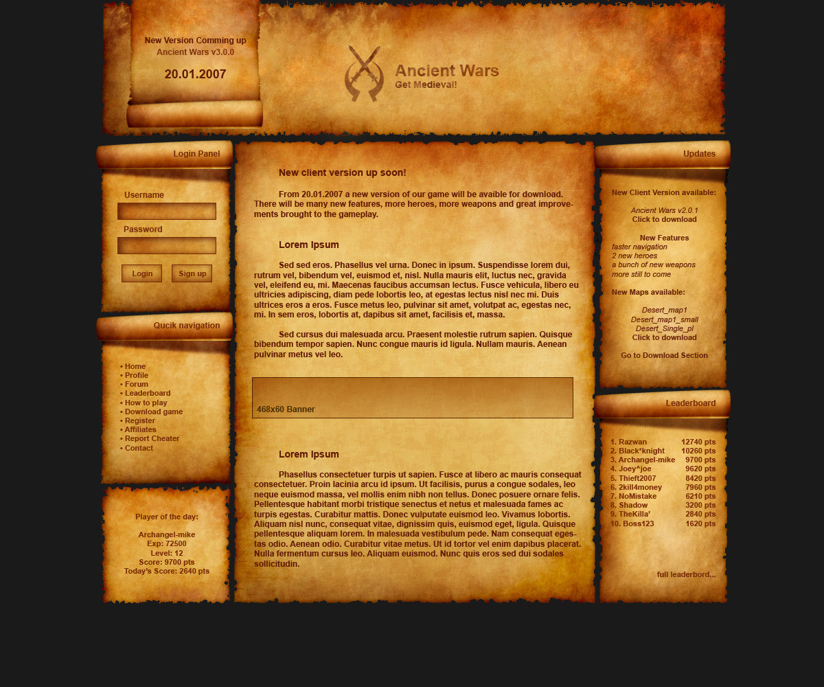
I wanted a warm... and old atmosphere... because i wanted to design it to be the site of a fantasy game. But it turned to be what it is... The language is Romanian/Latin, but I wanted to get some feedback on the design.
Thanks for the comment.
👍: 0 ⏩: 0