HOME | DD
 rds- — misprint

Published: 2004-08-21 02:40:17 +0000 UTC; Views: 1905; Favourites: 65; Downloads: 547
Redirect to original
Description
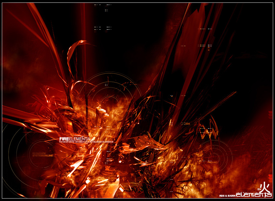
misprint_[link]
Related content


Comments: 39

This looks like the first image released of FFXII -- the city view.
👍: 0 ⏩: 0


looks great, really chaotic at the top, ill have to +fav
👍: 0 ⏩: 0

Lovely, I can't take my eyes of it.
When Im looking at it, it looks like an looong, elevetor to earth from the moon.
Sex! +fav
👍: 0 ⏩: 0


Really love it, especially the good choice of colors and the brilliant design.
👍: 0 ⏩: 0


fuckin sweet as hell mang.
i love the colors and the attention to detail.
you really fucked some shit up. great work man. +fav
👍: 0 ⏩: 0

Wooow... this is heavy
nice style, wish I could do that
+fav
👍: 0 ⏩: 0


wonderful imagery and color and in piece, how the colors flow from top to bottom are awsome, great work
👍: 0 ⏩: 0


awesome job!!!i love it!!hehe~~really ART work!Masterpiece~~lol~very well done again n always!brimming with artistic~~
i like such thing,i want too~
👍: 0 ⏩: 0


beautiful work. I dig the use of buildings as patterns.
Interesting font, it's nice.
Very good layout. The colors are great and the eye is drawn right to the text.
Well done.
👍: 0 ⏩: 0
beautiful work. I dig the use of buildings as patterns.
Interesting font, it's nice.
Very good layout. The colors are great and the eye is drawn right to the text.
Well cone.
👍: 0 ⏩: 0

some good ideas here but overall i get the feeling that its just been overmanipulated...
30minutes too long in the oven = burnt pie.
👍: 0 ⏩: 0


mmh yeah sexy. the lower red cross is a real eyecatcher. beautiful colors.
👍: 0 ⏩: 0


great misprint i would say ; ), great forms and elements in here man... liking it alot... well done
👍: 0 ⏩: 0

ill ass composition bro. love the colors here too, so much variance.
👍: 0 ⏩: 0

dek this is just so sexy -tear im very proud of you my fellow admin 
fav sucka.
👍: 0 ⏩: 0


wow that's nice. great brushing and composition
👍: 0 ⏩: 0

 (Wink)")


one of my favorite pieces from you (Smile)")
👍: 0 ⏩: 0

Oh wow this is insane! There are so many things at once! Amazing job!
👍: 0 ⏩: 0