HOME | DD
 readme-txt — Layout - Portfolio
Published: 2006-04-19 09:29:04 +0000 UTC; Views: 3369; Favourites: 1; Downloads: 292
Redirect to original
Description
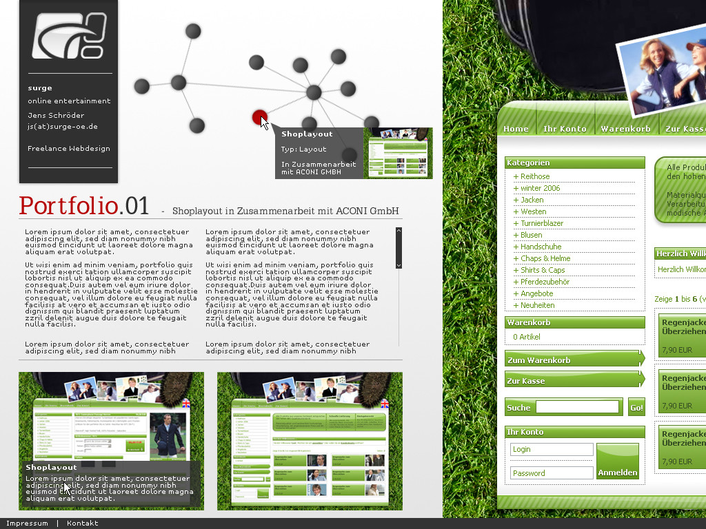
Well ... this ist the first draft of the layout for my portfolio page. Im not 100% satisfied with it but I think its a good start ... any comment it highly appreciated testRelated content


Comments: 5

I like it. The grass looks nice...except there's too much grass. IMO leave the grass on the right, and have the things on the bottom continue with the clean crisp feel of the main page. The navigation looks cool, but it's not that functional. It's actually really annoying to actually have to hover over the buttons to see where they go. But everything else looks great.
It looks hot!
👍: 0 ⏩: 1

Thanks for the comment  (Smile)")
👍: 0 ⏩: 0

I agree this is a good start.. i like the look of that navigation up at the top, and that headline font (what is it?)
👍: 0 ⏩: 1
The Headline Font is called "PetitLatin" ... it is a free font and can be downloaded here: [link]
👍: 0 ⏩: 1
theres some seriously nice font there - thanks
👍: 0 ⏩: 0