HOME | DD
 realshow — Quick sprite test
Published: 2016-07-16 13:05:44 +0000 UTC; Views: 1152; Favourites: 22; Downloads: 2
Redirect to original
Description
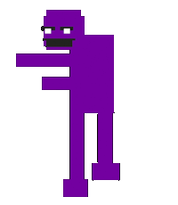
Small fact, the reason Scott's outline is so uneven is to make it look like he's glowing.FNAF (c) Look up
Related content


Comments: 8

They all look different forms of Purpleguy from FNaF World.
Which is the reason why I like the sprites, because they remind me of my favorite character from that game.
I think you did a good job on converting Scott into a Purpleguy like design. And the third one is kinda cue, it looks like he's sleeping imo.
The first one is my favorite though, mainly because it reminds me of my design of Purpleguy.
But other than that, some solid work right here.
👍: 0 ⏩: 1


 (Smile)")

