HOME | DD
 Red-Fallout — Distant Storm

Published: 2006-01-19 05:15:34 +0000 UTC; Views: 283; Favourites: 2; Downloads: 32
Redirect to original
Description
Did this for my spouse. It took me a while to do and I think it came out pretty well. I'm still finding my coloring style, and it's coming out in this picture a bit more finaly. This was done entirely in Photoshop CS2 with a tablet (finaly puting the thing to more decent use). Any suggestions as to helping me out would be appreciated, I'm not entirely pleased with the black outlines, but I'm still trying to figure out do with them too... oh well.Related content


Comments: 10

My technique can be described using a tutorial set up by kawaiiyume ( [link] ).
I used the blur tool on the clouds alot ( using a speckly brush ) and I skipped the extra blending on the water because I liked the more violent feel of it. I also did all of the coloring on layers underneath the linework instead of all one layer like in the tutorial. I find it's faster this way, for me at least. Hope that helps at all!
👍: 0 ⏩: 0

Cool artwork. Really nice. I'd really like to know how do you make such picures)
👍: 0 ⏩: 1
My technique can be described using a tutorial set up by kawaiiyume ( [link] ).
I used the blur tool on the clouds alot ( using a speckly brush ) and I skipped the extra blending on the water because I liked the more violent feel of it. I also did all of the coloring on layers underneath the linework instead of all one layer like in the tutorial. I find it's faster this way, for me at least. Hope that helps at all!
👍: 0 ⏩: 1

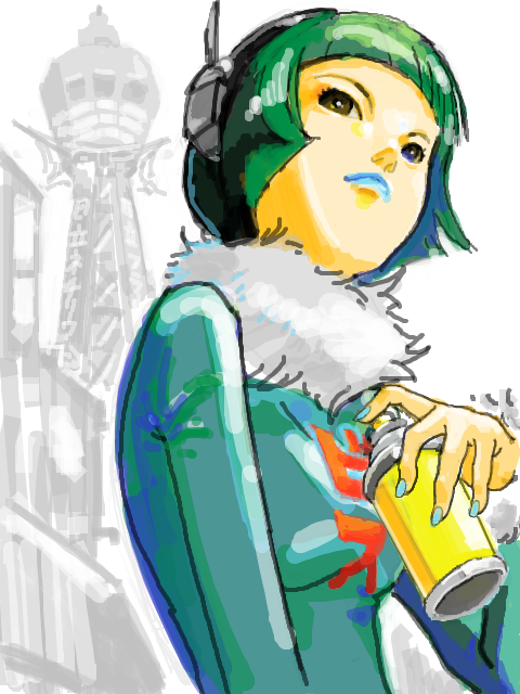
*Heart* the girl and there guy in the middle. (I'm such a sucker for guys with half-open shirts) And that small cloud in the middle of the two large ones? Very nice touch.
I think you're possibly the sweetest, most darling person I know for turning it into a book cover and even finding a book of the right size to gift it to your spouse.
I also actually have no further comments.
👍: 0 ⏩: 1
"I also actually have no further comments." Haha, I like that.
This was my first major background piece, so it makes me happy in that regard, thanks for the compliment!
👍: 0 ⏩: 0

You, my dear, are love. I adore the landscape in the background, it looks so so neat and your shading is fantastic! ^^
The only thing that's striking me as odd is the man in the blue outfit on the far right...
Now, it depends on your intended look, of course...
But I might suggest shifting his nose and mouth down a bit so the chin doesn't seem so large a space on his face? And maybe dropping his shoulders a bit? He looks like he's shrugging them up around his neck (but if you MEANT for him to look like that, never mind anything I say >_>
Awesome job on all of it in general, I really love the hair on the girl, it's so lovely. I can't draw curls to save my life and they look so RIGHT on her! ^^
(and tell your darling spouse I say hello and that I want a picture of you two in the traditional canadian hats I sent you sometime! XD)
 (Wink)")
👍: 0 ⏩: 1
I love those hats!  (Smile)")
👍: 0 ⏩: 0

oh wooow *_* you rock the shadows! i love the background a lot (since i can't do them myself, it's amazing) and the way you colour is cool; i hope you keep it that way. the thing i notice is the way you shadowed the first guy in the front's chin so that it really looks like he's looking up without adding lines. btw, the lines look fine. maybe they bother you because the rest of the picture doesn't have any? i think it looks fine the way it is. it's a nice view... i'm wondering what this is all about; it's cool!
👍: 0 ⏩: 1
Hm, I think you're right. The existing lines bother me because half the picture doesnt have the same lines. I also get the impression that the lines are too thick... maybe I should thin them out in the future? I've toyed around with making a picture with no hard outlines at all, but I didn't like the results (not to mention it takes alot longer to draw).
The subject of the piece is a novel that Nolan is going to write when I finaly get my full-time out-of-college job one of these days. The guy in the middle is under a curse from the semi-sentient pendant around his neck ( he gets pretty messed up as the story progresses), the other two are companions he meets along the way. The picture I gave Nolan actually is book cover size, I added book style text, intro, and author picture, got it professionaly printed, and wrapped it around a book that was the right size. I once heard that doing something like that was good at motivating an author to finish a book, and I think Nolan liked it alot.
Thanks for the comments Mura, and for swinging by!
👍: 0 ⏩: 0