HOME | DD
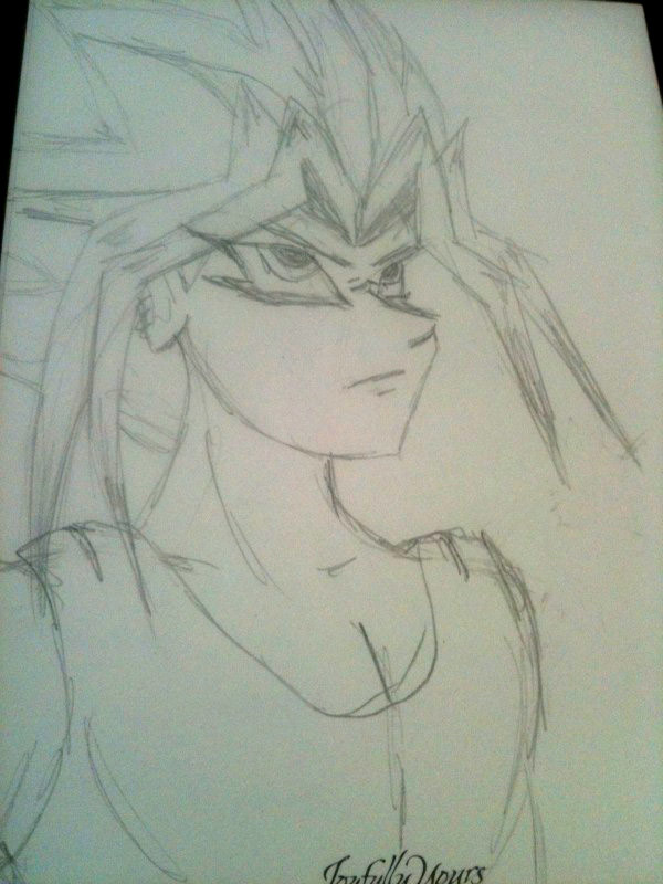
 redconvoy — Atemu
Published: 2013-09-24 16:05:11 +0000 UTC; Views: 609; Favourites: 26; Downloads: 0
Redirect to original
Description
Pharaoh Atemu. Just a pencil sketch I did a while back.Related content


Comments: 21

Overall


Vision
Originality
Technique
Impact
First of all, I'd like to compliment you on your attempt at drawing this angle. It is a very challenging one, for sure.
I usually don't write critiques, but I thought I might as well do give you some pointers.
As for the vision, I can't say much, because it's a sketch and doesn't have any background.
Unlike the other critic, I think this piece deserves originality credits. You don't usually find many pictures of Yami/Atem in this 3/4 upwards faced position and I like the fact you dared to burn your fingers at this angle e.deviantart.net/emoticons/let… " width="15" height="15" alt="
")
As for the technique you used, it's obviously a pencil sketch, so I can't say much about it. But I'd like to give you some pointers on the perspective part of this drawing and some details about the facial features. First, I don't think Yami/Atemu has these deep set eyes. While I appreciate artists' own take on characters, I think your drawing is exaggerated and makes the facial shape out of proportion. Because the eyes are drawn 'too deep', the cheeks are coming off quite unnatural. Related to the same - may I say - problem the nose is exaggerated, too. In this drawing he doesn't have a high nose bridge, but quite a far extended nose. Again, I'd like to emphasize the fact that artists own interpretation and preferences play a role here, I'd like to contribute that this does not look very natural to me. If the drawing was coming off from a more downwards angle, then maybe that would have worked, but then other problems concerning the drawings will come to mind. It seems the angle you choose is just few inches lower than eye-height, if it was meant to extend further then that, you might want to consider drawing the underpart of his chin.
Furthermore, the mouth is situated in the middle of the face, therefore, when drawing these angles, you should take into mind that the mouth starts at the other side of the face and not in the middle of the face. As you can see, his mouth starts just below the end of the hook of the nose, supposedly to be the middle of the face. Therefore, when turned back to front-view, the mouth would have started at the middle of the face, which won't be correct.
As for the facial shape, it's usually considered more manly if they have a more clear jawbone, instead of a round facial shape. But that's of course up to artist's own personal preferences.
As for his bangs, I'd like to add that is usually drawn to frame his face in front view. Therefore, in this angle it normally wouldn't have extended further than the ears, like drawn in your drawing. Since it's supposed to frame his face, the first bang should have come down before reaching the ears (if that makes sense). Also, since it's a 3/4 view, the bangs coming towards us, should have been thicker that the bangs facing away from us. And a small detail on the bangs facing away from us, it's usually drawn more horizontally than the bangs coming towards us. (But again, that might have been done on purpose, to add personal flavor into the drawing).
Last pointer on the clothing. It's supposedly a thin fabric he's wearing if you wearing drawing his usual black hemd. Therefore, it should have been drawn closer to the skin. While it's good to see you added depth by drawing it like this, it could be toned down a little, because now it has a puffy look to it.
I'm not sure how I'm supposed to rate impact, since it's still a sketch, so I'll be giving it a neutral 2.5 star like the vision part.
Aside from all that, a really good shot at this angle. I hope you find the critiques helpful, and note that some of them are, of course, personal preferences, anyways, keep on drawing, I'll be looking forward to them.
👍: 0 ⏩: 1

Thanks. I have to work on my clothing. This was done a year or so ago when I started drawing again. Thanks for the input. ")
👍: 0 ⏩: 0

Overall
Vision
Originality
Technique
Impact
As far as pencil sketches go this is good, decently cleaned up, neat enough that anyone with a brain could tell it's a person, and any Yugioh fan with a brain could tell it's Yami-Yugi/Atem. I'll give a 4 for technique.
Head shape on anime characters is always tricky at that 2/3rds angle but the artist here handled it well. The way the eyebrow extends from the head isn't how the anime was usually drawn but it is more anatomically accurate, so well done on that. His face is well shaped though his pectorals might be a bit large (not that as a female I didn't appreciate that). For the slightly unorthodox facial structure I'll give you a 4 on vision.
Unfortunately, as all Fan art is, this drawing is not original in the slightest. It's a basic sketch of a character that many people have sketched before. Sorry but I can't give more than a 0.5 on originality.
As far as impact goes, my first reaction was "~whistle~ Lookin' good Atem!" like the creeper I am (just kidding). Looking more closely you'll see his brow is furrowed and his shoulders are drawn back, indicating he's preparing for some sort of encounter. Could be that some long time enemy is looking down at him from above, or it could be just a usual moment of over-dramatics by our favorite cheesy Pharaoh. Whatever it is, it looks cool. I'll give a 3.5 for Impact.
👍: 0 ⏩: 1
Thank you for your critique and your honesty
👍: 0 ⏩: 1
Thank you. Sorry this is late
👍: 0 ⏩: 1

That's ok! ^•^ your welcome!
👍: 0 ⏩: 0


 (Smile)")


Excellent work!He kinda looks like Yugi himself.The adult,not the child.
👍: 0 ⏩: 1