HOME | DD
 RedGella — Year walking part2
Published: 2016-01-07 12:24:30 +0000 UTC; Views: 1832; Favourites: 162; Downloads: 22
Redirect to original
Description
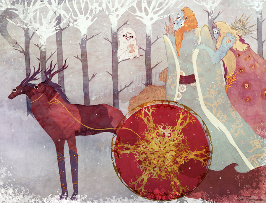
I almost completely changed colors. Just felt for something more like this, could not let it go. It is weird how it works inside. I do not really thing it got better or prettier but it is just what i needed for now...now it is calm inside (Smile)")
I decided to leave the other one here too for now, cause they are so different
Related content


Comments: 18

I like the previous version, but I appreciate this one more.
I think when you changed the colors it helped make the piece cohesive as a whole.
The bottom right has various shades of cool red which stands out from the desaturated colors around them. Very pretty.
👍: 0 ⏩: 0


* ¡Fantástico trabajo! Lo hemos destacado dentro de la carpeta "Featured nº5 o Destacados nº 5" en Special-Groups. (Es la carpeta donde se exhiben los mejores trabajos del grupo).
¡Por favor, queremos ver más trabajos tuyos en el grupo!.
* Fantastic work! Featured in Special-Groups in folder Featured nº 5. (Best works of the group).
Please, We want to see more works in the group of you!.
👍: 0 ⏩: 0

I think you were right to go with these colours in the end, it makes everything stand out, but the other piece is just as valuable to your gallery! Brilliant work, I love your pictures so much, they are so full of character!
👍: 0 ⏩: 1

Glad you liked it. O was in the end satisfied when i changed colors but i will keep the other one too , some days i like the otger one
👍: 0 ⏩: 1
Very wise words indeed!
👍: 0 ⏩: 0

very nice work.
hard to explain, but I find this version more successful in colors... because of the wheel, I think.
👍: 0 ⏩: 1
Thank you. I kind of off like ot too but in some way i like the other one too so i will keep both
👍: 0 ⏩: 0

Wow you have change it a lot! I like the color schee of this one much more, it feels more harmonic for me. Very pleasant for eye. I wanted to say that I do love your art, its so beautiful and full of imagination and its wonderful to see the images of world you create
👍: 0 ⏩: 0

Both versions are gorgeous. The red and gold are stunning. I do like how the colours have changed in this one. As always, I adore your style.
👍: 0 ⏩: 0

I love to wintry colors of this - feels like the start of the year to me.
The first version is more like... night time. Also lovely.
👍: 0 ⏩: 1
I agree it is more wintry, and it was suppose to be when i did pencil drawing. I planned this one as a kind of new year card but than i did not have time to color. so some how some other colors stepped in, but i was not really satisfied until now
👍: 0 ⏩: 1
I'm glad you shared both versions - interesting how the feeling changes with the colors.
👍: 0 ⏩: 0

Beautiful ")
👍: 0 ⏩: 1

But i am glad you like it
👍: 0 ⏩: 1
But that is the thing maybe you should not be such a pinchpenny when it comes to displaying the warm of yours
You say yourself it is mans imperative to please....give love for free, i will say
👍: 0 ⏩: 0