HOME | DD
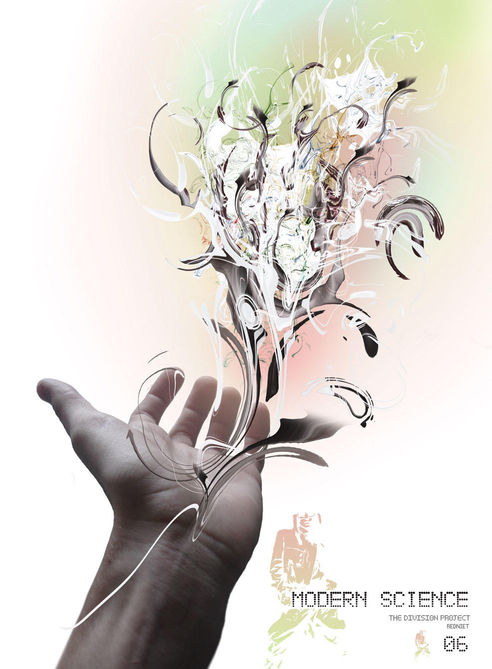
 redniet — bad idea

Published: 2005-03-17 03:18:16 +0000 UTC; Views: 1207; Favourites: 23; Downloads: 362
Redirect to original
Description
just made whatever i thought looked coolphotoshop 7
thanks
Related content


Comments: 56


Damn that I missed this one before. I love it. The face is amazing and the upside down tree with the upside down birds looks great.
👍: 0 ⏩: 0


face and composition is wonderful, not fond of the default custom shapes used though.
👍: 0 ⏩: 0

this is sweet, the colours and the vector work are great...
👍: 0 ⏩: 1

Dig the face thrown in with the composition, very nicely done. Dig the piece...oh yeah, and once again your website is quite tight, I recommend peeps check it out.
👍: 0 ⏩: 1


i love how everything is integrated into the face and the outline of face is flawless nice job.
👍: 0 ⏩: 1


hahaha the bird is upsidedown!
i dont get it, no matter how hard i try i can never make somethign the east bit cool. you however, have the same version of photoshop, and trun out masterpeices! need to practive more
great colros and at firt i didnt see the face
great job on all the lines btw, the roots are perfects
👍: 0 ⏩: 2
ur welcome! sorry for the spelling errors...
👍: 0 ⏩: 0

thanks man!
ya, pratice makes perfect  (Wink)")
👍: 0 ⏩: 0

I love it! You're getting really good at vector art. You blow me away pretty much lol
Over all nice peice. I like the simplicity with the colours and shapes. The spider webs are my favourite part. Nice added touch. However, the only thing I don't like is that face. I don't think it goes with the peice. I know I've tried adding in a face to some of my vectors but I can never get it right. Sometimes they don't seem to fit in with abstracts...
👍: 0 ⏩: 1
o god i know what you mean haha, i had the face in 5 different sizes and places to chooose from, i could never make up my mind if i even wanted it, but i spent so much time desciding if i wanted it just left it there :\ , at first it was really abstract, then i started to add some things that made somewhat sense, so thats another reason i left the face, anyways thanks alot fashion!
👍: 0 ⏩: 0


I like the focal point. Some nice details in there.
👍: 0 ⏩: 1

Lovely. Great composition and use of imagery. Lovely stuff
👍: 0 ⏩: 0

not bad at all. i keep looking at this and can't figure out what to say about this piece. it seems like there is something missing or it could be that something shouldn't be there. AHHHH!! anyway, it is still a great piece, love your style bro......//
👍: 0 ⏩: 1
ya i know what you mean, it was kinda hard posting it, i didnt know if it was done, thanks man
👍: 0 ⏩: 0


WOw thats sweet! I love the simple tone to it too... Kind of feels like the idea's I'm having at the moment..

👍: 0 ⏩: 0

ohh. not bad tho, i dont realli like bg colour, and mayb u coulda done a better job, but the fave looks good in it. (Smile)")
👍: 0 ⏩: 1

It does look cool
👍: 0 ⏩: 1


great shapes. i feel you could have done some better colors though. nice piece.
👍: 0 ⏩: 1
i know what you mean, i ment for it to be b&w tho, thanks man
👍: 0 ⏩: 0

Geeze.... I love it. All of it just mixes into each other. Its so perfect lol. +fav
👍: 0 ⏩: 1

Such graceful simplicity, matched with overwhelming complexity and spacial tension. Beautifully done, bravo.
👍: 0 ⏩: 0

| Next =>