HOME | DD
 RedXen — Contest Submission

Published: 2008-06-23 10:08:13 +0000 UTC; Views: 3213; Favourites: 61; Downloads: 201
Redirect to original
Description
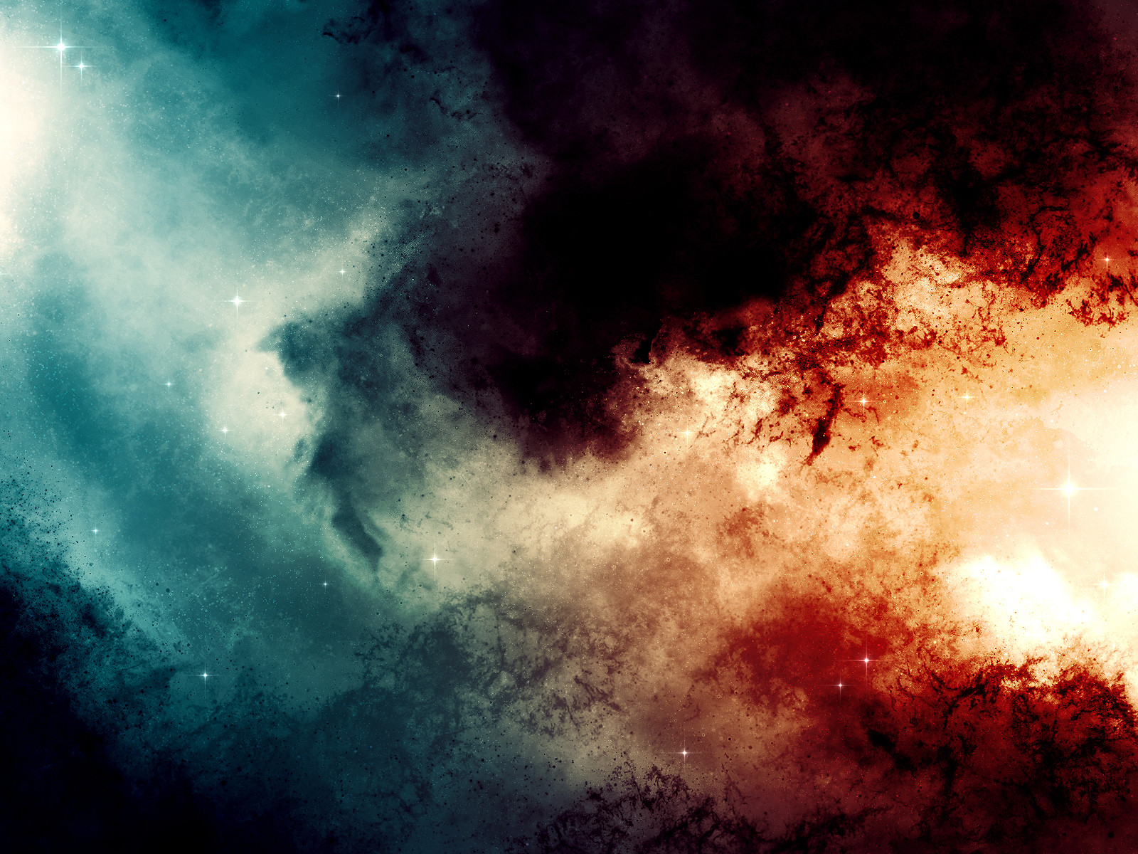
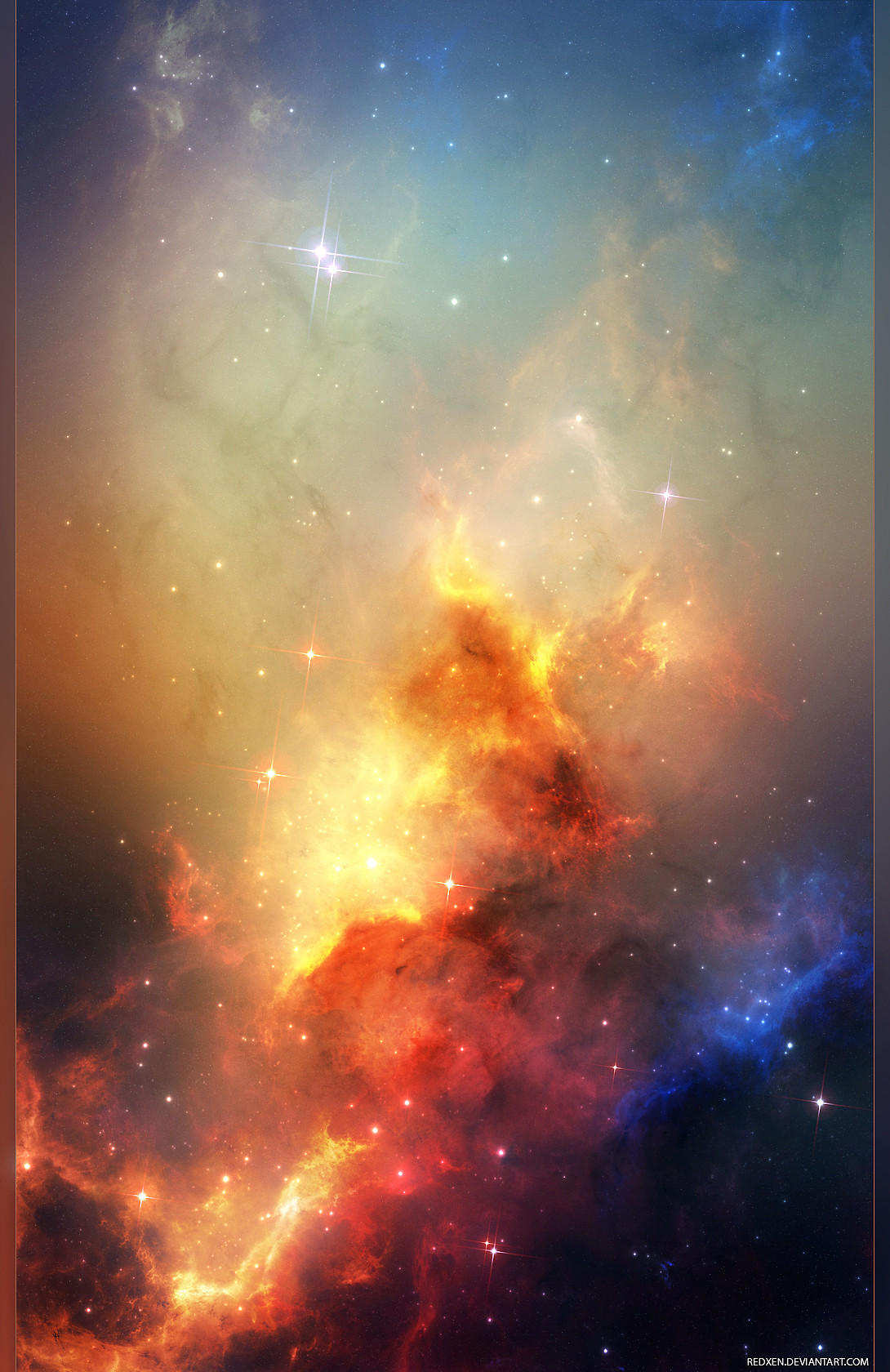
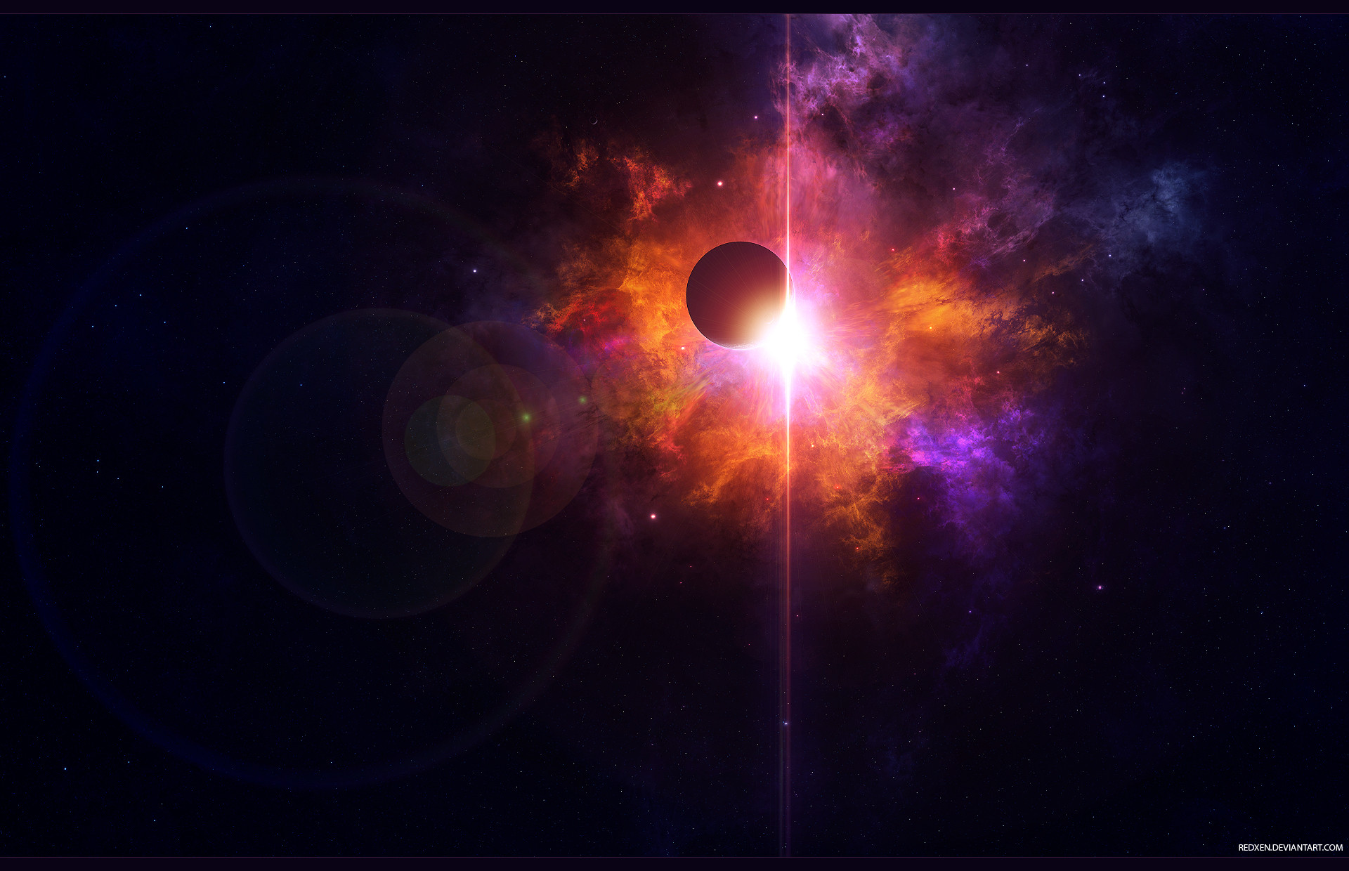
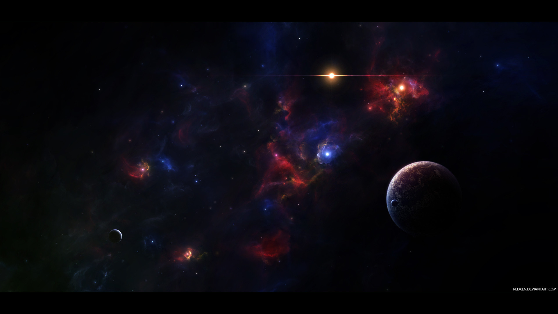
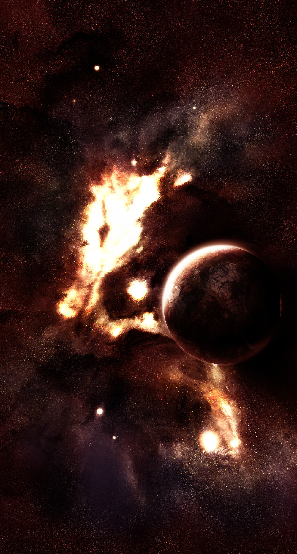
Submission for Phritz's contest. Yeah, I pretty much remade the bottom piece.Finished for now.
Related content


Comments: 10


Holy crap, never mind my submission!! This is frickin beautiful!!! I really hope you win!!
 (Smile)")
👍: 0 ⏩: 0


Stylish! Beautiful nebulae.
Zoomed out looks like underwater thingy.
👍: 0 ⏩: 0

the colors around the moon suck, everything else is so vibrant but then the 8-bit color gradient around the moon at the bottom is horrible
👍: 0 ⏩: 1

Haha are you fucking serious? Nice critiquing.
👍: 0 ⏩: 1
lol that was a while ago, but yes, that gradient is really bad, if you can't see it then calibrate your monitor. That part would look horrible in print. The voice of experience has spoken.
👍: 0 ⏩: 0

Took both of your suggestions and finished it up. Thanks
👍: 0 ⏩: 0

Add some blue color to the clouds at the bottom (the same color as the nebula). Maybe some small stars here and there in the black areas?
Looks good.
👍: 0 ⏩: 0

damn, i like alot man. you definitely have a good eye for composure. all of your pieces are always set up perfectly and the lighting is just spectacular.
on this one i only have two things of critique.
1. throw a sharpen filter on just the planets, the rest looks good for sharpness but the planet could use just a bit more.
2. your star fields need work. they are definitely your weakest point. try randomizing it more, and adding more really bright stars. if you want a more in depth description and explanation just hit me up with a note.
👍: 0 ⏩: 0