HOME | DD
 refa — Follow the communism

Published: 2001-10-29 22:16:03 +0000 UTC; Views: 631; Favourites: 0; Downloads: 60
Redirect to original
Description
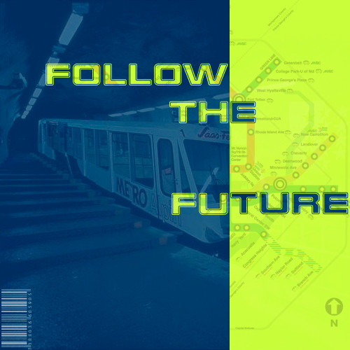
HI! My fourth creation using PS! Forgive me people if you don`t like it but I am beginner so all my pics ain`t look professional! This is a piece of art about the communism time with Lenin! I hope you will like it! Comments are welcom!!Related content


Comments: 12

I would remove the 'CCCP' and put the 'Follow the Communism' centered at the bottom where that last single star is. What do you think?
👍: 0 ⏩: 0

C: taxi, follow that car, er, I meant, follow the communism.
D: that would cost you a little bit extra.
how do you follow communism? A rhetorical question I would like to see answered...
-----
[lomechanik][link]
[homepage][link]
👍: 0 ⏩: 0

simple but with a great message!!
-----
Ed Nunes | sh4vo
[link]
👍: 0 ⏩: 0

yeah...cool work for a beginner...
i agree with pandaguevara: i would center the "follow the communism".
-----
the demon is coming to take ya!
.::AciDemon::. [member of DeviantA doptionProgram]
👍: 0 ⏩: 0

hmm..center the "follow the communism" and you got one good pic
👍: 0 ⏩: 0

it cool man i love he look of the thing ;P
-----
Over and out!
👍: 0 ⏩: 0

Very nice for a newbie. Im still a newbie too As always fits read and white great togheter.
[quote] This is a quote. [/quote]
👍: 0 ⏩: 0

That's not the communism, that's my window! heh, Good job. Maybe one day, you will be da master at Photoshop!
..:: |CodeRebel| ::..
👍: 0 ⏩: 0

Lol.. yeah follow the communism. I know what feeling you tried to achieve here... you need some less saturated (vise ko sivo-crveno) and more variations of the red colours so it looks older. But great work otherwise.
👍: 0 ⏩: 0

It really looks like communistic propaganda! I think it could be a logo of new age communists.. something that is print on leaflets! Clearly arranged and catchy design!
-[ VanNovA ]-
👍: 0 ⏩: 0

Oh, so *that's* where the communism is, over there. Hehe, kidding aside, nice pic. I like it, at least.
Stupid like a fox!
👍: 0 ⏩: 0

Yes you did follow that way !
great mon
Simple but you got the visual powa .
You should try to work with a bit of black cause it fits well that kinda pic (black + white+red= good)
👍: 0 ⏩: 0