HOME | DD
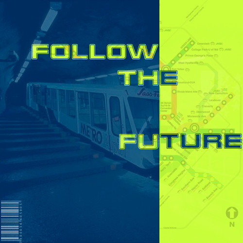
 refa — Follow the future
Published: 2001-11-03 21:39:43 +0000 UTC; Views: 610; Favourites: 0; Downloads: 75
Redirect to original
Description
OK! What to tell you? I was inspired in this moment so I decided make this CD layout! I hope you will like it! I think this is my 6 creation using PhotoShop! Comments are welcome!Thank you
Refa
Related content


Comments: 25

looks intresting but most i liked in "follow the future" the somebody on the wall like some spiderman p.s. thanks for comment
👍: 0 ⏩: 0

in reply to faderhead who is already a revolutionary, since when was public transport corporate mass transit? In conclusion and all honesty it does look like a rail-company's promo. pamphlet (i hope you're not offended - both cd and pamphlet DO have the same end of actually selling their product). keep it up, not bad for a 6th attempt (i'm on the 32nd and struggling...)
-----
[lomechanik][link]
[homepage][link]
👍: 0 ⏩: 0

colors are good. and the design is cool...
what kind of music would be on this cd? the design fit's to electronic sound, not to your music style....imho
-----
the demon is coming to take ya!
.::AciDemon::. [member of DeviantA doptionProgram]
👍: 0 ⏩: 0

I love the green. It's cool. Great mixture of images. And the barcode's fine.
👍: 0 ⏩: 0

that green yellow is too bright... it should probably be a shade of the colors on the left.
👍: 0 ⏩: 0

The metro is very good! How did you drew it? just excellent.
[elbarto] [El Barto] [Kris]
👍: 0 ⏩: 0


hmm i think the yellow might be a bit too bright, the left side is ma FAve! i wish i had time to work on photoshop.. keep workin'
.............::::::............
someday you will ache like i ache
👍: 0 ⏩: 0

I love that design, subway style. Great colors. It´s so darn "new age" design!
[quote] This is a quote. [/quote]
👍: 0 ⏩: 0

you know, man...this is a cool work...looks like some cool stylish tube's map
I like the two main colours...the nicely fit each other...
I also like the text. Great Cd cover!
[just get the rid of the bar code... ]
I LOVE DESTROY --> https://destroy.deviantart.com
👍: 0 ⏩: 0

Woot man!
did some progress d00d
nice composition.
Keep it on and you'll rule my brotha !!!
👍: 0 ⏩: 0

funky colours; but id lose the barcode too
nice work mon ami!
: : e k u d :
:
@deviantmag.com
👍: 0 ⏩: 0

Yea, I agree with the other, about the bright colors. But you got a great idea there. That's great man. Keep it going.
Kwan Studios - Defining creativity - http://www.kwanstudios.com
👍: 0 ⏩: 0

hey yo refa, this is very nice, the green is maybe too bright, i like the idea of the plan combined with the train photo, continuing the paths on the photo would be cool, but if u were really trendy u would have used the London Underground plan cos that is the mother of all plans!
i dont bother about the barcode though, actually i though that was going to be the real life pice tag kinda thing, and not part of the artwork...
👍: 0 ⏩: 0

I dont understand the problem with the barcode... I think it fits. And I think the font with the border also fits that style... it looks really interesting especially with the ´inverted´ part! The colors are perfect.. that blue hue in combination with that acid yellow/green is really eye catching!
The message is fun: ever thought about NOT to follow the future? Hehe.. do you have another possibility?
However: really cool design! I like it!
Good work Refa!
-[ VanNovA ]-
👍: 0 ⏩: 0

the colors r fine... i like the mix of them, catches ur attention, the typo is pretty good too, though I guess the message could be different... but all in all a good job!
---------------------------------------
who?? me??? huh?? me??? D
I dare ya! --> http://screaming.cjb.net
👍: 0 ⏩: 0

I like it very much. I love subways, and the two color combinations you've got is great too. The map in the yellow area is also a very nice touch. The only bad thing I can think of is that you maybe remove the border around the text, but it's not a big deal. Great work overall. Keep it up!
👍: 0 ⏩: 0


i like the whole subway thing the barcode doesnt do it anyjustice but overall nice refa
HEY LOOK OVER THERE A DIVERSION!
👍: 0 ⏩: 0

Actually refa, this is perfect. Don´t listen to the other fools. The barcode may be overused but it looks pretty fitting here. A subway is a method of corporate mass transit and therefore the barcode is cool, imnsho. The colors could be chosen differently but those colors will catch attention. My only problem is with the message. What does follow the future mean? And what does the subway and the map have to do with it?
- faderhead
btw, I love how you continued the map inside the type!
👍: 0 ⏩: 0

pretty cool..different colors which is always good..nice lil designs in the yellow part..not sure about the bar code..i guess it can stay =] nice job
.·:·.shr00m.latest. https://www.deviantart.com/deviation.php? id=92787.·:·.
👍: 0 ⏩: 0

i like the colors .. nice and bright but not too bright and the backgrounds used .. fits nicely together
👍: 0 ⏩: 0

i like the barcode... so NYA!!!
i like the blue also... but the yellow seems too greenish to me... maybe... errr... i'm not a color expert... nm... ;P
good stuffs
kol-be(wirewolf)
👍: 0 ⏩: 0

Green's too bright. 0.o
http://dijitalgirl.net
DijitalgirlDotNet
👍: 0 ⏩: 0

bar...code..overused...
But besides that I really like how you combine the map and the picture, good work.
| Mage is feeling devious |
👍: 0 ⏩: 0