HOME | DD
 ReiQuintero — inner Peace

Published: 2012-04-25 07:54:22 +0000 UTC; Views: 8810; Favourites: 274; Downloads: 215
Redirect to original
Description
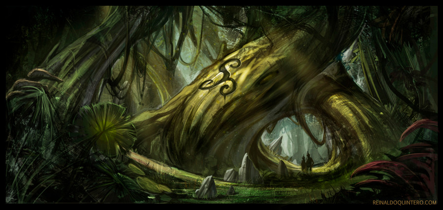
Quick test.My first attempt to a more stylized style , trying new things. I check how it plays with a character.
need to practice more this style.
Related content


Comments: 22


Power to you for trailblazing into the unknown!
👍: 0 ⏩: 0

This is amazing!! Can't wait for you to try this style out more!!
👍: 0 ⏩: 0

esta bueno pero no me convence la textura, como que satura mucho al trabajo, solo es mi opinion, no se cual era la idea...
👍: 0 ⏩: 0

I like this style. Very Wile E Coyote, but with an Edge to it that's more contemporary.
👍: 0 ⏩: 0

I really like this style, reminds me a bit of "the secret of kells". I just don't know about this rough look with these particles. Looks like it has been dry-brushed. I suppose both, the clean and the rough look work. It's ultimately a question of taste
 (Wink)")
👍: 0 ⏩: 0

I can dig it. Very streamlined. I can see where you're trying to find a better economy of shape and rendering though. Keep at it. I want to see more.
👍: 0 ⏩: 0

Nice, the pointillism gives it a nice airbrushed kind of feel.
It feels like almost like graffiti art if a talented graffiti artist had more time to actually paint something more detailed.
👍: 0 ⏩: 0


Mm, well aside from the slightly grainy texture I think it works fairly well.
👍: 0 ⏩: 0

I like the style. I think the pointillation (spl?) needs to be lighter in the background and bolder in t he foreground to maintain depth, otherwise it flattens the image.
Really interesting look, though.
Somehow t he woman looks likea giant, I think it's the trees in relation to everything there.
👍: 0 ⏩: 1

I was just testing didn't think much of composition or scales jee, just wanted to see the result, but you're right
👍: 0 ⏩: 1
I think it has potential. So the experiment is a success in my eyes.
👍: 0 ⏩: 0

It needs two more things to be added. The Roadrunner and Wile Coyote : D
👍: 0 ⏩: 1

Would be interesting to see a Reiq version of the Roadrunner and Wile E...
")
👍: 0 ⏩: 0

whoa feels pastelly when I see this stuff. and the background feels mellow dude awesome stuff!
👍: 0 ⏩: 0

It's a pretty neat design, kind of cartoonish if you don't mind me saying it.
👍: 0 ⏩: 1
")
I wish people wouldn't use the term "cartoonish" as a negative criticism.
👍: 0 ⏩: 1