HOME | DD
 renopocalypse — Descend
Published: 2013-03-02 19:39:02 +0000 UTC; Views: 688; Favourites: 24; Downloads: 0
Redirect to original
Description
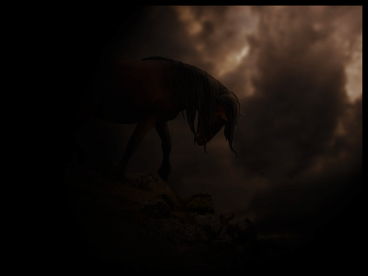
CommentsI've been working on this for a few days. Finally, something that I actually made without it being an order!
")
Well, I got a new computer, which makes it a LOT easier to make graphics. On my last one it was hard to see and it was an awkward setup. So I hope it shows in this newest piece that I am improving
 (Smile)")
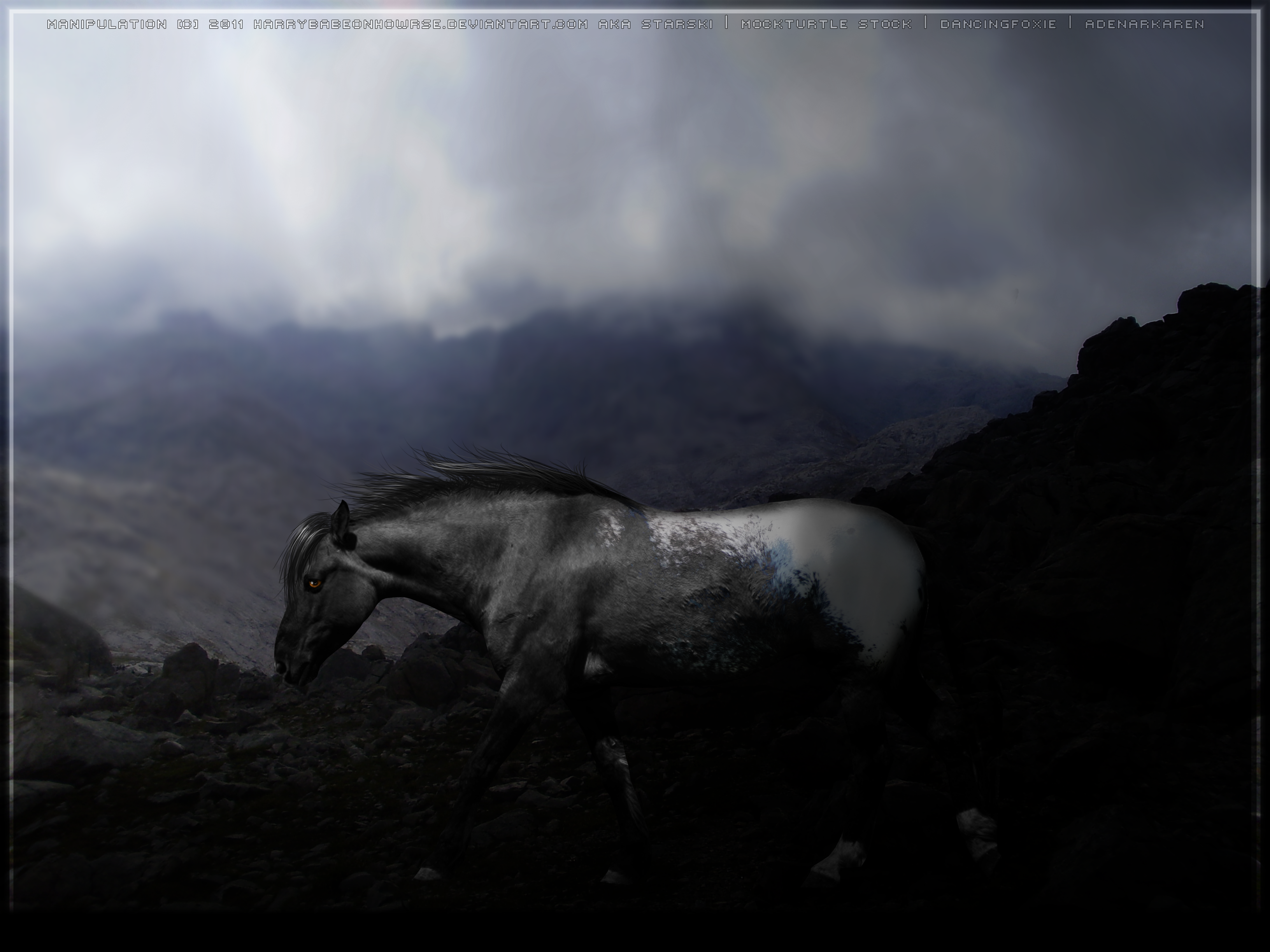
Credits
Related content


Comments: 5


I really appreciate it!
👍: 0 ⏩: 0

This is a very lovely piece!
For my personal taste it is a bit too dark ( I would have put the contrast and stuff a bit up, but that's just me ")
It is very atmospheric anyway and you chose awesome stock.
I probably would never have gotten the idea to use the horse that way!

👍: 0 ⏩: 1
Thanks a lot for the critique! You always give the best critiques!
Well, I wasn't sure if it was too dark because I just got a new monitor and it may be different than my laptop.
I was afraid in may be off. D:
👍: 0 ⏩: 1
Nah, I guess that it depends on the brightness of the monitor then. Mine is bad (it's from 2004 or something xD) so it might be affecting my visual experience. Doesn't matter anyways
I am glad that you consider my critiques good
Though I always think that I criticise too harshly and am too subjective as I don't have this "art-teacher-professional-sight" ^^
But I don't think that it is off that much and could surely be "intended"; it was just my personal view on the manip as I especially like those who reveal about 3/4 of the horses body  (Wink)")
But that doesn't mean that the picture is bad; not at all


👍: 0 ⏩: 0