HOME | DD
 reversenorm — Boarding The Ship
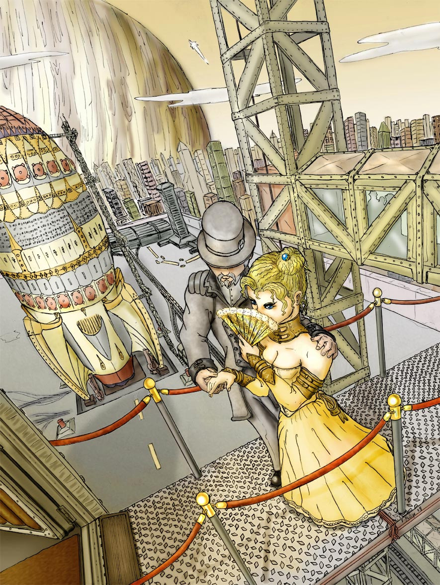
#classy #ink #modern #perspective #punk #rocket #rocketship #ship #space #spaceship #steam #titanic #vacation #victorian
Published: 2008-05-18 03:24:29 +0000 UTC; Views: 5462; Favourites: 25; Downloads: 49
Redirect to original
Description
Alright I had a lot of fun working this one out. This is a throwback to an old image I did called Ballroom ship, well this is the same universe but much better drawn and I had a blast revisiting the old idea. Also Yellow is cool.Related content


Comments: 5

I enjoy the feel of this image. The Retro-future vibe of it all. Though I have to question the bit of "over complicating" of the ship in the distance, a bit too many "fiddly bits" seem to mess it up. Mostly in that middle grey band. But that's just nit pickery.
 (Smile)")
👍: 0 ⏩: 0

I very much like the way you've used the colour yellow to bring out a warm feel to the whole piece, but the background kinda...i dunno..
Don't get me wrong, it looks like the whole thing is in another dimension and that idea comes out excellently, but still....
The framework, the glass and the texture also look fantastic.
One suggestion i'd like to make though, is to put a bit more stronger highlights to the thing. The hair, for instance, and the metal on the rail thing.
[Phew getting to be a long comment, but...]
One other thing that i feel strongly about and have learnt through experience is that one needs too have powerful strokes. I used to have really weak strokes and my teacher always chided me for it.
What i mean by that is, the strength of the shades weakens as distance increases: that is a part of perspective. In this piece, the background has near perfect shading, but the main character, the dude and lady do not because the strokes are merged too much. I hope u understand what im tryin to say.
Even so, the picture still looks good.
👍: 0 ⏩: 1

Great feed back. I was planning on going back in and doing stronger highlights, and I like the idea of paying attention to the stroke quality on the main characters.
Thanks
👍: 0 ⏩: 1
