HOME | DD
 Rewd — Forgotten Demon
Published: 2007-09-14 22:53:56 +0000 UTC; Views: 75; Favourites: 0; Downloads: 2
Redirect to original
Description
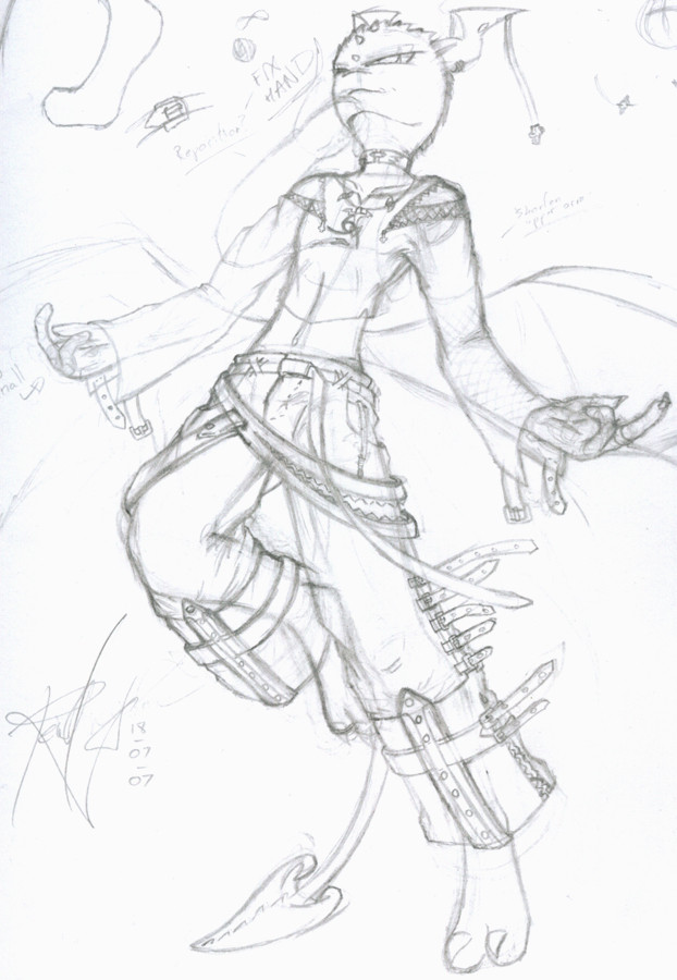
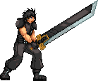
It's not as evil looking as I'd set out to make it..maybe that's why I lost the will to continue...well, there y'go, this is the last thing I'm uploading tonight.Nothing much to say about this, aspects I still like, things I hate, overall, the image is very blargh to me.
As such, I doubt I'll ever finish this either, so, much like Itachi, it winds up in the scraps. Oh, it's title also comes from that, with hints at me thinking it's lost the demo feel about it that I originally wanted.
Right, well, now that really is it, time to go yell my last few objections, then whip up a new ID.
Related content


Comments: 4

.... I'm not sure why, but I think the anatomy's out a bit, which is probably what's throwing the image. The chest seems a little small, or a little too far in for the neck and the arm. Maybe also the angle for the front of the jeans to how the bending leg is positioned. Y'know, the sorts of things that can be easily readjusted on computer.
That doesn't mean its a bad image, though, and I think this one would be awesome finished. The way the head looks down like we're all human scum is great.
 (Wink)")
")
👍: 0 ⏩: 1

Anatomy is shot in alot of places, the bicep areas bug me to no end, as to the shoulders..so, that general area has my most "blargh"ness. But, as you said, they's all fixable on a computer, you drag chunks of the line art around, and make your digital lines fit the new set up, piece of cake.
As I said though, the image just doesn't feel right to me anymore, but I may redo it, since the head seems to have retained the look it was supposed to. Was going for that general, arms out, almost inviting a free punch. A "you think you're a challenge?" sorta look.
...higher powers are arrogant bastards.
👍: 0 ⏩: 0

I saw dat one before everyone else!
I still like it and love the shirt design. It's really not as bad as you think it is, but we're our own worst critics.
👍: 0 ⏩: 1
The design on the shirt may come back, it's a very simple use of the ol' 666, fashioned into a logo so to speak.
I'm just not happy with alot of the image, not for "oh this looks crap" reasons, (though there are bits that make me think that), it's just not the image I'd intended it to be. I've no drive to want to finish it when it's not what I wanted. I may try redo'ing it at some point, but it's on hold regardless.
👍: 0 ⏩: 0