HOME | DD
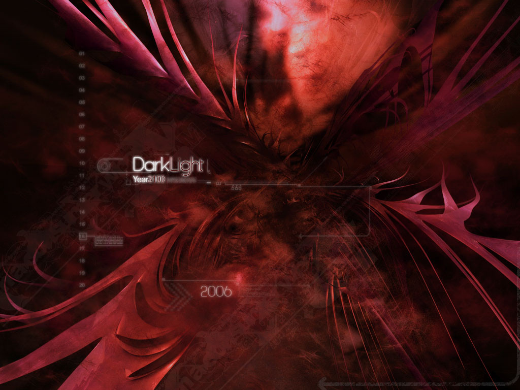
 reWolution — DarkLight
Published: 2006-01-31 10:45:46 +0000 UTC; Views: 1653; Favourites: 11; Downloads: 301
Redirect to original
Description
this is my first wp where i have done the best part whit ps")
thx to (PAULW [link] ) for his ps brushes
 (Smile)")
done whit c4d & ps.
Related content


Comments: 48

wow sweet.....and just happens to be my user name lol...awsome werk!!!!!!
👍: 0 ⏩: 0


thx
👍: 0 ⏩: 0


This reminds me of...angel wings ^_^ deserves a
👍: 0 ⏩: 0

There's something oddly organic over this pic, like it's a cyborg with iron feathered wings and a big, red hear that's beating. Like it

👍: 0 ⏩: 1
u find the right words to discriple wp's ")
👍: 0 ⏩: 1
U:r welcome ! Enjoy your weeken

👍: 0 ⏩: 0


ihan siisti työ, lisää vähän väriä niin pienimmätkin teksturiit erottuvat.
👍: 0 ⏩: 1
nii totta, onhan toi vähäsen yksvärinen
👍: 0 ⏩: 1
heitäppä maili osottees niin näytän mitä tarkotan... omani on masa86@gmail.com
👍: 0 ⏩: 1
he, totta vähä elosamman näkönen tollee. Mut se on aina vaikee päättää se oikee versio työst
👍: 0 ⏩: 1
juu se on kyllä totta, postaan sen takia muutaman eri version työstä daahan ja annan katsojan päättää mikä niistä on paras
👍: 0 ⏩: 1

It's a great use of red, I like it alot. I see people have told you this already, I'm sorry for repeating it, but the text needs to be more clear, perhaps a little larger in size as well. It's really great, keep up the nice work!
👍: 0 ⏩: 1
thx mate
👍: 0 ⏩: 0


very nicely done indeed! enjoyed this at full view... thanks for showing it
👍: 0 ⏩: 1

looks pretty good the only thing i would have to say constuctive is the middle text is a bit fuzzy and a bit hard to read other than that nice job
👍: 0 ⏩: 1
i think you mean the small text, "year 3100"
👍: 0 ⏩: 1

Oooh very nice, I like it alot, great design and smoothness, cool colors too!
👍: 0 ⏩: 1

awesome , nice man , love ur brushing x) . teach me some !!!!
👍: 0 ⏩: 1
he thanks for comment
👍: 0 ⏩: 1
oh ")
👍: 0 ⏩: 1
[link] <- here u go and "download to desktop and open it whit photoshop
👍: 0 ⏩: 1

thanks
👍: 0 ⏩: 0

thanks i think
👍: 0 ⏩: 0

Great work! The only flaws I can pick out are that the box around the sixteen needs to be centered a bit more (looks iffy when it's to one side, like that), and what ~OutbreakDesigns mentioned about sharpening the "3100" and "Light".
Other than that, it's an amazing job. It's a superb render, complimented with extensive brushing. Keep it up, mate.
👍: 0 ⏩: 1
thanks man
👍: 0 ⏩: 1
You're most welcome. Glad to be of help.
👍: 0 ⏩: 0

great! one of best yo works! voin kirjottaa kyl suomeks jos et ymmärrä että yks hienoimpii sun töit!
also visited my site: [link]
-Fo sho
👍: 0 ⏩: 1
thx man!, voin kyl puhuu suomeks et ymmärrät ton, eli kiitti
👍: 0 ⏩: 0

Great job man! Awesome render and brushwork!
Only problem is the text style of 'Light' and '3100'. Needs to be crisp.
👍: 0 ⏩: 1
thanks realy, nice to hear that somebody likes
👍: 0 ⏩: 0