HOME | DD
 richardanthony — untitled1
Published: 2007-08-23 17:27:22 +0000 UTC; Views: 1397; Favourites: 50; Downloads: 44
Redirect to original
Description
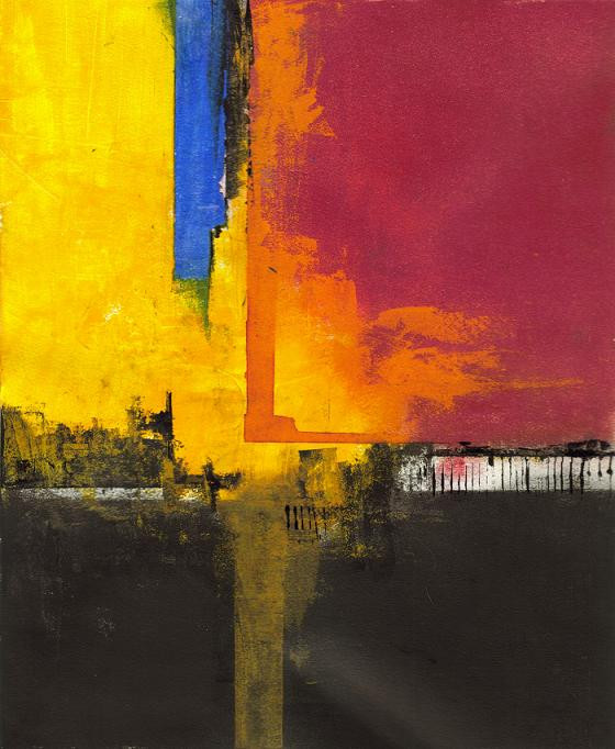
acrylic and oilusually, I dont use the primary color scheme. I wanted to see how it would look though.
Related content


Comments: 14


Acrylic and oil.. you're doomed to Leonardo Da Vinci's fate - crumbling artworks in 100 years
I like it. It's simple and interesting, the colour scheme works really well.

👍: 0 ⏩: 1

ya. I really dont give a fuck.
👍: 0 ⏩: 1

Ouchies... why the harsh language?
👍: 0 ⏩: 0


 (Smile)")

Great piece, I love how it looks.
I realize this is an abstract piece, but have you ever thought about integrating figures into your works?
The way this is laid out, it reminds me very much of the work of Ian Francis. From this one piece I could see your work going his direction.
Ian Francis
check his work out, I think you may like it.
👍: 0 ⏩: 1
wow. I did check that out and I really do like his work. For me though, I dont want people to be too distracted by anything like that. I want people to pay more attention to the colors and the strokes.
Thank you very much for the comment.
👍: 0 ⏩: 1

I see things in your latest paintings...
and I really like this one, it's a beauty
👍: 0 ⏩: 0

I like both of these pieces, added both to my favorites.
👍: 0 ⏩: 1
thanks for the favorites.
👍: 0 ⏩: 0

The primary color scheme works well in this piece.
👍: 0 ⏩: 0