HOME | DD
 rika-dono — Coloring Practice
Published: 2014-02-02 16:23:10 +0000 UTC; Views: 8514; Favourites: 434; Downloads: 0
Redirect to original
Description
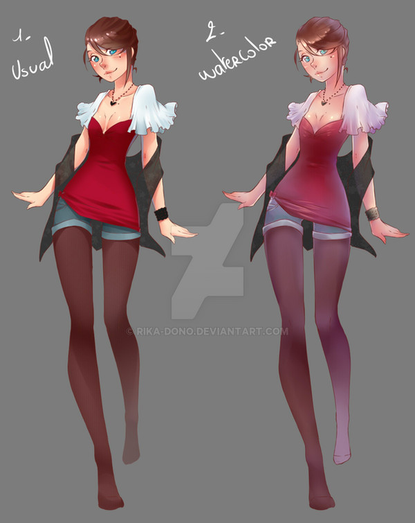
It's for illustration not designs (Smile)")
I've read your comments and I think n°2 is better for what I want to do
Time for usual coloring : about 30minutes
Time for watercolor : about 45minutes
process for both : youtu.be/mgvn2PPb4Wc
Related content


Comments: 47

They are both beautiful, with their own uniqueness. Your usual is well defined and vibrant in color. Your watercolor is more blended and realistic.
👍: 0 ⏩: 0


Definitely digging the 2nd one. More variation in hue to appreciate and draw your eye in, keep you looking.
👍: 0 ⏩: 0

")

")

I love both of them! Though I think the watercolor looks super nice! Gives it a different look~ But I love your usual style... Confliction!! >_<
👍: 0 ⏩: 0


beautiful character
Water color ^_^ but i preffer the face of usual version
👍: 0 ⏩: 0


I like number 2'better! But they're both so amazing so either way it's a win-win situation!!
👍: 0 ⏩: 0

I deifinitely love the 2nd one. It just looks really good and I can't help but just fall in love with it. Of course I love all your art but I really like the 2nd coloring.
👍: 0 ⏩: 0


I think the watercolor version looks more dimensional and defined on the skin and hair...
And the usual colors are sharp and vivid on the clothes...
Not sure it'd be possible or would even look good, but maybe splice the two? /:3c
👍: 0 ⏩: 0


They're both very nice, but I feel number one "pops" more. But one look at my gallery and it will probably become very clear that I tend to go for a lot of colors <.<
👍: 0 ⏩: 0

I'd say 1 for clothing designs, and basic drawings, but 2 for more complex pictures definitely. Both are great.
👍: 0 ⏩: 0

I like them both it's hard to decide...>.> I do really like how your usual style pops more than the watercolor. But the watercolor is pretty too..
👍: 0 ⏩: 0


I agree. For simple designs, I personally would go with number one, as it shows the base color better than number two, but for more complicated illustrations, I would go for number two. It has a more soft look to it, and I think it also makes the drawing look a lot prettier with the blended in purples. But it's your decision, so do whichever you're more fond of, and the one you have the most fun with.
👍: 0 ⏩: 0

I say offer both, but maybe more for the watercolour cause it took more time ^^
👍: 0 ⏩: 0


Usual is better but watercolor is beautiful as well
👍: 0 ⏩: 0


1) Looks great for designs and any picture with a bright, happy, energetic feel.
2) Looks great for realistic images and gives off a calm, quiet feel
Both are good, and I think you should use them for different circumstances.
👍: 0 ⏩: 0


I think both look amazing, but I personally prefer number 2. c:
👍: 0 ⏩: 0

2 is probably better as for illustrations rather than designs, though 1 is better for things like clothing designs and such due to more vibrant colors c:
👍: 0 ⏩: 0

2 Two shows that you're trying thingsand experimenting which is the only true way to grow an artist.
👍: 0 ⏩: 0


Water color definitely has a more dreamy and angelic appeal to it, but either way, they both look fantastic
👍: 0 ⏩: 0


Number 1 has truer colors, which is nice for designs.
👍: 0 ⏩: 0


The watercolor one looks both more refined and sketchy at the same time, and I like the palette more there, but I'm also inclined to the 'usual' one because it has a better base substance...so I dunno. If you can give the watercolor style more substance, like in this example the midline and darker parts get darker, richer color, then go for that.
Just my 2 cents.
👍: 0 ⏩: 1

Actually it's my first time doing the watercolor style so I still need to work on it ><
👍: 0 ⏩: 1
Practice makes perfect.
But yeah, everything is perfect, and this is just my opinion. Your style should be what you like to ude and, feel good using and developing.
👍: 0 ⏩: 2
*Isn't perfect **use
Gawd my spelling sucks atm...
👍: 0 ⏩: 0


Both are nice but.. second one is somehow cooler (wut)
👍: 0 ⏩: 0

