HOME | DD
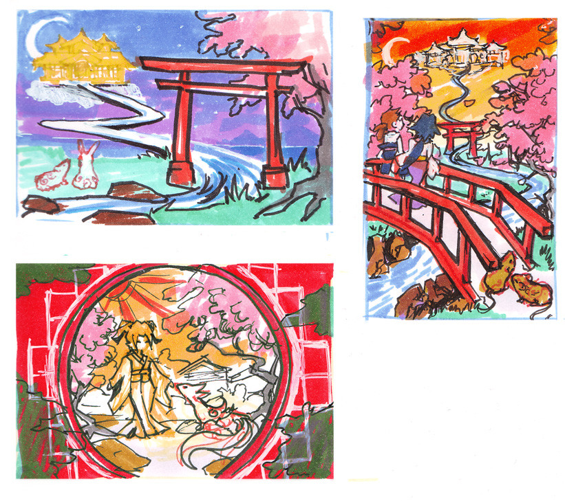
 Risachantag — Okami contest concepts
Published: 2008-04-20 10:53:27 +0000 UTC; Views: 13280; Favourites: 359; Downloads: 158
Redirect to original
Description
Colour thumbnails of some ideas for entries for the Okami contest. (damn you DA, two contests I really want to enter with deadlines within a week of each other!)I'm still deciding which one to work on, so I'd be happy to hear what people like the most!
Tools: Tria & Copic markers on marker paper
Related content


Comments: 80


I luv the style~ i always wanted to have a simple style like that but I can never achieve it b/c im such a detailed and solid colouring style ugh >.< lol = P I luv the top left, and bottom one, very nice ^^
👍: 0 ⏩: 0

ah they're all so pretty
and they're just thumbnails
*sigh
so much talent
👍: 0 ⏩: 0

lol, yeah about the spelling comments, we also spell it "colour" is South Africa too, ^.^ (Guess its got to do with the fact that it was the Dutch and English that settled here first but I'm no historian ^.^")
👍: 0 ⏩: 0

I like the one on the top right (Smile)")
👍: 0 ⏩: 0

Those are soooo awesome!! I love the scenery so much
")
👍: 0 ⏩: 0

you spell colour with a "u"! I dont know why Im so excited about it, but I hate how teachers mark that wrong.
Im glad that you made the girl bending over the fox. It adds more interest!
👍: 0 ⏩: 1

Oh, it's spelled 'colour' in Australia, where I live, as well as in the UK and New Zealand. It's pretty much just America that spells it 'color'.
👍: 0 ⏩: 2


And Norwegians, or at least me is lazy and spells it color.
👍: 0 ⏩: 0


yeah Keyhole or the Bridge FTW!
The keyhole style is my personal fav.
👍: 0 ⏩: 0

they are all brilliant, but if I had to choose one it would be the one on the right, the composition really draws the eye all over the piece with the use of the shrine and the bride, and the splash of pink in the trees really complements the rest of the picture. It feels very full, very alive, a lot of natural elements, and very little 'empty' space, goes well with the really vibrant and full dynamic of the game.
👍: 0 ⏩: 0


those are some nice colors!
and the buildings and backgrounds are amazing!
👍: 0 ⏩: 0

They're all so beautiful!
I think the bottom left one looks the best.
👍: 0 ⏩: 0

I'm a little torn between the bridge and the one with the circle. But I'm gonna have to go with the one with the circle.
Shawn
👍: 0 ⏩: 0

I'd say the one on the bottem left! But they're all really good!
👍: 0 ⏩: 0

They all look great to be honest. ...I'd have to say bottom left is my choice.
👍: 0 ⏩: 0


")

Bottom one!!! It's awesome. I love the creature--it's so cute!!! Though in the rough sketch I'm finding it hard to figure out what it is... It looks like a two-tailed cat.

👍: 0 ⏩: 0


I think the one with the birdge or the one on the bottom, leaning more towards the bottom.
👍: 0 ⏩: 0

I like the one on the bottom left. It's simple, yet still appears to portray the style of the game.
👍: 0 ⏩: 0

I like the one on the top right... but all of them look amazing! i wish i could do that!
👍: 0 ⏩: 0

Top left is really simple, I love it. I also like the bottom one, but I think my favorite is the top-right, it's just so pretty!
👍: 0 ⏩: 0

Those are absolutely precious! I personally like the one on the bottom and the one on the top right the best...OwO
👍: 0 ⏩: 0

these are gorgeous but my favourite is the two stood on the bridge
👍: 0 ⏩: 0

I love the one in the top left. It's beautiful so far.
👍: 0 ⏩: 0

the one in the botton or the one in the right will be just fine ^^
👍: 0 ⏩: 0


really amazing concepts, try and combine them.
but my fav is the one on the far right.
👍: 0 ⏩: 0

i like the bottom letf one a lot but i love the idea of the top left one ^^
👍: 0 ⏩: 0

the top two ! something about the floating building makes those two work best for me.
👍: 0 ⏩: 0

hmm I think the one on the right is the best. It flows nicely and has good contrast.
👍: 0 ⏩: 0

out of all these very pretty concepts, i like the concept of the top one the best but the one on the right has the best colors i think.
👍: 0 ⏩: 0


The bottom one fits the current style of the game the best - the use of the circular border goes back to the sun symbolism present in the game. I like that one the best, because it's the most pleasing to the eye. Can't wait to see your finished entry!
👍: 0 ⏩: 0

The bottom one has a lot of potential, but so does the one on the right. The top left is too simplistic, seems to be lacking something. I'd go with the bottom left.
👍: 0 ⏩: 0

Wow, I like them all! But I like the upper left hand corner the best. :]
👍: 0 ⏩: 0

I love the colors in top, but the one on the right has a very nice design.
👍: 0 ⏩: 0


I really like the bottom left one the most. Very nice job on all three, though ^^
👍: 0 ⏩: 0
| Next =>