HOME | DD
 ritabuuk — Controlled Power 2.0

Published: 2011-06-05 20:35:42 +0000 UTC; Views: 1283; Favourites: 40; Downloads: 11
Redirect to original
Description
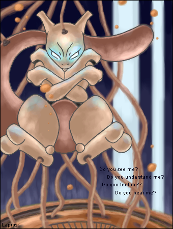
Now I fully perceive my power. But what is my purpose?I decided to redo my drawing Controlled Power from 2004 for the So I Herd u Liek Progress contest (the goal being to redraw an older piece of fanart to see how much you have improved). I missed the deadline for the official contest, but I still get the prize of seeing how much I have improved. The original version of Controlled Power is one of my most popular submissions to deviantArt, but it is so old. I can do this much better now.
Comparison: [link]
Media: Pencil Sketch, Derwent Colored Pencils, Eraser, Tortillion
Begun: May 29, 2011
Completed: June 5, 2011
Critique is always greatly appreciated!
Related content


Comments: 14


great work here! i'm not familiar with pokemon, but still i want to give you some general critics.
first, i really like your composition and your general lineart. the proportions look great, everything fits together, your lines are consistent in their thickness and the curves look just right. you evenaccomplished to add some mimic in his face. also, i like the way you melt the colours into each other - how smooth you got them as well as how you added mirrored colours (i don't know how to describe that in a better way) like when you added the purple of the tail in his upper thights, for example.
still, when i look at the piece, the first thing i notice is the floor on which the light reflects (which is great, by the way). To get the viewer to look at the pokemon first, i would suggest using brighter colours in the fire (leave more white! i think smudging here might be the problem, it makes the colours look a bit dirty) and if i'm right and the pokemon is partly metal-ish, it would reflect the light more (like the floor does). i also would suggest a brighter red for the cables/wires you have here. one last thing, then i'm done (Wink)")
other than that, a really really good piece, keep up the great work!
(sorry for my english by the way, i'm not a native speaker)
👍: 0 ⏩: 1

Thank you for your critique (and I am sorry for the late reply 
I definitely agree with all your points, especially about needing more space on the top and the left. Wow, I hadn't noticed that at all, and now that you have pointed it out, it is suddenly glaring.
Your comment makes sense, no worries.  (Smile)")
👍: 0 ⏩: 0

First of all I have to apoligize my English, I'm not a native speaker
I admit I'm not that familiar with Pokemon, but I do have family member who's a fan. And I do like Mewtwo
Smooth work with your chosen technique. I like how you've made the blue fire, there's something dreamlike about it. I also like how you done those metal parts, especially how you've created that texture (= metal looks like metal
I checked out the comparison link and I must say you have improved tons 
A little critique
Overall I think you done great work with this one, it's not that simple to manage with pencils, which you did great with. To me it seems you do know what you are doing when you start to draw a picture

")
👍: 0 ⏩: 1
You make sense, and your advice about the wires seems like a great idea. Thank you!
👍: 0 ⏩: 1
No problem, I'm glad I could help
👍: 0 ⏩: 0


luv the medium, so effective for this! Mewtwo is my all time fav Pokemon
👍: 0 ⏩: 0

Well, well.
Someone just re-defined the word "kickass".
👍: 0 ⏩: 1

Amazing improvement. (: But personally I think the first one was pretty well-done, too!
Love the tangle of wires. So striking. I also like the dark lighting.
Nicely done!
👍: 0 ⏩: 1
Thanks! When I started sketching this, one of my thoughts was, "This time, there will be a lot more wires!"
")
👍: 0 ⏩: 0