HOME | DD
 roach2018 — Brainteaser I-face
Published: 2001-07-22 08:05:18 +0000 UTC; Views: 358; Favourites: 2; Downloads: 83
Redirect to original
Description
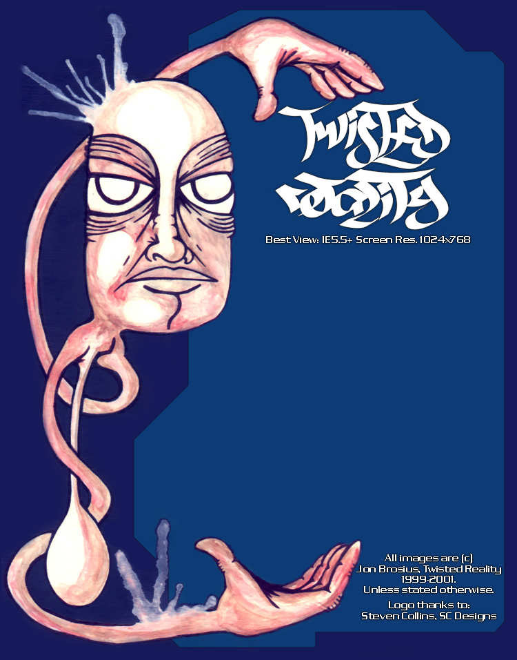
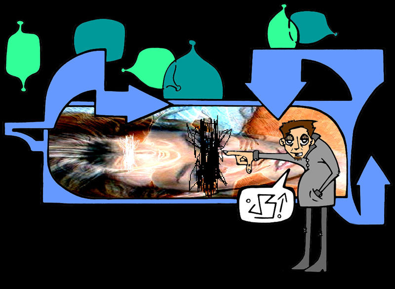
well well! i have been working alot on this design... it might not look like much but it took me many hours to get this to look just the way i wanted... i originally painted the whole i-face with acrylics on paper... but when i scanned the painting i was disapointed with how it turned out... lines didnt look as straight as they needed to be and other small things as well... so from there i erased the whole back ground and decided to keep the main figure and just slowly decide how the rest should be... i didnt wanna over do it... thats why it seems simple... but effective i think... the logo is one a friend of mine did and said i can use... thanks steve! also the blank area is where all the text goes... it looks way better in action...[link]
comments please!
Related content


Comments: 4

beautiful acrylic work on the figure and the colours compliment it perfectly. this really kicks ass dude.
BTW, i rarely rate, but this deserves it!
-[ke1th]-[keith]-[keef]-
👍: 0 ⏩: 0

nice i-face only it's to high.
-- Dredwerk
MSN IM: Dredwerk
ICQ: 117924921
AIM : dredwerk123
Your bound to catch me sometime!!
👍: 0 ⏩: 0

Hahahaha..This is cool shit..Awesome job.
.·:·.shr00m.·:·.
👍: 0 ⏩: 0

i like this for me i think the hands should be elongated to the end of the page but thats just me
strange little character you have there
👍: 0 ⏩: 0