HOME | DD
 rob-louw — OS Minimal v2
by-nc-sa
rob-louw — OS Minimal v2
by-nc-sa

Published: 2005-07-02 12:21:03 +0000 UTC; Views: 122952; Favourites: 141; Downloads: 72231
Redirect to original
Description
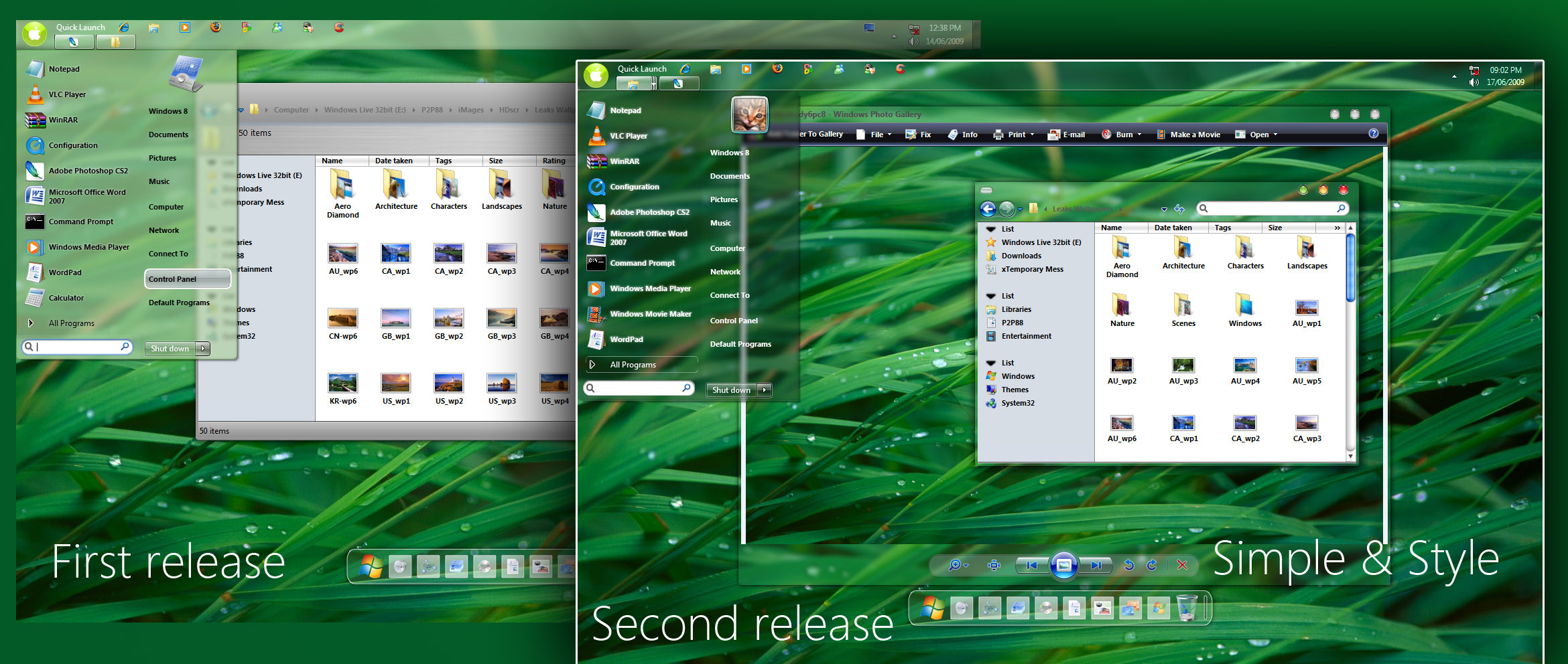
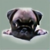
OS Minimal v2-----------------------
Minimal Visual Style with an "Old School" or Classic look and feel
Includes wall and custom click sound
Changelog version 2:
-------------------------
New startbutton
Added new color schemes black, orange, green, violet
Get styler toolbar theme here
[link]
Get winamp classic skin made by j0yrex here
[link]
To use the theme get a UXTheme Patcher:
[link]
[link]
Related content


Comments: 56

 (Smile)")


Would you consider porting this to windows 7? I love this skin but I can't use it on Windows 7.
👍: 0 ⏩: 0


classy. i agree with the start ment button comment - perhaps a smaller, unadorned square... thanks for all the links to related application skins. pity that the styler link is dead, though.
👍: 0 ⏩: 0

Nice, clean, simple. Though it's not easy to find a theme with these attributes these days, i'm very happy i found this one. Well done, Startmenu could look a bit more 'leet'
👍: 0 ⏩: 0


This visual style is awesome.
I am currently using it, it looks amazing.
You should get a award for this.
Look forward to see more of your work.
👍: 0 ⏩: 0
")

very nice work! although when I try and run the skin it give me this:
The visual styles could not be applied. Unspecified Error
any help with this is welcome.
👍: 0 ⏩: 0


Fantasic Visual style. I am using it right now.
Where could I get the ObjectDock skin background?
👍: 0 ⏩: 0


Very smooth, any way I could request that you do a Firefox visual style to match this?
👍: 0 ⏩: 0

nice, clean, simple
i like it
i've switched to xp recently, but so far it's my favourite style
although i'm not a big big fan of the stripped title bar, actually
i also wish the Start menu had maybe a nicer icon
and that the mhh.. how to explain ?
you know, when the systray is hiding some icons there's some arrow << for showing all
in you style, it only displays when the mouse is over it.. so it might be confusing sometimes.. at first sight, you don't really know if there are hidden icons or not
but still, i'll keep using that style  (Wink)")
so good work

👍: 0 ⏩: 0

I love the new colours! This is still the best visual style I have seen.
I prefer the old startbutton, though. Is it possible to make a modification with new colour schemes and old start button?
👍: 0 ⏩: 0

this is just awesome. and i really like the colours added to the v. 2

👍: 0 ⏩: 0


im having trouble getting it to work. the theme gets the background to show right, but when I select it in the themes tab, the apearance tab just goes black. the start button wont change...
👍: 0 ⏩: 0

I like the look... too many people go far too complex
👍: 0 ⏩: 0


Nice old skool feel. 
👍: 0 ⏩: 0


since theres many requests I might add more colors but I dont have time to spare at the moment
👍: 0 ⏩: 0

Very nice, also reminds me of HmmXP. I just wish there was a different start button...
👍: 0 ⏩: 0

exactly what I'm looking for.
any other colour options though?
👍: 0 ⏩: 0


If that is yz dock, could you point me to the skin?
Nice theme too
👍: 0 ⏩: 1
object dock
The icons are Milkanodised
[link]
👍: 0 ⏩: 0


I like it very much, but I think more color schemes would be good.
👍: 0 ⏩: 0

This got me off HmmXP ")
")
👍: 0 ⏩: 0


I like it a lot, but I think more color schemes would be good.
👍: 0 ⏩: 0

Looks a little too much like the HmmXP VS.
I like minimal VS's like this though.
👍: 0 ⏩: 0

Awesome take on classic style, reinventing it. Best style I've seen lately, I'm switching to this one from BlackMesa.
Some suggestions on how it would improve from viewpoint:
- A couple of pixels more height on the caption bar wouldnt hurt, it would make the text label and the close-min-max widgets look not so "squashed" in that tiny vertical space.
- The taskbar items hover state is so tiny that some icons overflow the rectangle, this doesnt look very good to me, maybe using a hover style similar to Black Mesa or Luna Element would look better with an ultra-thin taskbar (the whole taskbar height is changed on the hover state). Or maybe adding a few more pixels height to the taskbar as suggested here so the 16px icons fall inside the hover rectangle.
- The scrollbars look a bit of place with the rest of the window elements, I think they are a bit too beveled compared to the rest of the style's general flatness.
- I love the 1-pixel color border hover effect on drop-down boxes, what about using this same effect to highlight hover states on buttons and tabs too?
👍: 0 ⏩: 0

Yes, very nice work, dobee, but I too, am in love with your MSN vs.
I use that with the Longhorn alternative mod YZtoolbar theme and ooohhhh baby . . . .
This is actually very nice as well. Very clean and professional.
👍: 0 ⏩: 0

Woah, nice. I like it alot, simple and use-able.
Id love a full start menu though (getting it as we speak, might already be there xD),
and maybe a recolor - some kind of weak Beige instead of gray.
anyhow, +fav.
👍: 0 ⏩: 0
| Next =>