HOME | DD
 RobinKeijzer — LMG JIM
Published: 2014-03-14 11:49:44 +0000 UTC; Views: 2213; Favourites: 72; Downloads: 0
Redirect to original
Description
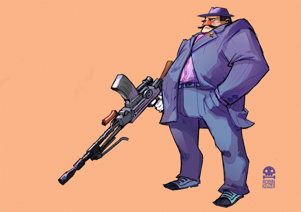
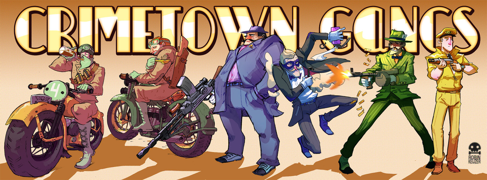
The Gang Up! Kickstarter is now live! www.kickstarter.com/projects/r…Another gangster for the 'Crimetow Gangs' cardgame! Still trying different coloring methods - although you might find it hard to see the difference
 (Smile)") This method is easier to keep consistent over 100 cards (oeff), and is less time consuming the previous methods.
This method is easier to keep consistent over 100 cards (oeff), and is less time consuming the previous methods.Find out more about the game here: www.robinkeijzer.com/
-Robin
Related content


Comments: 19

LM-Jim
Heavy Ma-Jim Gun
Heard of a Tommy Gun? Well this is my Jimmy Gun.
👍: 0 ⏩: 0

Amazing!
I love your art style, everything is beautiful, the brushes you use and the colours...!
👍: 0 ⏩: 1


Yes, I actually added this gun to emphasize his power & size  (Wink)")
👍: 0 ⏩: 1


I can't see the technique difference at all, which tools are you using? The only difference I see is that this lineart is more sketchy than the previous.
I like to use Paint Tool SAI's Marker Tool for this kind of cel-shading with a slight gradient, although this sample is kinda rushed:
marcotonio-desu.deviantart.com…
You might check it out if you're looking for a quick method on cel-shade. "Pen" for hard edges, Marker for delicious blending but defined strokes.
👍: 0 ⏩: 1
Normally I use a round-hard brush, making a big effort to neatly apply shadows. But this one is done with a tilted more egg shaped brush; making the coloring actually hard to control. I apply it by making a selection of the big shape and then I quickly apply 2 rough shading layers, while using a similar shaped ereaser to cut away parts of those layers. I don't really put an effort in getting the folds right, or excactly matching with the linework; but it still looks pretty well matched because of the wierd brush shape. Finally I add 1 or 2 gradient layers over the whole thing to get some color variation. The whole process takes me now about 30 minutes -instead of 60 or more for the other image. ..
👍: 0 ⏩: 1
Oh, so the gradient is a single piece. Lasso coloring is something I don't ever dare. Thanks for the insight!
👍: 0 ⏩: 0


You're welcome!
Cheers!
")
👍: 0 ⏩: 0

That looks really great, love the style and posture
If that's something you like and is easier for you to manage then that's really great to hear
Also I know it's a really weird thing to take note of and not sure if it's intentional but I the sort of comical-esque imperfection on the weapon here - puu(.)sh/7v7f0(.)png
It sort of gives it more style and makes it feel more organic as an overall image-like even though it looks real enough it is as much a part of the image as the character himself. Not quite sure if I'm describing it very well or if I'm majorly over-thinking it but it's a weird thing that instantly stood out to me as something that added to the 'charisma' of the image.
👍: 0 ⏩: 1
Hey, I'm curious to see the image you refere to, but the link doesn't seem to work. Can you link it again maybe?
And I did try to make the gun a bit cartoony (like done in TF2 for example), to make it less serious. Hope you like that
👍: 0 ⏩: 1
No worries, "puu sh/7v7f0 png", just replace the spaces with "."
Awesome, I absolutely love that
👍: 0 ⏩: 0